DIAD Study Guide

DIAD Introduction to Power BI
Accessing And Preparing the data
Selecting appropriate column data types is a critical step in data modeling and analysis. When working with Power BI or any data analysis tool, it is essential to ensure that each column in your dataset is assigned the correct data type. This ensures accurate data representation and enables the proper functioning of features such as sorting, filtering, and data calculations.
Importance of Correct Data Types
- Accuracy: Correct data types ensure that calculations and aggregations are performed accurately.
- Performance: Proper data types can improve query performance and reduce the size of the data model.
- Functionality: Certain functionalities, like date hierarchies, are only available when the correct data type is used .
Steps to Select Appropriate Column Data Types
- Assess the Data: Review the content of each column to understand what kind of data it represents—whether it’s textual, numeric, date/time, or boolean.
- Choose the Data Type: Based on the assessment,
choose a data type that best represents the column’s content. For
example, use
Datefor columns that contain dates andWhole NumberorDecimal Numberfor numeric columns. - Consider Data Type Limitations: Be aware that some data types might not be supported for certain operations or functionalities within Power BI. For instance, if a text column is selected as an outcome column for machine learning models, some model types might be disabled https://learn.microsoft.com/en-us/power-bi/transform-model/dataflows/dataflows-machine-learning-integration .
- Correct Incorrect Data Types: Imported data can sometimes have incorrect data types, such as dates and numbers imported as strings. These should be corrected in the Power BI model to ensure they are interpreted correctly https://learn.microsoft.com/en-us/power-bi/create-reports/../natural-language/q-and-a-best-practices .
- Ensure Consistency in Relationships: The data type
for both the “from” and “to” columns of a relationship should be the
same to avoid unexpected behavior. For example, working with
relationships defined on
DateTimecolumns might not behave as expected because the underlying engine usesDateTimedata types, and Power BI’s formatting constructs likeDate,Time, andDate/Time/Timezoneare implemented on top of it https://learn.microsoft.com/en-us/power-bi/transform-model/desktop-relationships-understand .
Best Practices
- Use Power Query Editor: To correct data types, especially for date and time data, use the Power Query Editor to remove the time portion from the imported data https://learn.microsoft.com/en-us/power-bi/transform-model/desktop-relationships-understand .
- Avoid Unnecessary Complexity: Do not use complex
data types when a simpler one will suffice. For example, use
Textinstead ofBinaryfor simple string data. - Consistency Across Tables: Ensure that the same data types are used for the same categories of data across different tables to maintain consistency and integrity.
Additional Resources
- For more information on how date/time types are handled in Power BI, you can read the documentation here https://learn.microsoft.com/en-us/power-bi/transform-model/desktop-relationships-understand .
- To learn about configuring data loading for queries and other data transformation techniques, refer to the Power BI documentation here https://learn.microsoft.com/en-us/power-bi/transform-model/dataflows/dataflows-machine-learning-integration .
By following these guidelines and utilizing the resources provided, you can ensure that your data model is robust, accurate, and performs well within Power BI.
DIAD Introduction to Power BI
Accessing And Preparing the data
Create and Transform Columns in Power BI Desktop
Creating and transforming columns in Power BI Desktop is a fundamental skill for data shaping and preparation, which allows you to tailor your data to meet specific reporting and analysis needs. Here’s a detailed explanation of how to create and transform columns:
Creating Calculated Columns
Calculated columns are created using Data Analysis Expressions (DAX), which is a formula language designed to work with relational data like that in Power BI. These columns are computed from other columns in the same table and become part of the data model.
Steps to Create a Calculated Column:
- In Power BI Desktop, go to the Data view by clicking on the Data icon in the left navigation pane.
- Select the table in which you want to add the calculated column.
- Go to the Modeling tab and click on “New Column”.
- In the formula bar, enter the DAX formula for your calculated column.
For example, to concatenate two fields, Territory and Chain, into a single calculated column called TerritoryChain, you would use the following DAX formula:
TerritoryChain = [Territory] & " - " & [Chain]For more detailed step-by-step instructions and examples, refer to the tutorial on creating calculated columns in Power BI Desktop here https://learn.microsoft.com/en-us/power-bi/transform-model/desktop-calculated-columns https://learn.microsoft.com/en-us/power-bi/collaborate-share/service-url-filters .
Transforming Columns
Transforming columns involves modifying the data within them to better suit your analysis. This can include renaming columns, changing data types, removing rows, and more.
Using Power Query Editor:
Power Query Editor in Power BI Desktop provides a robust set of tools for shaping data:
- Connect to your data source and load the data into Power Query Editor.
- Use the right-click menus or the Transform ribbon to perform actions such as renaming columns, changing data types, removing rows, and setting the first row as headers.
- Combine data from different sources if needed and consolidate them into a single query.
For a comprehensive guide on shaping and combining data using Power Query Editor, you can follow the tutorial here https://learn.microsoft.com/en-us/power-bi/connect-data/desktop-shape-and-combine-data .
Additional Resources
To deepen your understanding of DAX and its application in creating calculated columns, you can explore the following resource:
- Learn DAX basics in Power BI Desktop: Learn DAX basics https://learn.microsoft.com/en-us/power-bi/transform-model/desktop-calculated-columns .
By mastering the creation and transformation of columns in Power BI Desktop, you can effectively manipulate your data to build insightful and compelling reports.
DIAD Introduction to Power BI
Accessing And Preparing the data
Transforming a Query in Power Query Editor
When working with Power BI Desktop, transforming a query is a fundamental step in the data preparation process. The Power Query Editor is a powerful tool that allows you to clean and shape your data to meet the needs of your analysis. Here’s a detailed explanation of how to transform a query using Power Query Editor:
Accessing Power Query Editor: To begin transforming your data, you need to access the Power Query Editor. This can be done by selecting Transform data on the Home ribbon in the Queries section of Power BI Desktop https://learn.microsoft.com/en-us/power-bi/fundamentals/desktop-what-is-desktop .
Performing Transformations: Once in the Power Query Editor, you can perform a variety of transformations on your data. These transformations can include changing data types, removing columns, filtering rows, or combining data from multiple sources. Each action you take is recorded as a step in the Power Query Editor, ensuring that every time the query connects to the data source, these steps are automatically applied https://learn.microsoft.com/en-us/power-bi/fundamentals/desktop-what-is-desktop .
Shaping Data: The process of transforming data is akin to sculpting. You start with the raw data and refine it by removing unnecessary elements or adding new ones until it takes the shape you desire. This could involve renaming tables, changing column types, or deleting columns that are not needed for your analysis https://learn.microsoft.com/en-us/power-bi/fundamentals/desktop-what-is-desktop .
Recording Steps: Power Query Editor keeps track of each transformation step you perform. This means that the data will always be shaped according to your specifications whenever the query is refreshed. This feature ensures consistency and repeatability in your data transformation process https://learn.microsoft.com/en-us/power-bi/fundamentals/desktop-what-is-desktop .
Creating Visuals: After transforming and shaping your data to your satisfaction, you can then use it to create visuals in Power BI. The transformed data serves as the foundation for your reports and dashboards https://learn.microsoft.com/en-us/power-bi/fundamentals/desktop-what-is-desktop .
For additional information on transforming queries in Power Query Editor, you can refer to the following resources: - Power Query Editor Overview: Power Query Editor Documentation https://learn.microsoft.com/en-us/power-bi/fundamentals/desktop-what-is-desktop . - Common Query Tasks in Power BI Desktop: Power BI Desktop Common Query Tasks https://learn.microsoft.com/en-us/power-bi/transform-model/desktop-common-query-tasks .
By following these steps and utilizing the resources provided, you can effectively transform your queries within Power BI Desktop to prepare your data for analysis.
DIAD Introduction to Power BI
Accessing And Preparing the data
Selecting a Shared Dataset or Creating a Local Dataset
When working with data in Power BI, you have the option to either select a shared dataset or create a local dataset. Here’s a detailed explanation of both approaches:
Shared Dataset
A shared dataset is a reusable dataset published on the Power BI service. It allows users to create multiple reports from the same dataset, ensuring consistency and saving time. To use a shared dataset, you must have appropriate permissions. Shared datasets can be used across workspaces if you have read permissions for the dataset. This is particularly useful when you want to maintain a single source of truth for your data and enable collaboration among different users and reports.
Creating a Local Dataset
A local dataset is created within your Power BI report and is not shared with other reports or users. This is useful when you are working on a report that requires a unique data model or when you do not have access to a shared dataset that fits your needs. Local datasets are built directly in Power BI Desktop or Power BI Report Builder and can be sourced from a variety of data connections.
Choosing Between the Two
The choice between using a shared dataset or creating a local dataset depends on several factors:
- Data Governance: Shared datasets promote a governed environment where data models are managed centrally.
- Collaboration: If the dataset is to be used by multiple reports or users, a shared dataset is preferable.
- Specific Requirements: For reports with unique data requirements, a local dataset might be more appropriate.
- Data Source Availability: If the data source is not available as a shared dataset, you may need to create a local dataset.
For additional information on shared datasets and creating local datasets in Power BI, you can refer to the following URLs:
Remember, when selecting a shared dataset or creating a local dataset, it’s important to consider the long-term maintenance and usage patterns of your reports to make the most effective choice for your organization’s needs.
DIAD Introduction to Power BI
Accessing And Preparing the data
Choosing Between DirectQuery, Import, and Dual Mode in Power BI
When working with Power BI, one of the key decisions you’ll need to make is how to connect to your data sources. There are three primary modes of data storage and retrieval that you can choose from: DirectQuery, Import, and Dual mode. Each mode has its own advantages and use cases, and understanding the differences between them is crucial for optimizing the performance and efficiency of your Power BI reports.
DirectQuery Mode
In DirectQuery mode, no data is imported or cached within your Power BI report. Instead, queries are sent directly to the data source in real-time. This means that your reports always reflect the current state of the data source, which is beneficial for scenarios where up-to-date information is critical.
- Advantages:
- Always up-to-date data.
- No need to manage data refresh schedules.
- Can handle large datasets that exceed Power BI’s data capacity limits.
- Considerations:
- Query performance depends on the data source’s performance.
- Some Power BI features, like quick measures and certain DAX functions, are not available.
Import Mode
Import mode involves pulling data into Power BI, where it is stored in an in-memory cache. This allows for faster query performance since the data is readily available within Power BI.
- Advantages:
- Fast query performance due to in-memory storage.
- Full access to Power BI features, including all DAX functions and data transformations.
- Considerations:
- Data is not real-time and requires scheduled refreshes.
- There are data volume limitations based on the Power BI edition you are using.
Dual Mode
Dual mode, also known as Hybrid mode, allows a table to operate in both Import and DirectQuery modes. This mode is particularly useful when you have related tables that need to interact with each other, some of which may benefit from being cached (Import) and others that require real-time data (DirectQuery).
- Advantages:
- Flexibility to cache data or retrieve it in real-time, depending on the query context.
- Reduces the number of limited relationships in the model, leading to more efficient data source queries https://learn.microsoft.com/en-us/power-bi/connect-data/incremental-refresh-troubleshoot .
- Considerations:
- Tables in Dual mode have the same functional constraints as DirectQuery tables.
- Switching tables to Dual mode may require manual work, especially if they are currently in Import mode https://learn.microsoft.com/en-us/power-bi/troubleshoot/../connect-data/incremental-refresh-troubleshoot .
Additional Resources
For more detailed information on managing storage modes in Power BI Desktop, you can refer to the following resources: - Manage storage mode in Power BI Desktop https://learn.microsoft.com/en-us/power-bi/troubleshoot/../connect-data/incremental-refresh-troubleshoot . - Use composite models in Power BI Desktop https://learn.microsoft.com/en-us/power-bi/connect-data/service-dataset-modes-understand .
When choosing between these modes, consider the size of your dataset, the need for real-time data, and the specific features of Power BI that you plan to use. The right choice will depend on the specific requirements of your report and the nature of the data you are working with.
DIAD Introduction to Power BI
Data Modeling and Exploration
Define a Relationship’s Cardinality and Cross-Filter Direction
In Power BI, defining a relationship’s cardinality and cross-filter direction is crucial for accurate data modeling and analysis. Here’s a detailed explanation of these concepts:
Cardinality
Cardinality refers to the nature of the relationship between two tables in a data model. It indicates the uniqueness of data in one table related to the data in another table. There are three types of cardinality:
- One-to-One (1:1): Each row in Table A is related to one and only one row in Table B, and vice versa.
- One-to-Many (1:N) or Many-to-One (N:1): Each row in Table A can relate to many rows in Table B, but each row in Table B is related to only one row in Table A.
- Many-to-Many (N:N): Each row in Table A can relate to many rows in Table B, and each row in Table B can also relate to many rows in Table A.
When setting up relationships in Power BI, the cardinality is automatically determined by Power BI Desktop during data load, but it can also be manually adjusted in the “Manage relationships” dialog box https://learn.microsoft.com/en-us/power-bi/transform-model/desktop-create-and-manage-relationships .
Cross-Filter Direction
Cross-filter direction determines how filters applied to one table affect another table in a relationship. There are two options for cross-filter direction:
- Single: Filters are applied in one direction only, either from the “one” side to the “many” side in a one-to-many relationship or from one table to another in a one-to-one relationship.
- Both: Filters are applied in both directions, allowing for bi-directional filtering. This is common in star schema designs where dimension tables filter fact tables and vice versa.
The cross-filter direction can be set to “Single” or “Both” depending on the cardinality type. For example, in a one-to-many relationship, the cross-filter direction is from the “one” side and optionally from the “many” side (bi-directional) https://learn.microsoft.com/en-us/power-bi/transform-model/desktop-relationships-understand .
Considerations and Best Practices
- Bi-directional relationships (cross-filter direction set to “Both”) can negatively impact performance and may lead to ambiguous filter propagation paths. It is recommended to use bi-directional filtering only when necessary https://learn.microsoft.com/en-us/power-bi/transform-model/desktop-relationships-understand .
- The CROSSFILTER DAX function can be used to modify the relationship cross filter direction, including disabling filter propagation https://learn.microsoft.com/en-us/power-bi/transform-model/desktop-relationships-understand .
- In Power BI Desktop model view, a relationship’s cross filter direction is indicated by arrowheads along the relationship line. A single arrowhead represents a single-direction filter, while a double arrowhead represents a bi-directional relationship https://learn.microsoft.com/en-us/power-bi/transform-model/desktop-relationships-understand .
For additional information on these topics, you can refer to the following resources: - Row-level security (RLS) with Power BI Desktop - Bi-directional relationship guidance - CROSSFILTER function
By understanding and correctly defining the cardinality and cross-filter direction of relationships, you can ensure that your Power BI reports and dashboards reflect accurate and meaningful insights from your data.
DIAD Introduction to Power BI
Data Modeling and Exploration
Create a Common Date Table
In Power BI, a common date table is essential for performing time-based analysis and using time intelligence functions effectively. A date table contains a range of dates with no gaps, and it usually includes additional columns like year, quarter, month, and day to facilitate hierarchical time-based analysis.
Steps to Create a Common Date Table in Power BI:
Open Power BI Desktop: Start by launching Power BI Desktop.
Get Data: In the Home ribbon, select “Get data” to import your data sources.
Create or Import a Date Table: You can either create a new date table within Power BI or import an existing one. If you’re creating a new table, you can use DAX functions to generate a table with a sequence of dates. If you’re importing, ensure that the table has a continuous range of dates and includes the necessary time-based columns.
Mark as Date Table: Once you have your date table, you need to mark it as such. Right-click the table in the Data pane and choose “Mark as date table > Mark as date table” from the menu. Then, specify the primary date column from the dropdown menu in the “Mark as date table” dialog https://learn.microsoft.com/en-us/power-bi/transform-model/service-edit-data-models .
Validate the Date Table: Power BI will validate that the table has a single date column with unique values and no gaps in the dates. This step is crucial for the date table to work correctly with time intelligence functions.
Use the Date Table: After marking the table as a date table, you can use it in your reports. It will enable you to perform time-based analysis and use time intelligence quick measures effectively.
Additional Considerations:
Built-in Date Hierarchy: With imported data, every date/datetime column has a built-in date hierarchy by default, which is not available with DirectQuery. If you’re using a Date table from a data warehouse, you can use DAX time-intelligence functions as usual https://learn.microsoft.com/en-us/power-bi/connect-data/desktop-directquery-about .
Custom Date Tables: If you’re using a custom date table, especially with external tabular models, ensure that the primary date column is marked as a date table for time intelligence functions to work correctly https://learn.microsoft.com/en-us/power-bi/transform-model/desktop-quick-measures .
Row-Level Security: If you implement row-level security roles, consider how the date table interacts with these roles to ensure proper data access https://learn.microsoft.com/en-us/credentials/certifications/resources/study-guides/pl-300 .
For further details on creating and using date tables in Power BI, you can refer to the official documentation: - Set and use date tables in Power BI Desktop - Specify Mark as Date Table for use with time-intelligence
By following these steps and considerations, you can create a common date table in Power BI that will serve as the foundation for all time-based reporting and analysis.
DIAD Introduction to Power BI
Data Modeling and Exploration
Use Synonyms
When working with Q&A visuals in Power BI, it is essential to enhance the natural language understanding capabilities of the system. One effective way to achieve this is by using synonyms for the data in your model. Synonyms allow you to map the language used by people to the specific fields and tables in your data model. This mapping is particularly useful when dealing with domain-specific language or various terms that refer to the same concept.
Adding Synonyms
To add synonyms in Power BI, you can:
- Utilize the Q&A setup menu, which may prompt you to improve your Q&A visual by adding synonyms when you first create a Q&A visual or access the setup menu https://learn.microsoft.com/en-us/power-bi/create-reports/../natural-language/q-and-a-copilot-enhancements .
- Enable Copilot as a source for automatically generated synonyms, which can suggest alternative names for your tables and columns https://learn.microsoft.com/en-us/power-bi/create-reports/../natural-language/q-and-a-copilot-enhancements .
- Review and approve the suggested synonyms to ensure they accurately represent the data fields and are relevant to your users https://learn.microsoft.com/en-us/power-bi/create-reports/../natural-language/q-and-a-tooling-intro .
Benefits of Synonyms
- Improved Accuracy: By defining synonyms, you can ensure that the Q&A engine correctly interprets user inputs, leading to more accurate and relevant results .
- Enhanced User Experience: Users can interact with the Q&A visual using their natural vocabulary without being restricted to the predefined names of columns or tables https://learn.microsoft.com/en-us/power-bi/create-reports/../natural-language/q-and-a-best-practices .
- Efficiency: Synonyms can save time by allowing users to quickly get the information they need without having to know the exact terminology used in the data model https://learn.microsoft.com/en-us/power-bi/create-reports/../natural-language/q-and-a-tooling-intro .
Considerations
- Avoid Ambiguity: Be cautious when adding the same synonym to multiple columns or tables, as this can create confusion for the Q&A engine. Where possible, use unique synonyms to reduce ambiguity https://learn.microsoft.com/en-us/power-bi/create-reports/../natural-language/q-and-a-best-practices .
- Review and Curate: Regularly review the synonyms to ensure they remain accurate and relevant. Remove any that are incorrect or no longer applicable .
Additional Resources
For more information on how to effectively use synonyms in Power BI, you can refer to the following resources:
By incorporating synonyms into your Power BI models, you can significantly improve the interactivity and user-friendliness of your Q&A visuals, making it easier for users to explore and analyze data using natural language queries.
DIAD Introduction to Power BI
Data Modeling and Exploration
Use the QnA Function in Power BI
The QnA function in Power BI is a powerful feature that allows users to explore their data using natural language queries. This feature can be particularly useful for quickly gaining insights without the need for complex report building or deep technical knowledge of the underlying data structure.
How to Use QnA in Power BI
Accessing QnA: To start using QnA, navigate to a dashboard within the Power BI service. You will find the QnA question box prominently displayed. On a dashboard, it’s labeled as Ask a question about your data https://learn.microsoft.com/en-us/power-bi/fundamentals/service-get-started .
Formulating Questions: Simply place your cursor in the QnA field and begin typing your question. Power BI provides autocomplete suggestions and displays phrases or complete questions that include the names of tables in the semantic model https://learn.microsoft.com/en-us/power-bi/create-reports/../natural-language/end-user-q-and-a-tutorial .
Refining Questions: As you type, Power BI offers visual cues and restatements to help refine your question. It also dynamically picks the best visualization to display your answer, which changes as you modify the question https://learn.microsoft.com/en-us/power-bi/create-reports/../natural-language/end-user-q-and-a-tutorial .
Visualization Types: If you prefer a different type of visualization than the one automatically chosen by Power BI, you can edit the natural language question to specify your preferred visualization type https://learn.microsoft.com/en-us/power-bi/create-reports/../natural-language/end-user-q-and-a-tutorial .
Pinning Visualizations: Once you are satisfied with the result, you can pin the visualization to a dashboard by selecting the pin icon. This allows you to save the visual for later reference or to share with others https://learn.microsoft.com/en-us/power-bi/create-reports/../natural-language/end-user-q-and-a-tutorial .
Tips for Using QnA
- Explore Suggestions: Before typing your own question, consider using the suggested questions provided by Power BI as a starting point https://learn.microsoft.com/en-us/power-bi/create-reports/../natural-language/end-user-q-and-a-tutorial .
- Familiarize with Terminology: If you’re unsure about what to ask, expand the Show all suggestions option or look through other visuals in the report to get familiar with the terms used in the semantic model https://learn.microsoft.com/en-us/power-bi/create-reports/../natural-language/end-user-q-and-a-tutorial .
- Specify Visuals: To change the default visualization, include the type of visualization you want in your question (e.g., “as bar chart” or “as line chart”) https://learn.microsoft.com/en-us/power-bi/fundamentals/service-get-started .
Additional Resources
For more detailed guidance on using the QnA feature in Power BI, you can refer to the following resources:
- End-user Q&A tutorial https://learn.microsoft.com/en-us/power-bi/create-reports/../consumer/end-user-q-and-a
- Create featured questions for Q&A https://learn.microsoft.com/en-us/power-bi/create-reports/../natural-language/end-user-q-and-a-tutorial
- Pin a visual from Q&A to your dashboard https://learn.microsoft.com/en-us/power-bi/create-reports/../consumer/end-user-q-and-a
By leveraging the QnA function in Power BI, users can interact with their data in a conversational manner, making data analysis more accessible and intuitive.
DIAD Introduction to Power BI
Visualizations
Identify and Implement Appropriate Visualizations
When creating reports, it is essential to identify and implement visualizations that effectively communicate the data’s story. The choice of visualization depends on the nature of the data and the insights you wish to convey. Here are some steps and considerations for selecting and implementing the right visualizations:
Understand Your Data: Before choosing a visualization, you must understand the data you are working with. This includes knowing the data types, the relationships between different data points, and what you want to highlight in your report.
Define the Purpose: Each visualization should have a clear purpose. Are you trying to show a trend, compare values, or demonstrate a distribution? The goal will guide your choice of visualization.
Choose the Right Chart Type: Different chart types are suitable for different kinds of data and insights. For example, use line charts for trends over time, bar charts for comparisons, pie charts for showing parts of a whole, and scatter plots for relationships between variables.
Custom Visuals: Sometimes, the standard visuals may not suffice. Power BI allows the use of custom visuals to cater to specific reporting needs. These can be sourced from the Power BI Visuals Marketplace.
Apply and Customize Themes: Consistent visual styling is important. Power BI themes can help you apply a consistent color palette and font styling across all visuals in your report.
Conditional Formatting: This feature can be used to highlight specific data points, such as high or low values, using color or other visual cues.
Slicing and Filtering: Slicers and filters can be used to focus on specific segments of the data, allowing for interactive reports where viewers can drill down into the data.
Report Page Configuration: The layout and configuration of the report page are crucial. Ensure that visuals are arranged in a logical and easy-to-follow manner.
Analyze in Excel: For users who prefer to work with Excel, Power BI provides the “Analyze in Excel” feature, which allows for further data exploration and visualization in Excel.
Paginated Reports: For printing or PDF generation, paginated reports are useful as they provide consistent formatting and layout.
For additional information on creating effective visualizations in Power BI, you can refer to the following resources:
- Power BI Visualization Types for Reports and Q&A https://learn.microsoft.com/en-us/power-bi/create-reports/../visuals/power-bi-visualization-types-for-reports-and-q-and-a .
- Create Smart Narrative Summaries https://learn.microsoft.com/en-us/power-bi/create-reports/../visuals/power-bi-visualization-types-for-reports-and-q-and-a .
- Python Visualizations in Power BI Service https://learn.microsoft.com/en-us/power-bi/connect-data/desktop-python-visuals .
- Using Python Visuals in Power BI https://learn.microsoft.com/en-us/power-bi/connect-data/desktop-python-visuals .
Remember, the key to effective data visualization is not just about making the report visually appealing but also about making it easy for the audience to understand and derive insights from the data.
DIAD Introduction to Power BI
Visualizations
Format and Configure Visualizations in Power BI
When working with Power BI, formatting and configuring visualizations is a key step to enhance the readability and effectiveness of reports. Here’s a detailed explanation of how to approach this task:
- Identify and Implement Appropriate Visualizations:
- Choose the right type of visualization based on the data and the insights you want to communicate. Power BI offers a variety of charts, graphs, and other visual elements to represent data effectively.
- Format and Configure Visualizations:
- Use the Visualizations pane to select a visualization and then use the paintbrush icon to access the Format section. Here, you can adjust various settings like colors, text size, and data labels to make your visual more informative and visually appealing https://learn.microsoft.com/en-us/power-bi/create-reports/../visuals/power-bi-visualization-tables .
- Use a Custom Visual:
- Power BI allows the use of custom visuals from the marketplace or ones that are created by users. These can provide specialized functionality not available in the standard set of visuals https://learn.microsoft.com/en-us/credentials/certifications/resources/study-guides/pl-300 .
- Apply and Customize a Theme:
- Themes in Power BI help maintain consistency in design and color across all visuals in a report. You can apply a predefined theme or create a custom theme to match your organization’s branding https://learn.microsoft.com/en-us/credentials/certifications/resources/study-guides/pl-300 .
- Configure Conditional Formatting:
- Conditional formatting can be used to highlight data points in your visuals based on certain conditions, such as using data bars or color scales to represent values, or icons to represent categories https://learn.microsoft.com/en-us/power-bi/create-reports/../visuals/power-bi-visualization-tables https://learn.microsoft.com/en-us/power-bi/create-reports/../visuals/power-bi-visualization-tables .
- Apply Slicing and Filtering:
- Slicers and filters can be used to control the data that is displayed in the visualizations. This allows users to focus on specific segments of the data or to explore the data interactively https://learn.microsoft.com/en-us/credentials/certifications/resources/study-guides/pl-300 .
- Configure the Report Page:
- The report page can be configured to set the page size, background, and other properties that affect the overall layout and presentation of the visualizations on the page https://learn.microsoft.com/en-us/credentials/certifications/resources/study-guides/pl-300 .
- Use the Analyze in Excel Feature:
- This feature allows users to analyze Power BI data using the familiar Excel interface, providing additional flexibility for data exploration and reporting https://learn.microsoft.com/en-us/credentials/certifications/resources/study-guides/pl-300 .
- Choose When to Use a Paginated Report:
- Paginated reports are designed for scenarios where you need to display all data in a table format, often for operational reporting or for creating invoice-style reports https://learn.microsoft.com/en-us/credentials/certifications/resources/study-guides/pl-300 .
For more information on how to format and configure visualizations in Power BI, you can refer to the following resources: - Create tree maps in Power BI https://learn.microsoft.com/en-us/power-bi/create-reports/../visuals/power-bi-visualization-tables . - Review visualization types in Power BI https://learn.microsoft.com/en-us/power-bi/create-reports/../visuals/power-bi-visualization-tables . - Apply conditional formatting in tables and matrixes https://learn.microsoft.com/en-us/power-bi/create-reports/../visuals/power-bi-visualization-tables .
By following these guidelines, you can create compelling and informative visualizations that make your Power BI reports stand out.
DIAD Introduction to Power BI
Visualizations
Use a Custom Visual in Power BI
Custom visuals in Power BI are powerful tools that allow users to go beyond the standard visuals provided by Power BI. They are created by members of the Power BI community or by yourself, and they can be used to tailor reports to meet specific data visualization needs.
Understanding Custom Visuals
Custom visuals are not included in the default set of visuals in Power BI. They are additional components that can be found in the AppSource or created by users. These visuals can be used to represent data in unique ways that are not possible with the native visuals provided by Power BI https://learn.microsoft.com/en-us/power-bi/consumer/end-user-basic-concepts .
Importing Custom Visuals
To use a custom visual, you must first import it into your Power BI
report. Custom visuals come in .pbiviz file packages, which
include the code necessary to render the data. You can import a
.pbiviz file from your local computer into Power BI by
following the steps outlined in the Power BI documentation https://learn.microsoft.com/en-us/power-bi/troubleshoot/../developer/visuals/power-bi-custom-visuals
.
Developing Your Own Custom Visuals
If you have web development skills, you can create your own custom
visual for Power BI. The process involves developing the visual and
packaging it as a .pbiviz file. Once created, you can
import it into your Power BI report, use it within your organization, or
share it with the Power BI community https://learn.microsoft.com/en-us/power-bi/troubleshoot/../developer/visuals/power-bi-custom-visuals
.
Security and Trust
Before importing a custom visual into your report, ensure that you trust the author and the source of the visual. Custom visuals can contain code that poses security or privacy risks https://learn.microsoft.com/en-us/power-bi/troubleshoot/../developer/visuals/power-bi-custom-visuals .
Sharing Custom R Visuals
If you create R-powered visuals, you can contribute these to the Power BI visuals gallery through GitHub. This allows you to share your work with others and potentially benefit the wider Power BI community https://learn.microsoft.com/en-us/power-bi/create-reports/desktop-r-powered-custom-visuals .
Additional Resources
For more information on how to certify your custom visual, visit the following URL: How to Certify Your Custom Visual https://learn.microsoft.com/en-us/power-bi/create-reports/../visuals/power-bi-visualization-copy-paste .
For a full list of visualizations included with Power BI and to understand more about custom visuals, refer to the following URL: Power BI Visualization Types for Reports and Q&A https://learn.microsoft.com/en-us/power-bi/consumer/end-user-basic-concepts .
To learn how to develop a Power BI visual and publish it to AppSource, you can find additional information at the following URL: Develop a Power BI Visual https://learn.microsoft.com/en-us/power-bi/troubleshoot/../developer/visuals/power-bi-custom-visuals .
For examples of Power BI custom visuals available for download, visit the following URL: Examples of Power BI Visuals https://learn.microsoft.com/en-us/power-bi/troubleshoot/../developer/visuals/power-bi-custom-visuals .
To contribute to the R-powered Power BI visuals gallery, follow the guidelines provided here: Contributing to the R-powered Power BI visuals gallery https://learn.microsoft.com/en-us/power-bi/create-reports/desktop-r-powered-custom-visuals .
By understanding and utilizing custom visuals, you can significantly enhance the visual representation of data in your Power BI reports, providing a more tailored and insightful experience for report viewers.
DIAD Introduction to Power BI
Visualizations
Apply and Customize a Theme in Power BI Desktop
Applying and customizing a theme in Power BI Desktop allows users to create a consistent look and feel across their reports by using predefined or custom color schemes and visual formatting. Here’s a detailed explanation of how to apply and customize a theme:
Applying a Built-in Theme
- Open Power BI Desktop and navigate to the View ribbon.
- Click on the dropdown arrow next to Themes.
- Select from the available built-in themes, which are similar to themes in Microsoft PowerPoint https://learn.microsoft.com/en-us/power-bi/create-reports/desktop-report-themes .
Built-in themes offer a variety of predefined color schemes that can be selected directly from the Power BI Desktop menu https://learn.microsoft.com/en-us/power-bi/create-reports/desktop-report-themes .
Customizing a Theme
For more granular control over the report’s appearance, you can customize themes in Power BI Desktop:
- From the View ribbon, select the Themes dropdown button and choose Customize current theme https://learn.microsoft.com/en-us/power-bi/create-reports/desktop-report-themes .
- A dialog will appear where you can adjust various settings of the
current theme, such as:
- Name and colors: Modify theme name, theme colors, sentiment colors, divergent colors, and structural colors https://learn.microsoft.com/en-us/power-bi/create-reports/desktop-report-themes .
- Text: Change font family, size, and color for labels, titles, cards, KPIs, and tab headers https://learn.microsoft.com/en-us/power-bi/create-reports/desktop-report-themes .
- Visuals: Adjust settings for background, border, header, and tooltips https://learn.microsoft.com/en-us/power-bi/create-reports/desktop-report-themes .
- Page: Set wallpaper and background for pages https://learn.microsoft.com/en-us/power-bi/create-reports/desktop-report-themes .
- Filter pane: Customize background color, transparency, font and icon color, size, and filter cards https://learn.microsoft.com/en-us/power-bi/create-reports/desktop-report-themes .
- After making the desired changes, click Apply and save to save the new theme https://learn.microsoft.com/en-us/power-bi/create-reports/desktop-report-themes .
For more advanced customization, you can create and modify a custom report theme JSON file. This allows for finer adjustments to the theme’s elements https://learn.microsoft.com/en-us/power-bi/create-reports/desktop-report-themes .
Custom Report Theme JSON File
- Create a JSON file with the desired theme settings or modify an existing one https://learn.microsoft.com/en-us/power-bi/create-reports/desktop-report-themes .
- Save the JSON file and import it into Power BI Desktop by selecting Browse for themes from the Themes dropdown menu https://learn.microsoft.com/en-us/power-bi/create-reports/desktop-report-themes .
- Navigate to the location of the downloaded JSON file and select it to apply the theme https://learn.microsoft.com/en-us/power-bi/create-reports/desktop-report-themes .
When successful, Power BI will display a dialog confirming the successful import of the theme https://learn.microsoft.com/en-us/power-bi/create-reports/desktop-report-themes .
Additional Resources
For more information on customizing themes and the JSON file format, you can refer to the following resources:
- Customize report themes in Power BI Desktop: Customize report themes
- Report theme JSON file format: Report theme JSON file format
By following these steps, you can apply and customize themes in Power BI Desktop to create visually appealing and consistent reports that align with your corporate branding or personal preferences.
DIAD Introduction to Power BI
Visualizations
Configure Conditional Formatting in Power BI
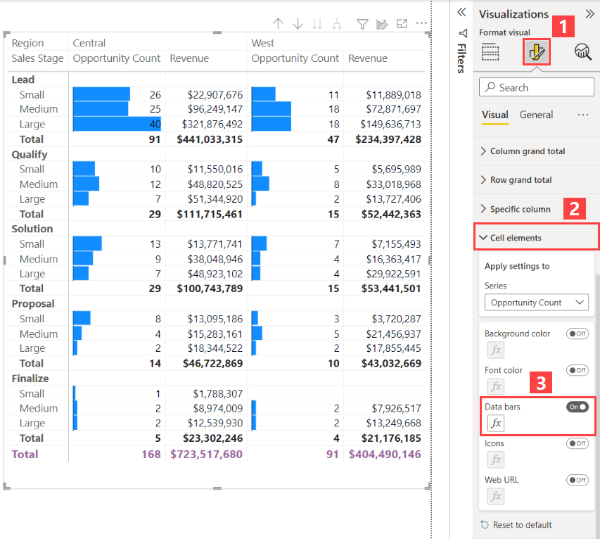
Conditional formatting in Power BI allows you to customize the appearance of your data visualizations based on specific conditions. This feature enhances the visual impact of reports by highlighting critical data points, trends, and exceptions. Here’s how you can configure conditional formatting for various elements in Power BI:
For Matrix Visuals
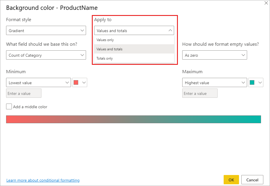
- Applying Conditional Formatting:
- Select the matrix visual and open the Format pane.
- Expand the Cell elements card.
- For Background color, Font color, or Data bars, turn the slider to On.
- Click the definitions icon that appears to customize the colors and values for the formatting https://learn.microsoft.com/en-us/power-bi/create-reports/../visuals/desktop-matrix-visual .
- Customization Options:
- Conditional formatting can be applied to the background of cells, the text, and the values themselves within the matrix https://learn.microsoft.com/en-us/power-bi/create-reports/../visuals/desktop-matrix-visual .
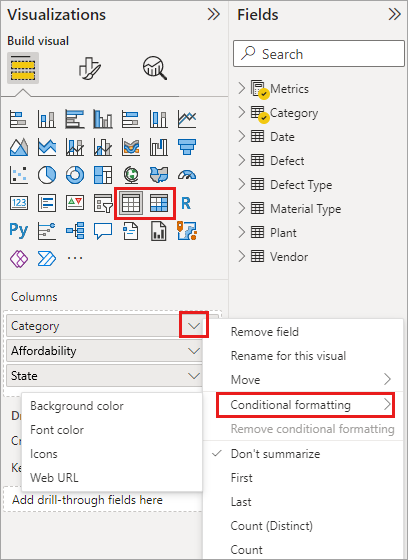
For Tables and Matrixes
- Setting Up Conditional Formatting:
- In Power BI Desktop or the Power BI service, select a Table or Matrix visualization.
- In the Visualizations pane, right-click or select the down-arrow next to the field in the Values well that you wish to format.
- Select Conditional formatting, and then choose the type of formatting to apply https://learn.microsoft.com/en-us/power-bi/create-reports/desktop-conditional-table-formatting .
- Customization Capabilities:
- Specify customized cell colors, including color gradients, based on field values.
- Represent cell values with data bars, KPI icons, or as active web links.
- Apply conditional formatting to any text or data field, based on numeric values, color names or hex codes, or web URLs https://learn.microsoft.com/en-us/power-bi/create-reports/desktop-conditional-table-formatting .
- Overriding Custom Colors:
- Note that conditional formatting will override any custom background or font color applied to the conditionally formatted cell https://learn.microsoft.com/en-us/power-bi/create-reports/desktop-conditional-table-formatting .
- Removing Conditional Formatting:
- To remove conditional formatting, select Remove conditional formatting from the field’s drop-down menu, and choose the type of formatting to remove https://learn.microsoft.com/en-us/power-bi/create-reports/desktop-conditional-table-formatting .
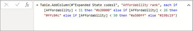
Using Formulas for Conditional Formatting
- Creating Calculations:
- Create a calculation that outputs different values based on selected business logic conditions.
- This method can be faster than creating multiple rules in the conditional formatting dialog https://learn.microsoft.com/en-us/power-bi/create-reports/desktop-conditional-table-formatting .
- Applying Colors Based on Calculations:
- For example, apply hex color values to a new column based on values from an existing column.
- Select Background color or Font color conditional formatting for the column, and base the formatting on the Field value of the calculated column https://learn.microsoft.com/en-us/power-bi/create-reports/desktop-conditional-table-formatting .
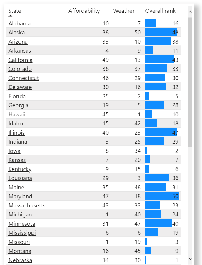
Conditional Formatting for Totals and Subtotals
- Applying Rules to Totals/Subtotals:
- Conditional formatting rules can be applied to totals and subtotals in both table and matrix visuals.
- Use the Apply to drop-down in conditional formatting to set this up https://learn.microsoft.com/en-us/power-bi/create-reports/desktop-conditional-table-formatting .
- Setting Thresholds and Ranges:
- Manually set the thresholds and ranges for conditional formatting rules.
- For matrices, Values will refer to the lowest visible level of the matrix hierarchy https://learn.microsoft.com/en-us/power-bi/create-reports/desktop-conditional-table-formatting .
Active Web Links
- Creating Active Links:
- If you have a column or measure with website URLs, use conditional formatting to apply those URLs as active links.
- Select Conditional formatting for the field, then select Web URL.
- In the dialog box, choose the field that contains the URLs to base the formatting on https://learn.microsoft.com/en-us/power-bi/create-reports/desktop-conditional-table-formatting .
- Displaying Live Links:
- With Web URL formatting, each applicable field can become an active link to the specified website https://learn.microsoft.com/en-us/power-bi/create-reports/desktop-conditional-table-formatting .
For additional information and visual guides on how to apply conditional formatting in Power BI, you can refer to the following resources:
- Power BI Matrix Visuals - Conditional Formatting https://learn.microsoft.com/en-us/power-bi/create-reports/../visuals/desktop-matrix-visual .
- Power BI Desktop - Conditional Formatting for Tables https://learn.microsoft.com/en-us/power-bi/create-reports/desktop-conditional-table-formatting .
- Power BI - Conditional Formatting with Calculations https://learn.microsoft.com/en-us/power-bi/create-reports/desktop-conditional-table-formatting .
- Power BI - Applying Conditional Formatting to Totals and Subtotals https://learn.microsoft.com/en-us/power-bi/create-reports/desktop-conditional-table-formatting .
- Power BI - Active Web Links in Conditional Formatting https://learn.microsoft.com/en-us/power-bi/create-reports/desktop-conditional-table-formatting .
By following these steps and utilizing the resources provided, you can effectively configure conditional formatting in Power BI to create more dynamic and insightful reports.
DIAD Introduction to Power BI
Visualizations
Apply Slicing and Filtering
Slicing and filtering are essential techniques in data visualization that allow users to refine and segment their data within reports to focus on specific information. These techniques are particularly useful in Power BI for creating interactive and dynamic reports.
Slicing
Slicing is the process of segmenting data into smaller, more focused parts. In Power BI, slicers are visual tools that let you filter the data displayed in other visuals on your report page. When you apply a slicer, you choose a subset of data to display, such as a particular time period, geographic location, or category. Slicers provide a quick way to make selections and see the data that matters to you.
Filtering
Filtering is similar to slicing but can be applied in different scopes:
- Visual-level filters affect only the specific visual you are working on.
- Page-level filters apply to all the visuals on a single report page.
- Report-level filters apply to all the visuals across multiple pages within a report.
Filters can be based on specific values, ranges, or conditions, and they can be used to include or exclude data points from your analysis.
How to Apply Slicing and Filtering in Power BI
- Using Slicers:
- Drag a field into the slicer visual.
- Adjust the slicer settings to display in a list, dropdown, or other formats.
- Select the values in the slicer to view the corresponding data in the report.
- Applying Filters:
- Select a visual and then use the Filters pane to add a filter.
- Choose the field you want to filter by and select the values or range.
- Apply the filter to the visual, page, or report level as needed.
Best Practices
- Use slicers for common fields that users would frequently want to interact with, such as dates or categories.
- Apply filters to remove unnecessary or irrelevant data points to make visuals more meaningful.
- Remember that filtering and slicing do not affect the underlying data; they only change the view of the data in the report https://learn.microsoft.com/en-us/power-bi/consumer/end-user-reports .
For additional information on how to effectively apply slicing and filtering in Power BI, you can refer to the following resources:
These resources provide guidance on interacting with reports, using slicers and filters, and ensuring that your reports are accessible to all users.
DIAD Introduction to Power BI
Visualizations
Configure the Report Page
When configuring a report page in Power BI, there are several key considerations to ensure that the report is both functional and visually appealing. Below are the steps and options available for configuring a report page:
Page Refresh Settings: For reports published to the Power BI service, you can set up automatic page refresh if the data source is DirectQuery. This allows the report to refresh data at specified intervals automatically. The configuration options include turning the page refresh on or off, selecting the refresh type, and providing inputs and information depending on the chosen refresh type. Note that when publishing a report with automatic page refresh from Power BI Desktop to the service, credentials for the DirectQuery data source must be provided in the semantic model settings menu https://learn.microsoft.com/en-us/power-bi/create-reports/desktop-automatic-page-refresh .
Mobile Layout Configuration: When embedding a Power BI report, it’s important to consider the mobile layout. After the initial report load, changing to a mobile layout is supported only if the mobile layout has been set in the initial embedding configuration object. If a report page does not have a MobilePortrait layout, it will default to the MobileLandscape layout. To navigate between pages in mobile layouts,
report.setPagecan be used to implement custom navigation https://learn.microsoft.com/en-us/javascript/api/overview/powerbi/mobile .Lock Pages in Memory: If there are issues rendering a Power BI report, assigning the “Lock pages in memory” privilege to the service account running Power BI Report Server may resolve the problem. This configuration helps in managing the memory allocation for the service, which can be crucial for report rendering https://learn.microsoft.com/en-us/power-bi/troubleshoot/../report-server/scheduled-refresh-troubleshoot .
Intune Configuration: Before users can use the Power BI app on their devices, an Intune admin must add the app to Intune and assign it to users. It’s important to note that after configuring Intune, background data refresh is turned off for the Power BI mobile app. The data will refresh from the Power BI service on the web when the app is opened https://learn.microsoft.com/en-us/power-bi/admin/service-admin-mobile-intune .
Paginated Reports: For large Power BI paginated reports, it is essential to configure them to support pagination. Page breaks are enabled by default and should not be disabled for large reports. The initial rendering format opens a report in a browser, and if the report isn’t paginated, all data is included on a single page, which can be overwhelming for browsers. Report size is determined by the row set from the query and the rendering extension used https://learn.microsoft.com/en-us/power-bi/create-reports/../paginated-reports/report-design/process-large-reports .
For additional information on these topics, you can refer to the following URLs: - Automatic page refresh in Power BI service: DirectQuery https://learn.microsoft.com/en-us/power-bi/create-reports/desktop-automatic-page-refresh . - Mobile layout and navigation in Power BI reports: Page navigation https://learn.microsoft.com/en-us/javascript/api/overview/powerbi/mobile . - Lock pages in memory for Power BI Report Server: Windows privileges assigned to the Analysis Services service account https://learn.microsoft.com/en-us/power-bi/troubleshoot/../report-server/scheduled-refresh-troubleshoot . - Intune and Power BI mobile app configuration: What is Intune? https://learn.microsoft.com/en-us/power-bi/admin/service-admin-mobile-intune . - Handling large paginated reports in Power BI: Paginated reports https://learn.microsoft.com/en-us/power-bi/create-reports/../paginated-reports/report-design/process-large-reports .
By following these guidelines and utilizing the provided resources, you can effectively configure your Power BI report pages to meet various requirements and ensure optimal performance across different platforms and devices.
DIAD Introduction to Power BI
Visualizations
Choosing When to Use a Paginated Report
Paginated reports are ideal for scenarios where a highly formatted, pixel-perfect output is required, often for operational reporting or printing purposes. These reports are called “paginated” because they are formatted to fit well on a page. They can be printed or shared as PDFs without losing the layout or formatting. Here are some key considerations for choosing to use a paginated report:
Print-Ready Reports: If the end goal is to have a report that is optimized for printing, such as invoices, sales reports, or summary reports, paginated reports are the best choice. They maintain the formatting, headers, and footers on each page https://learn.microsoft.com/en-us/power-bi/create-reports/../paginated-reports/paginated-reports-samples .
Document Map and Parameters: Paginated reports allow the use of document maps for easy navigation and parameters for interactive filtering, which can be used to tailor the report content to the needs of different users https://learn.microsoft.com/en-us/power-bi/create-reports/../paginated-reports/subreports-troubleshoot .
Fixed Layout: When you need to ensure that the content layout does not change regardless of the screen size or device, paginated reports provide a consistent view. This is particularly important for legal or financial documents where precision is key https://learn.microsoft.com/en-us/power-bi/consumer/end-user-paginated-report .
Advanced Formatting: Paginated reports support advanced formatting options. You can control the report layout down to the pixel, which is not possible with other types of reports. This includes the placement of report items such as text boxes, lines, rectangles, and charts https://learn.microsoft.com/en-us/power-bi/create-reports/../paginated-reports/paginated-reports-samples .
Data-Driven Subscription: If you need to distribute your reports via email or need to generate reports based on a schedule, paginated reports can be configured with data-driven subscriptions to automate the delivery process https://learn.microsoft.com/en-us/power-bi/consumer/end-user-paginated-report .
Large Datasets: Paginated reports are capable of handling large datasets efficiently. They can manage and render reports with a large number of pages without performance issues https://learn.microsoft.com/en-us/power-bi/create-reports/../paginated-reports/subreports-troubleshoot .
For additional information on paginated reports, you can refer to the following resources:
- Subreports in Power BI paginated reports
- Bar Charts (Power BI Report Builder)
- Sample paginated reports
These resources provide further insights into the capabilities and features of paginated reports, helping you to make an informed decision on when to use them in your reporting solutions.
DIAD Introduction to Power BI
Visualizations
Configure Navigation for a Power BI Report
When configuring navigation for a Power BI report, it is essential to ensure that users can easily access and interact with the different elements of the report. Here are the steps and considerations for setting up navigation in a Power BI report:
Accessing the Power BI Service: Begin by opening the Power BI service at
app.powerbi.comand navigate to the workspace where your report is located https://learn.microsoft.com/en-us/power-bi/consumer/../natural-language/end-user-q-and-a-tutorial https://learn.microsoft.com/en-us/power-bi/create-reports/sample-tutorial-connect-to-the-samples .Using the Configuration Object: Utilize a configuration object to store settings related to your Power BI report. This object is then passed to the Power BI Client APIs when embedding the report into your application. The configuration object allows you to customize the report’s appearance and behavior https://learn.microsoft.com/en-us/javascript/api/overview/powerbi/configure-report-settings .
Customizing Report Settings: Within the configuration object, you can adjust various settings to tailor the navigation experience. These settings include:
- Filter Visibility: Control whether filters are visible to the users and how they interact with them.
- Navigation Access: Determine the level of access users have to navigate through different pages or views within the report.
- Location Settings: Specify the location within your application where the report will be embedded https://learn.microsoft.com/en-us/javascript/api/overview/powerbi/configure-report-settings .
Embedding Power BI Content: After configuring the report settings, you can proceed to embed the Power BI content into your application using the Power BI Client APIs. This involves providing the API with the necessary information about the report, including the configuration object https://learn.microsoft.com/en-us/javascript/api/overview/powerbi/configure-report-settings .
Updating the Workspace and App: If you are working with a template app and make changes to the workspace, remember to update the app to apply these changes. This ensures that the navigation and other configurations are reflected for all users of the organizational app https://learn.microsoft.com/en-us/power-bi/connect-data/service-template-apps-install-distribute .
For additional information on configuring and embedding Power BI reports, you can refer to the following URLs: - Power BI Client APIs documentation: Embedding with Power BI Client APIs - Power BI service: Power BI Service
By following these steps, you can effectively configure the navigation for a Power BI report, enhancing the user experience and ensuring that the report is seamlessly integrated into your application.
DIAD Introduction to Power BI
Visualizations
Apply Sorting
When working with data in reports, it is essential to understand how sorting affects the presentation of information. Sorting determines the order in which data appears in a report and can significantly impact the readability and analysis of the data.
In the context of report rendering, especially when dealing with Word formats, it is important to note that the report contents are rendered based on their current sorted state within the report data region. Word itself does not support interactive sorting, which means that once the report is rendered, the data will remain in the sorted order that was specified at the time of rendering. However, after rendering, you can manually apply table sorting within Word to rearrange the data as needed https://learn.microsoft.com/en-us/power-bi/create-reports/../paginated-reports/report-builder/export-microsoft-word-report-builder .
For visualizations such as charts, categories are displayed along the x-axis in the order they appear in the result set. To change the order of groups, you can add a SORT command to the query or sort the dataset using an expression. It’s worth noting that chart data regions are sorted in the same manner as all other data regions https://learn.microsoft.com/en-us/power-bi/create-reports/../paginated-reports/report-design/visualizations/format-axis-labels-chart-report-builder .
In Power BI, when connecting to multidimensional models, sorting can also be influenced by the model’s structure. For instance, Power BI applies specific rules to data processing based on which column is defined as the default member. The DefaultMember property value for an attribute hierarchy is set in the Conceptual Schema Definition Language (CSDL) for a particular column in a multidimensional model. When a Data Analysis Expressions (DAX) query is executed, the default member specified in the model is applied automatically, which can affect the sorting and presentation of data in the report https://learn.microsoft.com/en-us/power-bi/connect-data/desktop-default-member-multidimensional-models .
For additional information on how to apply sorting within reports and data regions in Power BI, you can refer to the following resources: - Sort Data in a Data Region (Power BI Report Builder) https://learn.microsoft.com/en-us/power-bi/create-reports/../paginated-reports/report-design/visualizations/format-axis-labels-chart-report-builder . - Attribute properties - Define a default member https://learn.microsoft.com/en-us/power-bi/connect-data/desktop-default-member-multidimensional-models .
Understanding and applying sorting correctly is crucial for creating meaningful and insightful reports that can aid in data analysis and decision-making processes.
DIAD Introduction to Power BI
Visualizations
Configure Sync Slicers in Power BI
Synchronizing slicers in Power BI allows you to maintain consistent filter contexts across multiple pages of a report. This feature is particularly useful when you want to apply the same filter to different pages without having to manually adjust each slicer. Here’s how to configure sync slicers:
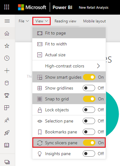
Access Sync Slicers Pane: In Power BI Desktop, go to the View ribbon and select Sync slicers. The Sync slicers pane will appear between the Filters and Visualizations panes https://learn.microsoft.com/en-us/power-bi/create-reports/../visuals/power-bi-visualization-slicers .
Select Slicer to Sync: On the page with the slicer you wish to sync, such as the District Manager slicer, select it to activate the Sync slicers pane https://learn.microsoft.com/en-us/power-bi/create-reports/../visuals/power-bi-visualization-slicers .
Choose Pages for Synchronization: In the Sync slicers pane, check the pages you want to sync under the Sync column. For example, you can select the Overview, District Monthly Sales, and New Stores pages to sync the District Manager slicer across these pages https://learn.microsoft.com/en-us/power-bi/create-reports/../visuals/power-bi-visualization-slicers .
Visibility of Slicers: Decide which pages will display the synced slicer by checking the appropriate pages under the Visible column in the Sync slicers pane. This will make the slicer visible on the selected pages https://learn.microsoft.com/en-us/power-bi/create-reports/../visuals/power-bi-visualization-slicers .
Syncing Separate Slicers: To sync two or more separate slicers, mark them as part of a group in the Sync slicers pane by expanding Advanced options and entering a group name. Ensure that all slicers in the group have the same group name entered https://learn.microsoft.com/en-us/power-bi/create-reports/../visuals/power-bi-visualization-slicers .
Sync Options: Choose whether to sync filter changes, field changes, or both between the slicers in the group. Select Sync filter changes to other slicers to keep filters in sync, and Sync field changes to other slicers to ensure field changes on the slicers are synced across the group https://learn.microsoft.com/en-us/power-bi/create-reports/../visuals/power-bi-visualization-slicers .
Testing Slicer Sync: After configuring, test the synchronization by changing the selection in one slicer and observing if the change is reflected in the other slicers within the group https://learn.microsoft.com/en-us/power-bi/create-reports/../visuals/power-bi-visualization-slicers .
Adjusting Synced Slicers: Although synced slicers initially appear at the same size and position as on the original page, you can independently move, resize, and format them on the various pages https://learn.microsoft.com/en-us/power-bi/create-reports/../visuals/power-bi-visualization-slicers .
For additional information on configuring sync slicers in Power BI, you can refer to the following resources: - Power BI Desktop: Sync slicers across multiple pages of a report https://learn.microsoft.com/en-us/power-bi/fundamentals/desktop-latest-update-archive . - Power BI Service: Sync slicers pane https://learn.microsoft.com/en-us/power-bi/create-reports/../visuals/power-bi-visualization-slicers .
Remember, the ability to sync slicers is a powerful feature that can enhance the interactivity and consistency of your Power BI reports. By following these steps, you can ensure that your report viewers have a seamless experience when interacting with slicers across different report pages.
DIAD Introduction to Power BI
Publishing and accessing Reports
Configure and Update a Workspace App
When configuring and updating a workspace app in Power BI, there are several key steps and considerations to ensure that the app reflects the most recent and relevant content for your organization.
Create and Configure a Workspace: Before you can create an app, you must have a workspace configured. This involves assigning appropriate roles to team members and setting up the workspace with the necessary dashboards, reports, and datasets https://learn.microsoft.com/en-us/credentials/certifications/resources/study-guides/pl-300 .
Publish, Import, or Update Assets in a Workspace: Once your workspace is configured, you can publish new content or import existing assets. It’s important to keep these assets up-to-date to ensure that your app contains the latest information https://learn.microsoft.com/en-us/credentials/certifications/resources/study-guides/pl-300 .
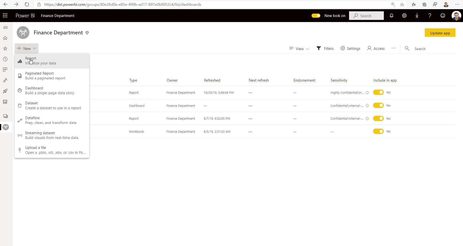
Update the Workspace App: After updating the workspace, you need to update the app to apply changes from the workspace to the app. This ensures that the app users see the latest content https://learn.microsoft.com/en-us/power-bi/connect-data/service-template-apps-install-distribute .
Overwriting Updates: When you update the workspace, it overwrites the reports, dashboards, and semantic model in the workspace, not the app itself. The app’s navigation, setup, and permissions remain unchanged unless you also update the app https://learn.microsoft.com/en-us/power-bi/connect-data/service-template-apps-install-distribute .
Sample Data During Refresh: After updating and overwriting, an automatic semantic model refresh starts. During this refresh, the app, reports, and dashboards will present sample data until the refresh is complete https://learn.microsoft.com/en-us/power-bi/connect-data/service-template-apps-install-distribute .
Permissions for Updating the App: By default, only workspace Admins and Members can create, publish, and update the app. However, the “Allow contributors to update the app for this workspace” setting enables workspace Admins to delegate the ability to update the app to users with the Contributor role https://learn.microsoft.com/en-us/power-bi/collaborate-share/service-create-the-new-workspaces .
Contributor Role Limitations: Contributors can update app metadata, add or remove items, and change item visibility. However, they cannot create or publish the app for the first time, manage user access, or enable/disable automatic installation for app users https://learn.microsoft.com/en-us/power-bi/collaborate-share/service-create-the-new-workspaces .
For additional information on creating and publishing apps from workspaces, you can refer to the following URL: Publishing Apps from Workspaces https://learn.microsoft.com/en-us/power-bi/collaborate-share/service-create-the-new-workspaces .
For more details on the different roles in workspaces and their permissions, the following URL provides a comprehensive guide: Roles in Workspaces https://learn.microsoft.com/en-us/power-bi/collaborate-share/service-create-the-new-workspaces .
Please note that the above steps are based on the functionalities available as of the last update and may be subject to change. Always refer to the latest Power BI documentation for the most current information.
DIAD Introduction to Power BI
Publishing and accessing Reports
Publish, Import, or Update Assets in a Workspace
When working with Power BI, a workspace acts as a container for dashboards, reports, datasets, and dataflows. It’s essential to understand how to manage these assets effectively. Here’s a detailed explanation of how to publish, import, or update assets in a Power BI workspace:
Publishing Assets
To publish assets to a Power BI workspace, you can use Power BI
Desktop to create reports and then publish them directly to your
workspace. When you publish a .pbix file to the Power BI
service from Power BI Desktop, the file’s label is applied to both the
report and the semantic model created in the service https://learn.microsoft.com/en-us/power-bi/admin/service-security-apply-data-sensitivity-labels
.
Importing Assets
Importing assets into a Power BI workspace can be done in several
ways. You can upload a .pbix file directly to the Power BI
service via the OneLake data hub. If the .pbix file you’re
uploading replaces existing assets, you’ll be prompted to choose whether
to keep the existing labels on the assets or have the .pbix
file’s label overwrite them https://learn.microsoft.com/en-us/power-bi/admin/service-security-apply-data-sensitivity-labels
.
Updating Assets
Updating assets in a workspace can involve several actions, such as
re-publishing a .pbix file with new data or changes to the
report. If the .pbix file is unlabeled, the labels in the
service are retained. When downloading a .pbix file from
the Power BI service, if both the report and semantic model have labels
and they are different, the more restrictive label is applied to the
.pbix file https://learn.microsoft.com/en-us/power-bi/admin/service-security-apply-data-sensitivity-labels
.
For additional information on managing workspaces and assets, you can refer to the following URLs: - Workspace modification and scanning: workspaces/modified - Workspace information retrieval: workspaces/getInfo - Scan status checking: workspaces/scanStatus/{scan_id} - Scan result retrieval: workspaces/scanResult/{scan_id}
Remember, when managing assets in a workspace, it’s crucial to maintain the integrity and security of the data by appropriately applying sensitivity labels and managing access through workspace roles https://learn.microsoft.com/en-us/credentials/certifications/resources/study-guides/pl-300 .
DIAD Introduction to Power BI
Building a Dashboard and Sharing
Create Dashboards in Power BI
Creating dashboards in Power BI involves several steps that allow business users and designers to effectively present and share data insights. Dashboards are a collection of visuals that provide an at-a-glance view of key metrics and trends. Below is a detailed explanation of how to create dashboards in Power BI:
Access Power BI Service: To start creating a dashboard, you need to access the Power BI service, which requires a Pro or Premium license https://learn.microsoft.com/en-us/power-bi/create-reports/../consumer/end-user-insight-types .
Understand Insights: Power BI provides a feature called Insights that automatically finds trends and patterns in your data. These insights are presented as visuals on dashboards and in reports https://learn.microsoft.com/en-us/power-bi/create-reports/../consumer/end-user-insight-types . To learn how to use Insights, you can visit View data insights on dashboard tiles with Power BI https://learn.microsoft.com/en-us/power-bi/create-reports/../consumer/end-user-insight-types .
Explore Dashboard Tiles: Each visual tile on your dashboard acts as a gateway to deeper data exploration. Selecting a tile can open a report or Q&A session, allowing you to filter and delve into the data https://learn.microsoft.com/en-us/power-bi/create-reports/../consumer/end-user-insights . For more information, see Dashboard tiles in Power BI https://learn.microsoft.com/en-us/power-bi/create-reports/../consumer/end-user-insights .
Use Q&A Feature: The Q&A feature is available on dashboards and enables natural language queries to interact with your data. If you have edit permissions, you can save the visual by pinning it to your dashboard https://learn.microsoft.com/en-us/power-bi/consumer/end-user-q-and-a . To learn more about using Q&A, visit Use Q&A on a dashboard https://learn.microsoft.com/en-us/power-bi/consumer/end-user-q-and-a .
Understand Semantic Models: A semantic model is a collection of data that designers use to build reports and dashboards. As a business user, you may not interact directly with semantic models, but it’s important to understand how they are the foundation of the dashboards and reports you use https://learn.microsoft.com/en-us/power-bi/consumer/end-user-basic-concepts . For further reading on semantic models, you can check out How do designers assign permissions to semantic models and How semantic models are shared with colleagues https://learn.microsoft.com/en-us/power-bi/consumer/end-user-basic-concepts .
Inherit Sensitivity Labels: When creating new reports and dashboards, they inherit the sensitivity label from the parent semantic model or report. This ensures that the data classification remains consistent across your organization’s content https://learn.microsoft.com/en-us/power-bi/enterprise/service-security-sensitivity-label-overview . For an illustration of how sensitivity labels are inherited, see Inheritance of sensitivity labels in Power BI https://learn.microsoft.com/en-us/power-bi/enterprise/service-security-sensitivity-label-overview .
By following these steps and utilizing the resources provided, you can create informative and interactive dashboards in Power BI that help in making data-driven decisions.
DIAD Introduction to Power BI
Building a Dashboard and Sharing
Sharing Reports and Dashboards in Power BI
Sharing reports and dashboards is a fundamental aspect of collaboration in Power BI. It allows users to distribute their analytical insights with colleagues within and outside their organization. Here’s a detailed explanation of how to share reports and dashboards in Power BI:
Sharing within Power BI Service
- Direct Sharing:
- To share a report or dashboard, open the item in the Power BI service and select the Share button.
- You can share with individuals by entering their email addresses or with entire groups.
- Recipients can view and interact with the shared content. If granted permission, they can also edit, make a copy, and further share it with their coworkers.
- Shared content reflects the same data the sharer sees, unless row-level security (RLS) is applied to restrict data access.
- Sharing with People Outside Your Organization:
- External sharing is possible, but external users can only view and interact with the dashboard; they cannot share it further.
- It’s important to note that both the sharer and the recipient need a Power BI Pro license, or the content must be in a workspace within a Premium capacity.
- Managing Permissions:
- Once access is granted, it can be managed through the Power BI service. However, clearing the permission to access does not revoke access for users who have already been granted it.
- To remove access, you must manage permissions to the specific dashboard or report.
- Sharing Methods:
- Reports can be shared via links that give access or by granting users direct access.
- Dashboards can be shared by granting direct access but not via links.
Additional Sharing Features
- Workspaces: Create collaborative spaces where colleagues can work together on reports and dashboards.
- Apps: Bundle reports and dashboards into apps for easy distribution.
- Semantic Models: Share the underlying semantic models to enable others to build their own reports.
Licensing Requirements
- A Power BI Pro license is required for both the sharer and the recipient to share and interact with the content.
- Alternatively, the content should be hosted in a workspace that is part of a Premium capacity.
URLs for Additional Information
- To learn more about sharing reports and dashboards, visit Share Power BI reports and dashboards with coworkers and others.
- For managing permissions, refer to Manage permissions to a dashboard and Manage permissions to a report.
- Explore different ways to collaborate and share in Power BI by reading Ways to collaborate and share in Power BI.
By understanding and utilizing these sharing features, users can effectively distribute their insights and collaborate on data-driven decision-making within Power BI https://learn.microsoft.com/en-us/power-bi/consumer/end-user-app-view https://learn.microsoft.com/en-us/power-bi/troubleshoot/../collaborate-share/service-troubleshoot-subscribe https://learn.microsoft.com/en-us/power-bi/collaborate-share/service-how-to-collaborate-distribute-dashboards-reports https://learn.microsoft.com/en-us/power-bi/collaborate-share/service-share-dashboards https://learn.microsoft.com/en-us/power-bi/fundamentals/power-bi-service-overview .
DIAD Introduction to Power BI
Building a Dashboard and Sharing
Sharing Reports and Dashboards in Power BI
In Power BI, sharing reports and dashboards is a fundamental feature that allows users to distribute their analytical insights with colleagues and stakeholders. This capability is central to collaborative analytics and decision-making processes. Here’s a detailed explanation of how to share reports and dashboards in Power BI:
Sharing within Power BI Service
- Direct Sharing:
- To share a report or dashboard, open the item within the Power BI service and click on the Share button.
- You can share with individuals inside or outside your organization, allowing them to view and interact with the content.
- Recipients with the appropriate permissions can edit, make a copy, and even reshare the report or dashboard with others.
- It’s important to note that sharing directly grants access to all the data in the underlying semantic model, unless row-level security (RLS) is applied.
- Sharing via Links:
- Reports can be shared using links that give access, which can be sent through email or embedded in applications like Microsoft Teams.
- Dashboards, however, cannot be shared via links but can be shared by granting direct access to users.
- Permissions and Licensing:
- A Power BI Pro license is required for both the sharer and the recipients to share content.
- Alternatively, the content needs to be in a workspace within a Premium capacity.
- If you share content with external users, they can view and interact with it but cannot reshare it.
- Managing Access:
- Once access is granted, it can be managed and revoked through the Power BI service.
- Clearing the Permission to access the report/dashboard option does not revoke access for users who have already been granted it.
- To remove access, you must manage permissions individually for each dashboard or report.
- Collaboration Workspaces:
- Users can collaborate on reports and dashboards by creating workspaces.
- These workspaces serve as a shared environment where teams can work together on analytics content.
- Content can be bundled and distributed as apps, and semantic models can be shared for others to use as a basis for their reports.
Additional Resources
For more detailed instructions and information on sharing reports and dashboards in Power BI, refer to the following resources:
- Share Power BI reports and dashboards with coworkers and others
- Manage permissions to a dashboard
- Manage permissions to a report
- Ways to collaborate and share in Power BI
- Working with content shared with you
By understanding and utilizing these sharing features, users can effectively disseminate their Power BI reports and dashboards, fostering a collaborative environment for data-driven insights and actions.