PL-300 Study Guide

Prepare the data (25–30%)
Get data from data sources
Identify and Connect to a Data Source
When working with Power BI, one of the initial steps is to identify and connect to a data source. This process involves several key actions:
Identifying the Data Source: Determine the type of data source you need to connect to. This could be a database, a spreadsheet, a web service, or any other data provider.
Connecting to the Data Source: Use Power BI Desktop to establish a connection to your chosen data source. This is done through the ‘Get Data’ experience where you can select your data source from a wide range of options.
Data Source Settings: After connecting, you may need to adjust the data source settings. This includes configuring credentials to access the data source, setting privacy levels, and specifying the data source location.
Selecting a Dataset: You have the option to either select a shared dataset that is already available or create a local dataset within your Power BI environment.
Choosing the Connection Mode: Decide between DirectQuery, Import, or Dual mode based on your data and reporting needs. DirectQuery allows you to work with large datasets without the need to import all data into Power BI, while Import mode brings the data into Power BI. Dual mode offers the flexibility of both methods.
Parameter Value Changes: If your data source connection relies on parameters, you may need to change the value in a parameter to ensure the data is accurate and up-to-date.
For additional information on connecting to data sources in Power BI, you can refer to the following resources:
- For general information on data sources in Power BI and how to connect to them, visit Power BI data sources.
- To understand the limitations when using R scripts in Power Query Editor and how to set data source settings to Public, see the details provided here.
- For guidance on configuring scheduled refresh and troubleshooting connectivity issues, the how-to guide Configuring scheduled refresh can be helpful.
- To identify performance issues with your data sources, the Performance Analyzer tool in Power BI Desktop can be utilized.
- If you are unsure about the data source used, follow the steps outlined here to find the information within Power BI Desktop.
By following these steps and utilizing the provided resources, you can effectively identify and connect to a data source in Power BI, setting the foundation for your data analysis and reporting tasks https://learn.microsoft.com/en-us/credentials/certifications/resources/study-guides/pl-300 https://learn.microsoft.com/en-us/power-bi/create-reports/../connect-data/desktop-r-in-query-editor https://learn.microsoft.com/en-us/power-bi/connect-data/refresh-data https://learn.microsoft.com/en-us/power-bi/connect-data/desktop-directquery-troubleshoot https://learn.microsoft.com/en-us/power-bi/connect-data/service-admin-troubleshoot-unsupported-data-source-for-refresh .
Prepare the data (25–30%)
Get data from data sources
Changing Data Source Settings in Power BI
When working with Power BI, it’s essential to understand how to manage data source settings effectively. This includes changing credentials, privacy levels, and data source locations to ensure that your reports and dashboards are up-to-date and secure.
Changing Credentials
To maintain data security and integrity, it’s crucial to manage the credentials used to access your data sources. If you need to update the credentials for a dataset in Power BI, follow these steps:
- In the Power BI service, navigate to the dataset’s refresh settings.
- Go to “Manage Data Sources.”
- For any data source displaying an error, select “Edit credentials.”
- Sign in with the new credentials for the data source https://learn.microsoft.com/en-us/power-bi/connect-data/service-admin-troubleshooting-power-bi-personal-gateway .
Privacy Levels
Privacy levels in Power BI control how data is combined during a scheduled refresh. They are crucial for maintaining data privacy when dealing with sensitive information. To configure the privacy level for a data source:
- In the Power BI service, find the dataset for which you want to configure privacy settings.
- Access the data source settings and locate the privacy level configuration.
- Choose the appropriate privacy level that aligns with your data security requirements https://learn.microsoft.com/en-us/power-bi/connect-data/service-gateway-enterprise-manage-sap .
For more information on setting privacy levels, you can refer to the Power Query documentation on privacy levels: Set privacy levels (Power Query) https://learn.microsoft.com/en-us/power-bi/connect-data/service-gateway-enterprise-manage-sap .
Data Source Locations
Changing the data source location involves updating where Power BI looks for the data it needs to refresh reports and dashboards. This might be necessary if the data has moved to a new server or if you’re switching from a local server to a cloud service. To change the data source location:
- Identify the dataset you want to update in the Power BI service.
- Access the dataset settings and navigate to the data source settings.
- Update the data source location with the new path or connection string https://learn.microsoft.com/en-us/credentials/certifications/resources/study-guides/pl-300 .
Selecting Data Connectivity Mode
Power BI offers different data connectivity modes: DirectQuery, Import, and Dual. Each mode has its use cases and implications for data source settings:
- DirectQuery: No data is imported or copied into Power BI. Instead, queries are sent directly to the data source. This mode is suitable for large datasets or when real-time data is required. Note that privacy levels do not apply to DirectQuery https://learn.microsoft.com/en-us/power-bi/connect-data/service-gateway-enterprise-manage-sap .
- Import: Data is imported into Power BI, allowing for faster report interactions. This mode is suitable when working with static or slow-changing data.
- Dual: Combines both DirectQuery and Import modes, allowing for a balance between performance and real-time data https://learn.microsoft.com/en-us/credentials/certifications/resources/study-guides/pl-300 .
When configuring these settings, it’s important to consider the data source’s capabilities, the size of the data, and the refresh requirements of your reports.
By understanding and managing these settings, you can ensure that your Power BI reports are secure, efficient, and reliable.
Prepare the data (25–30%)
Get data from data sources
Selecting a Shared Dataset or Creating a Local Dataset
When working with Power BI, you have the option to either select a shared dataset or create a local dataset. Here’s a detailed explanation of both options:
Selecting a Shared Dataset
A shared dataset is a reusable dataset published on the Power BI service. It allows users to create multiple reports from the same dataset without the need to duplicate the data. To use a shared dataset:
- Identify the shared dataset you want to use within the Power BI service.
- Ensure you have the necessary permissions to access the dataset. Typically, you need Read permission assigned at the dataset level.
- Connect to the shared dataset from Power BI Desktop or Power BI Report Builder.
Shared datasets follow specific rules, especially when it comes to paginated reports and row-level security (RLS). For instance, if you are using a paginated report that connects to a Power BI semantic model, you need to ensure that RLS is enabled and enforced for viewers, which also requires Read permission at the dataset level https://learn.microsoft.com/en-us/power-bi/create-reports/../paginated-reports/paginated-reports-embedded-data-source .
Creating a Local Dataset
A local dataset is created within your Power BI report and is not shared with other reports or users. To create a local dataset:
- Open Power BI Desktop or Power BI Report Builder.
- Connect to your desired data source(s), which could range from Azure SQL Database to on-premises SQL Server, among others https://learn.microsoft.com/en-us/power-bi/create-reports/../paginated-reports/paginated-reports-report-builder-power-bi .
- Import the data into your report, or use DirectQuery to maintain a live connection to the data source.
- Define the data model by creating relationships, measures, calculated columns, and hierarchies as needed.
Creating a local dataset gives you the flexibility to tailor the dataset specifically for your report. However, it is not reusable across other reports, and any changes made to the dataset are local to the report in which it was created.
For more information on data sources supported by Power BI paginated reports, you can refer to the official documentation on Supported data sources for Power BI paginated reports https://learn.microsoft.com/en-us/power-bi/create-reports/../paginated-reports/paginated-reports-report-builder-power-bi .
Additionally, if you need to share a semantic model with other users in your organization, Power BI provides a feature to share semantic models with specified permissions. More details on this can be found in the Share semantic model dialog https://learn.microsoft.com/en-us/power-bi/connect-data/service-dataset-details-page .
Remember, when selecting between a shared dataset and creating a local dataset, consider factors such as the need for data reuse, report performance, data refresh requirements, and collaboration needs.
Prepare the data (25–30%)
Get data from data sources
Choosing Between DirectQuery, Import, and Dual Mode in Power BI
When working with Power BI, understanding the differences between DirectQuery, Import, and Dual mode is crucial for optimizing the performance and efficiency of your data models. Here’s a detailed explanation of each mode and guidance on when to use them:
DirectQuery Mode
DirectQuery mode allows you to create visualizations while maintaining a live connection to the data source. This means that queries are sent directly to the data source in real-time, and the results are returned to Power BI. This mode is beneficial when you need to work with very large datasets or require up-to-the-minute data. However, it can result in slower performance if the data source is not optimized for query performance.
Import Mode
Import mode brings data into Power BI’s in-memory engine, where it is compressed and stored. This allows for very fast query performance within Power BI, as the data is readily available and doesn’t require a round trip to the data source. Import mode is ideal when working with smaller datasets or when the data does not change frequently. The limitation of this mode is that the data is static and needs to be refreshed to reflect any changes in the source.
Dual Mode
Dual mode combines the benefits of both DirectQuery and Import modes. Tables set to Dual mode can act as either cached (Import) or not cached (DirectQuery), depending on the context of the query submitted to the Power BI model https://learn.microsoft.com/en-us/power-bi/connect-data/incremental-refresh-troubleshoot . This mode is particularly useful when you have related tables and want to maintain flexibility in how data is retrieved and managed. It helps to reduce the number of limited relationships in the model and generate efficient data source queries https://learn.microsoft.com/en-us/power-bi/connect-data/incremental-refresh-troubleshoot .
When configuring an incremental refresh policy, Power BI Desktop may prompt you to switch related tables to Dual mode to ensure optimal performance https://learn.microsoft.com/en-us/power-bi/troubleshoot/../connect-data/incremental-refresh-troubleshoot . Additionally, when changing the storage mode of a table to Import, Power BI may suggest setting dimension tables to Dual to improve performance and reduce limited relationships https://learn.microsoft.com/en-us/power-bi/transform-model/desktop-storage-mode .
In Composite models, you can configure each table’s storage mode individually, choosing from Import, DirectQuery, or Dual. This allows for a mix of high query performance and the ability to retrieve near real-time data https://learn.microsoft.com/en-us/power-bi/connect-data/service-dataset-modes-understand .
Considerations for Choosing the Right Mode
- Dataset Size: Use Import for smaller datasets and DirectQuery for larger ones.
- Data Freshness: Use DirectQuery for real-time data and Import for data that doesn’t change frequently.
- Performance: Import generally offers faster performance, but DirectQuery ensures data is always current.
- Complexity: Dual mode can be more complex to manage but offers greater flexibility.
For more information on managing storage modes in Power BI Desktop, you can refer to the following resources: - Manage storage mode in Power BI Desktop https://learn.microsoft.com/en-us/power-bi/troubleshoot/../connect-data/incremental-refresh-troubleshoot . - Use composite models in Power BI Desktop https://learn.microsoft.com/en-us/power-bi/connect-data/service-dataset-modes-understand .
Remember, the choice between DirectQuery, Import, and Dual mode will depend on the specific requirements of your Power BI project, including data size, refresh frequency, and performance needs.
Prepare the data (25–30%)
Get data from data sources
Changing the Value in a Parameter
When working with Power BI paginated reports, parameters play a crucial role in customizing the data presented in the report. Parameters can be used to filter data, connect related reports, and alter the report’s presentation. To change the value in a parameter, follow these steps:
Access the Parameters Pane: Locate the Parameters button to display the Parameters pane, where you can see all the parameters available for the report https://learn.microsoft.com/en-us/power-bi/create-reports/../consumer/paginated-reports-view-parameters .
Select the Desired Parameter: Identify the parameter whose value you wish to change. This could be a date parameter, a text parameter, or any other type of parameter defined in the report.
Input New Value: For parameters like dates, you can type a new date directly into the text box, select a date from the calendar, or use the Go to today option if available. For other parameters, input the new value as required https://learn.microsoft.com/en-us/power-bi/create-reports/../consumer/paginated-reports-view-parameters .
View Report with New Parameters: After entering or changing the parameter values, click on View Report to refresh the report with the new parameters applied. If the parameters have default values, the report will run automatically on the first view with those values https://learn.microsoft.com/en-us/power-bi/create-reports/../consumer/paginated-reports-view-parameters .
Understand Parameter Behavior: Be aware that the behavior of date type parameters may differ between Power BI Report Builder and published reports in the Power BI service. For example, date formats may change based on the locale of the operating system or the format used by the host server https://learn.microsoft.com/en-us/power-bi/create-reports/../paginated-reports/paginated-localize-date-parameters .
Localize Date Parameters: If you need to localize the displayed value of date parameters, you can use DAX to add a new column to a Power BI semantic model, which allows you to localize the label of a multi-value date parameter https://learn.microsoft.com/en-us/power-bi/create-reports/../paginated-reports/paginated-localize-date-parameters .
Adjust Parameter Order: If necessary, change the order of parameters, especially when dealing with dependent parameters, to ensure a logical flow for the user. The order in which parameters appear on the report viewer toolbar is determined by their order in the Report Data pane and their location in the custom parameters pane https://learn.microsoft.com/en-us/power-bi/create-reports/../paginated-reports/parameters/change-order-report-parameter-report-builder .
For additional information on customizing parameters in Power BI paginated reports, you can refer to the following resources:
- Add, Change, or Delete Available Values for a Report Parameter (Power BI Report Builder)
- Customize the Parameters Pane in a Report (Power BI Report Builder)
By following these guidelines, you can effectively change parameter values in Power BI paginated reports to tailor the data and presentation to your specific needs.
Prepare the data (25–30%)
Transform and load the data
When working with data in Power BI, selecting the appropriate column data types is crucial for accurate data modeling and analysis. Data types determine how data is stored, displayed, and calculated within Power BI. Here’s a detailed explanation of how to select the appropriate column data types:
Numeric Data Types
Numeric data types include whole numbers, decimal numbers, and percentages. Use whole numbers for data that does not require decimals, such as IDs or counts. Decimal numbers are suitable for data involving fractions, such as prices or measurements. Percentages are used for ratios and proportions.
Date and Time Data Types
Date and time data types are essential for time-based analysis. Power BI offers several date/time data types, including Date, Time, DateTime, and DateTimeZone. It’s important to match the data type to the data’s nature. For instance, use the Date type for calendar dates and DateTime for timestamps. Be aware that Power BI’s engine uses DateTime data types, so you may need to adjust the data in Power Query Editor to ensure consistency https://learn.microsoft.com/en-us/power-bi/transform-model/desktop-relationships-understand .
Text Data Types
Text data types are used for strings of characters, such as names or addresses. Even if a column contains numbers, if they are used as identifiers (like phone numbers or zip codes), they should be set as text to prevent any unintended calculations.
Correcting Data Types
Power BI can sometimes import data with incorrect data types, especially for dates and numbers that come in as strings. This can lead to issues with sorting, filtering, and calculations. To correct this, you can use the Power Query Editor to change the data type of a column. In the Transform tab, you can select ‘Detect Data Type’ for Power BI to attempt to identify the correct data type, or you can manually set the data type from the Home tab https://learn.microsoft.com/en-us/power-bi/create-reports/desktop-dimensional-model-report https://learn.microsoft.com/en-us/power-bi/create-reports/../natural-language/q-and-a-best-practices .
Best Practices
- Verify that numeric data types are italicized in the Navigator pane to ensure they are recognized correctly https://learn.microsoft.com/en-us/power-bi/create-reports/desktop-dimensional-model-report .
- Ensure that the data types of columns in relationships are consistent to avoid unexpected behavior https://learn.microsoft.com/en-us/power-bi/transform-model/desktop-relationships-understand .
- Use the Power Query Editor to transform and clean your data before loading it into the model https://learn.microsoft.com/en-us/credentials/certifications/resources/study-guides/pl-300 https://learn.microsoft.com/en-us/power-bi/create-reports/desktop-dimensional-model-report .
For additional information on selecting and transforming data types in Power BI, you can refer to the following resources: - Power BI Desktop: Data types in Power Query - Power BI Desktop: Query Overview - Power BI Tips: Working with Data Types
By carefully selecting the appropriate column data types, you can ensure that your Power BI reports and analyses are accurate and effective.
Prepare the data (25–30%)
Transform and load the data
Create and Transform Columns in Power BI
Creating and transforming columns in Power BI are essential skills for data analysts to shape and prepare data for analysis. Here’s a detailed explanation of how to create and transform columns in Power BI:
Creating Calculated Columns
Calculated columns are created using Data Analysis Expressions (DAX), which is a formula expression language used in Power BI. These columns are computed from other columns in the table and become part of the model data.
How to Create: In Power BI Desktop, go to the Data view, select the table in which you want to create the calculated column, and then select the “New Column” button from the Modeling tab. Enter the DAX formula for the calculated column in the formula bar.
Example: If you want to create a full name column from first and last names, the DAX formula would be:
FullName = [FirstName] & " " & [LastName].Additional Resources: For step-by-step lessons on creating calculated columns, refer to the [Tutorial: Create calculated columns in Power BI Desktop] https://learn.microsoft.com/en-us/power-bi/transform-model/desktop-calculated-columns .
Learning DAX Basics
Understanding DAX is crucial for creating calculated columns and measures. DAX includes functions, operators, and values that can be used in formulas to calculate and return one or more values.
- How to Learn: Microsoft provides resources to learn the basics of DAX, which can be found at [Learn DAX basics in Power BI Desktop] https://learn.microsoft.com/en-us/power-bi/transform-model/desktop-calculated-columns .
Creating Custom Columns
Custom columns are created as part of a query in Power Query Editor. These columns can be based on data transformations or the combination of existing columns.
How to Create: In Power BI Desktop, open the Power Query Editor, select the “Add Column” tab, and use the available tools to create a custom column.
Additional Resources: To learn more about creating custom columns, see [Create custom columns] https://learn.microsoft.com/en-us/power-bi/transform-model/desktop-calculated-columns .
Using Quick Measures for Common Calculations
Quick measures allow you to apply common calculations to your data without writing DAX formulas.
How to Use: In Power BI Desktop, right-click on a field in the Fields pane, select “New quick measure,” and then choose from a variety of pre-defined calculations.
Additional Resources: For more information on quick measures, visit [Use quick measures for common calculations] https://learn.microsoft.com/en-us/power-bi/transform-model/desktop-what-if .
Creating Calculated Tables
Calculated tables are created using DAX formulas and can be used for intermediate calculations and data that you want to store in the model.
How to Create: In Power BI Desktop, go to the Modeling tab and select “New Table.” Enter the DAX formula to define the table’s contents.
Additional Resources: To learn how to create calculated tables, refer to [Create calculated tables in Power BI Desktop] https://learn.microsoft.com/en-us/power-bi/transform-model/desktop-what-if .
Transforming Columns
Power BI provides various ways to transform columns, such as pivoting, aggregating, or enriching data with AI insights.
Pivoting Columns: To pivot columns, use the Power Query Editor to transform and aggregate data based on unique values in a column. For example, to count products in each category, select the category column, then select “Transform” > “Pivot Column” https://learn.microsoft.com/en-us/power-bi/transform-model/desktop-common-query-tasks .
Enriching Data with AI Insights: Power BI’s Cognitive Services allows you to enrich data with AI capabilities. For instance, you can score the sentiment of text in a column by using the “AI Insights” button in Power Query Editor https://learn.microsoft.com/en-us/power-bi/transform-model/dataflows/dataflows-machine-learning-integration .
By mastering these techniques, you can effectively create and transform columns in Power BI to build robust data models and perform advanced data analysis.
https://learn.microsoft.com/en-us/power-bi/transform-model/desktop-calculated-columns : https://learn.microsoft.com/en-us/power-bi/transform-model/desktop-tutorial-create-calculated-columns https://learn.microsoft.com/en-us/power-bi/transform-model/desktop-what-if : https://learn.microsoft.com/en-us/power-bi/transform-model/desktop-quick-measures https://learn.microsoft.com/en-us/power-bi/transform-model/desktop-common-query-tasks : https://learn.microsoft.com/en-us/power-bi/transform-model/desktop-common-query-tasks#create-custom-columns https://learn.microsoft.com/en-us/power-bi/transform-model/dataflows/dataflows-machine-learning-integration : https://powerbi.microsoft.com/blog/introducing-power-bi-data-prep-wtih-dataflows/
Prepare the data (25–30%)
Transform and load the data
Transform a Query in Power BI Desktop
Transforming a query in Power BI Desktop involves a series of steps and tools that allow you to shape and refine your data to better suit your reporting and analysis needs. The transformation process is carried out in the Power Query Editor, which is a feature-rich environment for data preparation.
Accessing Power Query Editor
To begin transforming a query, you first need to access the Power Query Editor:
- Open Power BI Desktop.
- On the Home ribbon, in the Queries section, select Transform data.
The Power Query Editor window will appear, displaying any existing queries and allowing you to start shaping your data https://learn.microsoft.com/en-us/power-bi/fundamentals/desktop-what-is-desktop .
Common Transformation Tasks
Within the Power Query Editor, you can perform a variety of transformations, including but not limited to:
- Selecting appropriate column data types: Ensuring that each column in your data is set to the correct data type (e.g., text, number, date) is crucial for accurate analysis https://learn.microsoft.com/en-us/credentials/certifications/resources/study-guides/pl-300 .
- Creating and transforming columns: You can add new columns based on existing data, or transform existing columns by splitting them, merging them, or performing calculations.
- Renaming columns or tables: To make your data more understandable, you can rename columns or tables to reflect their content or purpose https://learn.microsoft.com/en-us/power-bi/connect-data/desktop-shape-and-combine-data .
- Removing rows or columns: Unnecessary data can be removed to streamline your dataset and focus on the relevant information.
- Setting the first row as headers: This step is often necessary when the imported data does not automatically recognize the first row as the header row https://learn.microsoft.com/en-us/power-bi/connect-data/desktop-shape-and-combine-data .
- Merging and appending queries: Combining data from multiple sources into a single query is a common task in data preparation. You can merge queries to join them on a common key or append them to stack data vertically.
Using the Ribbon for Transformations
The ribbon in Power Query Editor is organized into tabs that group related tasks:
- Home: Contains common query tasks such as refreshing data, managing columns, and accessing recent sources https://learn.microsoft.com/en-us/power-bi/transform-model/desktop-query-overview .
- Transform: Provides access to data transformation tasks like changing data types, adding or removing columns, and other data-driven tasks https://learn.microsoft.com/en-us/power-bi/transform-model/desktop-query-overview .
- Add Column: Offers tools for adding new columns, formatting data, and creating custom columns https://learn.microsoft.com/en-us/power-bi/transform-model/desktop-query-overview .
- View: Allows you to toggle the display of different panes and access the Advanced Editor https://learn.microsoft.com/en-us/power-bi/transform-model/desktop-query-overview .
Right-Click Menus
Many of the tasks available from the ribbon can also be accessed by right-clicking on a column or other data elements in the center pane. This context menu provides a quick way to perform transformations without navigating the ribbon https://learn.microsoft.com/en-us/power-bi/transform-model/desktop-query-overview https://learn.microsoft.com/en-us/power-bi/connect-data/desktop-shape-and-combine-data .
Additional Resources
For more detailed guidance on transforming data in Power BI Desktop, you can refer to the following resources:
- Power Query Overview: Power Query Editor Overview
- Tutorial on Shaping and Combining Data: Shape and Combine Data in Power BI Desktop
- Data Sources in Power BI Desktop: Power BI Desktop Data Sources
By mastering the transformation capabilities of Power Query Editor, you can ensure that your data is in the optimal format for creating insightful and impactful reports.
Prepare the data (25–30%)
Transform and load the data
Designing a Star Schema with Facts and Dimensions
When designing a star schema for use in Power BI, it is essential to understand the structure and purpose of both fact and dimension tables. A star schema is a type of data modeling that organizes data into one or more fact tables referencing any number of dimension tables. This design is conducive to performing complex analytical queries and is a foundational concept for building intuitive and high-performing Power BI models.
Fact Tables
Fact tables are the central tables in a star schema. They contain the quantitative data for analysis—typically numerical metrics, measurements, or counts. These tables hold the data that answers the “how much” or “how many” questions that arise during data analysis. Fact tables often have foreign keys that correspond to primary keys in the dimension tables, creating a relationship between the tables.
Dimension Tables
Dimension tables, on the other hand, are the descriptive elements of the schema. They provide context to the data, such as time periods, geographical locations, product details, or customer information. Dimension tables contain attributes that are typically textual fields or discrete numbers that behave like text. These attributes are used to filter, group, or label facts.
Design Principles
To design an effective star schema:
Identify Fact and Dimension Tables: Determine which tables are your fact tables, usually containing transactional data, and which are your dimension tables, containing descriptive attributes.
Create Relationships: Establish clear relationships between fact tables and dimension tables. Each fact table should be connected to one or more dimension tables, and each dimension should connect to a fact table through a primary key to foreign key relationship.
Optimize Data Types: Select appropriate column data types to ensure efficient storage and query performance. Numeric types for measures in fact tables and appropriate types for dimension attributes are crucial https://learn.microsoft.com/en-us/credentials/certifications/resources/study-guides/pl-300 .
Configure Data Loading: Decide on the data loading strategy for your queries. This could involve setting up tables in Import or Dual storage modes for dimensions and DirectQuery mode for fact tables, especially in composite models https://learn.microsoft.com/en-us/power-bi/connect-data/service-dataset-modes-understand .
Apply Star Schema Design Principles: Follow star schema design principles to produce a model comprising dimension and fact tables. This setup allows for efficient filtering and data analysis through model relationships https://learn.microsoft.com/en-us/power-bi/transform-model/desktop-relationships-understand .
For additional guidance on star schema design and its importance in Power BI, you can refer to the following resources: - Understand star schema and the importance for Power BI - Model relationships in Power BI Desktop
By adhering to these principles, you can design a star schema that enhances the analytical capabilities of your Power BI reports and dashboards, leading to more insightful data-driven decisions.
Prepare the data (25–30%)
Transform and load the data
Identifying When to Use Reference or Duplicate Queries and the Resulting Impact
When working with Power BI, you may encounter situations where you need to reuse or modify existing queries. In such cases, you can choose between creating a reference to an existing query or duplicating it. Understanding when to use each option and the implications of your choice is crucial for efficient data modeling.
Reference Queries
A reference query creates a new query that is linked to an existing one. Any transformations applied to the reference query do not affect the original query. Reference queries are useful when you want to:
- Apply different transformations or aggregations to the same base data without altering the original query.
- Create multiple reports or visualizations from the same data source with varied perspectives.
Impact of Using Reference Queries:
- Efficiency: Reference queries are memory-efficient because they do not duplicate the data. They simply point to the original query’s data.
- Maintenance: Changes to the original query automatically propagate to all its reference queries, making maintenance easier.
- Performance: Since reference queries depend on the original query, they can increase refresh times if the original query is complex or involves large datasets.
Duplicate Queries
Duplicating a query creates an independent copy of the original query. The duplicate can be modified without affecting the original query. Duplicate queries are beneficial when you need to:
- Preserve the original query’s state before applying significant transformations.
- Create a backup of the query before making changes that cannot be easily reversed.
Impact of Using Duplicate Queries:
- Data Redundancy: Duplicating queries can lead to data redundancy, which may increase the file size and impact performance.
- Independence: Each duplicate query is independent, so changes to the original query do not affect duplicates. This can be both an advantage and a disadvantage, depending on the need for consistency across queries.
- Flexibility: Duplicates offer more flexibility as they can be altered without any link to the original query.
Best Practices
- Use reference queries to save memory and maintain consistency when the same base data is needed for different purposes.
- Use duplicate queries when you need complete independence from the original query or when you are experimenting with data transformations.
For additional information on working with reference and duplicate queries in Power BI, you can refer to the official documentation on Report Embedded Datasets (Power BI Report Builder).
Please note that the choice between reference and duplicate queries should align with your data modeling requirements and the specific context of your Power BI project.
Prepare the data (25–30%)
Transform and load the data
Merge and Append Queries
When working with data in Power Query Editor, two common operations to combine data from different sources are merging and appending queries. These operations are essential for creating a comprehensive dataset that can be used for analysis and reporting.
Merge Queries
Merging queries is the process of joining two tables or queries based on a common column. This is similar to a database join operation. When you merge queries, you effectively add new columns to an existing query from another query that shares one or more key values.
To merge queries, follow these steps:
- In Power Query Editor, select the query into which you want to merge another query.
- Go to the Home tab and select Merge Queries.
- In the Merge window, select the query you want to merge and the matching columns to use for the merge.
- After selecting the appropriate columns, click OK to perform the merge.
The result is a new column at the end of the query, which contains a table representing the merged query. You can then expand this table to include the specific columns you need.
For a visual guide and more details on merging queries, you can refer to the following resources: - Blog post on merging queries: [Power BI Desktop August Feature Summary] https://learn.microsoft.com/en-us/power-bi/fundamentals/desktop-latest-update-archive . - Video tutorial on merging queries: [Power BI Desktop - Merge Queries] https://learn.microsoft.com/en-us/power-bi/fundamentals/desktop-latest-update-archive .
Append Queries
Appending queries is the process of combining rows from one query with another query. This is useful when you have data in the same format spread across multiple queries or tables and you want to create a single, continuous dataset.
To append queries, follow these steps:
- In Power Query Editor, select the query to which you want to append data.
- Go to the Home tab and select Append Queries.
- Choose the query or queries from which you want to append the rows and click OK.
After appending, the rows from the selected query will be added to the bottom of the primary query, creating a longer list of data.
For more information on appending queries, you can visit the Power BI blog post that discusses this feature in detail: [Power BI Desktop August Feature Summary] https://learn.microsoft.com/en-us/power-bi/fundamentals/desktop-latest-update-archive .
Practical Example
Consider a scenario where you have two tables: “Retirement Data” and “State Codes.” If you want to merge the “State Codes” table into the “Retirement Data” table to add state abbreviations, you would select the “Retirement Data” query, choose to merge queries, and then select the “State Codes” query, specifying the matching columns for the merge. After merging, you can expand the new column to include only the “State Code” column from the “State Codes” table, as described in the documentation Merge and Append Queries https://learn.microsoft.com/en-us/power-bi/connect-data/desktop-shape-and-combine-data .
For a comprehensive guide on shaping and combining data in Power BI Desktop, including merging and appending queries, you can refer to the official Microsoft documentation: [Shape and Combine Data in Power BI Desktop] https://learn.microsoft.com/en-us/power-bi/fundamentals/desktop-getting-started .
By understanding and utilizing the merge and append features in Power Query Editor, you can effectively combine data from various sources to build a dataset that meets your analytical needs.
Prepare the data (25–30%)
Transform and load the data
Identifying and Creating Appropriate Keys for Relationships
When working with data models, particularly in Power BI, it’s crucial to understand how to identify and create appropriate keys for relationships. Keys are unique identifiers that establish a connection between two tables. These connections allow you to perform more complex data analysis and reporting by combining data from different sources.
Identifying Keys
Keys are typically columns in a table that are used to uniquely identify a row. In the context of relationships:
- Primary Key: A column, or a set of columns, that uniquely identifies each row within a table.
- Foreign Key: A column, or a set of columns, in one table that references the primary key in another table.
To identify appropriate keys for relationships, you should:
- Ensure that the key columns have values that match between the tables you want to relate.
- Confirm that at least one of the tables in the relationship has unique values in the key column. This is a common requirement for all relational database technologies https://learn.microsoft.com/en-us/power-bi/transform-model/desktop-create-and-manage-relationships .
Creating Keys
Once you have identified the appropriate columns to use as keys, you can create relationships between tables:
- Go to the Modeling tab and select Manage relationships > New https://learn.microsoft.com/en-us/power-bi/transform-model/desktop-create-and-manage-relationships .
- In the Create relationship dialog box, select the first table and the column you want to use in the relationship.
- Select the second table and the column you want to use, then select OK https://learn.microsoft.com/en-us/power-bi/transform-model/desktop-create-and-manage-relationships .
Power BI Desktop will automatically configure the options for Cardinality, Cross filter direction, and Make this relationship active. You can adjust these settings if necessary https://learn.microsoft.com/en-us/power-bi/transform-model/desktop-create-and-manage-relationships .
Best Practices
- Hide key columns from report view to simplify the data model and make it easier to use. You can do this by selecting the Eye icon next to the column name and choosing Hide in report view https://learn.microsoft.com/en-us/power-bi/create-reports/desktop-dimensional-model-report .
- Use the LOOKUPVALUE function to return values from related tables when a relationship might not be necessary https://learn.microsoft.com/en-us/dax/dax-overview .
- Use the USERELATIONSHIP function to specify which relationships to use in a specific calculation https://learn.microsoft.com/en-us/dax/dax-overview .
For additional information on creating and managing relationships in Power BI, you can refer to the following resources:
- Create and manage relationships in Power BI Desktop
- Use the LOOKUPVALUE function in DAX
- Use the USERELATIONSHIP function in DAX
By following these guidelines, you can effectively identify and create keys that will form the backbone of your data model’s relationships, enabling you to perform in-depth analysis and generate insightful reports.
Prepare the data (25–30%)
Transform and load the data
Configure Data Loading for Queries
When configuring data loading for queries in Power BI, it is essential to understand the various settings and features that can impact the performance and behavior of data loading processes. Here are some key considerations:
Column Data Types: Selecting the appropriate data types for columns is crucial as it affects both the storage efficiency and query performance. Ensure that each column’s data type is suitable for the kind of data it holds.
Query Transformation: Transforming a query involves operations such as filtering, sorting, and summarizing data. Power BI provides a powerful query editor for performing these transformations before the data is loaded into the model.
Star Schema Design: A star schema is a type of database schema that is optimized for query performance in a data warehouse. It consists of one or more fact tables referencing any number of dimension tables. The star schema simplifies complex queries, improves data retrieval, and enhances the clarity of the data model.
Reference or Duplicate Queries: Deciding when to use reference or duplicate queries can have a significant impact on the data model and refresh performance. Reference queries can be used to reuse a query without duplicating the data, while duplicate queries create a separate copy of the data.
Merging and Appending Queries: Power BI allows you to merge or append queries to consolidate data from multiple sources. Merging combines rows from two queries based on a common key, while appending adds the rows of one query to another.
Keys for Relationships: Creating appropriate keys for relationships is essential for accurately joining tables in a data model. Keys serve as a bridge between tables and ensure that the relationships are correctly established.
Data Loading Configuration: The configuration of data loading involves settings that determine how data is loaded into Power BI. This includes the use of the enhanced compute engine, which can accelerate queries by using SQL to process data https://learn.microsoft.com/en-us/power-bi/transform-model/dataflows/dataflows-premium-workload-configuration . It is also important to configure the dataflow settings, such as enabling load for downstream dataflows to ensure that engine optimizations are applied https://learn.microsoft.com/en-us/power-bi/transform-model/dataflows/dataflows-develop-solutions .
Query Caching: Power BI Premium supports query caching to maintain query results. This feature caches queries for the initial report page load, which can improve performance for those specific queries https://learn.microsoft.com/en-us/power-bi/enterprise/aggregations-auto .
Optimization Settings: Power BI offers settings to optimize query execution, which impact the speed and resources used when loading data. These settings include the maximum number of simultaneous evaluations, available memory per evaluation, and the maximum number of concurrent jobs https://learn.microsoft.com/en-us/power-bi/create-reports/desktop-evaluation-configuration .
For additional information on configuring data loading for queries in Power BI, you can refer to the following resources: - Enhanced Compute Engine https://learn.microsoft.com/en-us/power-bi/transform-model/dataflows/dataflows-premium-workload-configuration - Understanding and Optimizing Dataflows Refresh https://learn.microsoft.com/en-us/power-bi/transform-model/dataflows/dataflows-develop-solutions - Query Caching in Power BI Premium/Embedded https://learn.microsoft.com/en-us/power-bi/enterprise/aggregations-auto - Settings to Optimize Power Query Query Execution https://learn.microsoft.com/en-us/power-bi/create-reports/desktop-evaluation-configuration
By carefully considering these aspects and utilizing the available features and settings, you can effectively configure data loading for queries in Power BI to optimize performance and efficiency.
Prepare the data (25–30%)
Clean the data
Evaluate Data: Data Statistics and Column Properties
When evaluating data, it is crucial to understand both the statistical characteristics of the data and the properties of the columns within the dataset. This process involves several key steps:
- Data Statistics:
- Begin by examining the basic statistics of the data, such as mean, median, mode, minimum, maximum, and standard deviation. These statistics provide insights into the central tendency, dispersion, and distribution of the data.
- It is also important to identify any inconsistencies, unexpected values, or nulls that may affect the quality of the data https://learn.microsoft.com/en-us/credentials/certifications/resources/study-guides/pl-300 .
- For numeric columns, consider additional statistics like count, sum, and various aggregations that can be performed to summarize the data.
- In the context of Power BI, you can use the “Show column statistics” feature to create a query showing statistical information for a specific column, which varies depending on the data type of the column https://learn.microsoft.com/en-us/power-bi/transform-model/dax-query-view .
- Column Properties:
- Assess the properties of each column, such as data type (numeric, text, date), uniqueness, and whether the column is a primary key or has relationships with other tables.
- In multidimensional models, understand the role of the “Default Member” property in CSDL, which affects how Power BI processes data when a DAX query is executed https://learn.microsoft.com/en-us/power-bi/connect-data/desktop-default-member-multidimensional-models .
- Resolve any data import errors that may arise due to mismatches in column properties or data types https://learn.microsoft.com/en-us/credentials/certifications/resources/study-guides/pl-300 .
- Data Quality Issues:
- Address data quality issues by cleaning the data, which may involve deduplication, normalization, or transformation of the data to ensure consistency and accuracy https://learn.microsoft.com/en-us/credentials/certifications/resources/study-guides/pl-300 .
- Use Power Query Editor in Power BI to duplicate or reference queries, and then apply “Group by” to compute summary statistics, which can help normalize data for analysis https://learn.microsoft.com/en-us/power-bi/create-reports/desktop-tips-and-tricks-for-creating-reports .
- Data Preview:
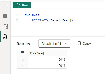
- Utilize the “Show data preview” feature in Power BI to create a query using DISTINCT() to view the unique values of a column, which can help in understanding the diversity and range of data within a column https://learn.microsoft.com/en-us/power-bi/transform-model/dax-query-view .
For more information on evaluating data and working with multidimensional models in Power BI, you can refer to the following resources: - Define a default member in multidimensional models https://learn.microsoft.com/en-us/power-bi/connect-data/desktop-default-member-multidimensional-models . - DAX query view in Power BI https://learn.microsoft.com/en-us/power-bi/transform-model/dax-query-view .
By following these steps and utilizing the available tools and features, you can effectively evaluate data to ensure that it is of high quality and suitable for analysis. This evaluation is a critical component of data preparation and analysis, setting the foundation for reliable insights and decision-making.
Prepare the data (25–30%)
Clean the data
Resolve Inconsistencies, Unexpected or Null Values, and Data Quality Issues
When working with data, it is crucial to ensure that the data is of high quality and reliable. This involves addressing several common issues that can arise:
Inconsistencies: Data inconsistencies occur when there are discrepancies in the data that can lead to confusion and inaccurate analysis. This can be due to duplicate records, conflicting data entries, or misaligned data formats. To resolve these, you can use data cleaning techniques such as deduplication, validation rules, and standardization of formats.
Unexpected Values: Sometimes, data can contain values that are outside the expected range or not in line with other data. These outliers can skew analysis and need to be investigated. Techniques such as data validation, outlier detection, and statistical analysis can help identify and address unexpected values.
Null Values: Null values represent missing or undefined data. They can be the result of incomplete data collection, data entry errors, or system errors. Handling null values is essential as they can affect the outcome of data analysis. Strategies to deal with null values include data imputation, where missing values are replaced with substitutes, or exclusion, where records with null values are omitted from analysis.
Data Quality Issues: Data quality issues can encompass a range of problems, including inaccuracies, incomplete data, and timeliness issues. Ensuring data quality may involve establishing data governance policies, performing regular data audits, and implementing data quality tools that can automate the detection and correction of data issues.
For additional information and resources on how to address these data issues, you can refer to the following URLs:
- Power BI Documentation: Power BI documentation
- Microsoft Power Apps Documentation: Microsoft Power Apps documentation
- Microsoft Q&A: Microsoft Q&A | Microsoft Docs
- Power Platform Community Support: Power Apps - Power Platform Community, Power Query - Power Platform Community, Building Power Apps - Power Platform Community
By addressing these data issues, you can improve the reliability and accuracy of your data analysis, leading to more informed decision-making and insights https://learn.microsoft.com/en-us/credentials/certifications/resources/study-guides/pl-300 https://learn.microsoft.com/en-us/credentials/certifications/resources/study-guides/pl-300 .
Prepare the data (25–30%)
Clean the data
Resolve Data Import Errors
When working with data in Power BI, it’s common to encounter import errors. These errors can occur for various reasons, such as inconsistencies, unexpected or null values, and general data quality issues. To effectively resolve data import errors, one should follow a systematic approach:
Evaluate Data: Begin by examining the data you are trying to import. Look at the data statistics and column properties to understand the structure and content of your data source https://learn.microsoft.com/en-us/credentials/certifications/resources/study-guides/pl-300 .
Identify Inconsistencies: Check for any inconsistencies in the data. This could include mismatched data types, unexpected formatting, or missing values that need to be addressed https://learn.microsoft.com/en-us/credentials/certifications/resources/study-guides/pl-300 .
Handle Null Values: Null values can cause errors during data import. Determine the appropriate way to handle these null values, whether it’s by filling them with a default value, removing the affected records, or addressing the source of these nulls https://learn.microsoft.com/en-us/credentials/certifications/resources/study-guides/pl-300 .
Improve Data Quality: Assess the overall quality of the data. Resolve any issues related to accuracy, completeness, and reliability to ensure that the data being imported is of high quality https://learn.microsoft.com/en-us/credentials/certifications/resources/study-guides/pl-300 .
Troubleshoot Import Errors: If you encounter specific import errors, refer to the error messages and documentation for guidance on how to resolve them. Power BI provides detailed error messages that can help pinpoint the cause of the problem.
Consult Additional Resources: For more in-depth guidance on resolving data import errors, you can refer to the following resources:
By following these steps, you can effectively troubleshoot and resolve data import errors in Power BI, ensuring that your data is accurate and reliable for analysis and reporting.
Model the data (25–30%)
Design and implement a data model
Configure Table and Column Properties
When configuring table and column properties in Power BI, there are several key aspects to consider to ensure that your data model is optimized for analysis and reporting. Here’s a detailed explanation of how to configure these properties:
Table Properties
- Name: Assign a clear and descriptive name to your table to make it easily identifiable within your data model.
- Data Category: Set the data category for a table to provide Power BI with hints on how to process and visualize the data. For example, you can categorize a table as ‘Geographic’ to enable map visualizations.
- Storage Mode: Choose between Import, DirectQuery, or Dual storage modes depending on the size of the data and the need for real-time updates.
- Sort By: Define the default sort order of a column by another column in the table, often used with date tables to sort by a chronological order.
Column Properties
- Name: Provide a meaningful name for each column that reflects the data it contains.
- Data Type: Specify the data type (e.g., text, number, date) to ensure correct processing and calculations.
- Data Category: Similar to tables, setting the data category for columns helps Power BI understand the data for better visualization options, such as URLs, images, or barcodes.
- Format: Define the display format for numeric and date columns, such as currency, percentage, or custom formats.
- Sort By Column: If the column contains categorical data that has a natural order (like months of the year), you can sort it by another column that represents that order.
- Summarization: Set the default summarization for numeric columns, such as sum, average, count, or none.
- Relationships: Define how the column relates to columns in other tables, including cardinality and cross-filter direction, to ensure accurate data analysis.
Role-Playing Dimensions
In scenarios where a single physical table should be used in multiple roles, such as ‘Order Date’ and ‘Ship Date’, role-playing dimensions allow you to reuse the same date table for different purposes in your model.
Row-Level Security (RLS)
Implement RLS to restrict data access for given users. Define roles and rules to control which data can be viewed by which users, ensuring data security and compliance.
For additional information on configuring table and column properties in Power BI, you can refer to the official Power BI documentation:
Please note that some features and properties may vary between Power BI Desktop and Power BI Service, and it’s important to be aware of these differences when configuring your data model https://learn.microsoft.com/en-us/power-bi/transform-model/service-edit-data-models .
Model the data (25–30%)
Design and implement a data model
Implementing Role-Playing Dimensions
Role-playing dimensions are a concept in data modeling where the same
dimension is used for different purposes within the same database or
model. In the context of Power BI and data analysis, this often applies
to dimensions like dates, where a single date table might need to serve
multiple roles, such as OrderDate, ShipDate,
or DueDate.
To implement role-playing dimensions, you can follow these steps:
Configure Table and Column Properties: Begin by setting up your dimension table with the appropriate properties. This includes defining the data types, formatting, and data categories for the columns within your table https://learn.microsoft.com/en-us/credentials/certifications/resources/study-guides/pl-300 .
Create Duplicate Tables for Different Roles: If you need to use the dimension in multiple roles, duplicate the dimension table for each role it needs to play. For example, if you have a
Datetable that needs to serve as bothOrderDateandShipDate, you would create two separate tables in your model, one for each role https://learn.microsoft.com/en-us/power-bi/transform-model/desktop-relationships-understand .Define Relationships: Establish relationships between your fact table(s) and each instance of the role-playing dimension. For example, you would create a relationship between the
Orderstable and theOrderDatetable, and another relationship between theOrderstable and theShipDatetable https://learn.microsoft.com/en-us/credentials/certifications/resources/study-guides/pl-300 .Use Inactive Relationships: In some cases, you may need to introduce additional relationship paths that are set as inactive. These can be activated as needed during the evaluation of a model calculation using the
USERELATIONSHIPDAX function. This function allows you to specify which relationship should be active in the context of a particular calculation https://learn.microsoft.com/en-us/power-bi/transform-model/desktop-relationships-understand .Calculated Tables: For more complex scenarios, you might create calculated tables using DAX formulas. These tables are based on the original dimension table but can be tailored to specific needs, such as filtering for a particular time frame or subset of data https://learn.microsoft.com/en-us/dax/dax-overview .
Leverage DAX Functions: Utilize DAX functions like
USERELATIONSHIPto manage active and inactive relationships,RELATEDandRELATEDTABLEto retrieve values across relationships, andTREATASto apply filters in scenarios where you want to simulate a virtual relationship https://learn.microsoft.com/en-us/power-bi/transform-model/desktop-relationships-understand .
For additional information on implementing role-playing dimensions and managing relationships in Power BI, you can refer to the following resources:
- USERELATIONSHIP function in DAX
- Active vs inactive relationship guidance
- Calculated tables in Power BI Desktop
- DAX functions for model relationships
By following these guidelines, you can effectively implement role-playing dimensions in your data model, allowing for more flexible and powerful data analysis within your reports.
Model the data (25–30%)
Design and implement a data model
Define a Relationship’s Cardinality and Cross-Filter Direction
When working with data models in Power BI, defining relationships between tables is crucial for accurate data analysis. Two key concepts in this context are the cardinality and the cross-filter direction of a relationship.
Cardinality
Cardinality refers to the uniqueness of data values that can be found in any given column of a table. It defines the nature of the relationship between two tables. There are four types of cardinality:
- **One-to-many (1:*)**: This is where a single row from the first table relates to many rows in the second table. The “one” side contains unique values, while the “many” side can have duplicates.
- **Many-to-one (*:1)**: This is the inverse of one-to-many, where many rows in the first table relate to a single row in the second table.
- One-to-one (1:1): Each row in the first table relates to one and only one row in the second table, and vice versa. Both sides contain unique values.
- Many-to-many (:): Rows in the first table can relate to many rows in the second table and vice versa. Both sides can contain duplicate values.
Power BI Desktop automatically detects and sets the cardinality type when creating a relationship, but it can be manually adjusted if necessary, provided that any “one” side columns contain unique values https://learn.microsoft.com/en-us/power-bi/transform-model/desktop-relationships-understand .
Cross-Filter Direction
Cross-filter direction determines how filters applied to one table affect the data in another table within a relationship. There are two options for cross-filter direction:
- Single: Filters are applied in one direction only. For example, if you have a one-to-many relationship, the filter will typically flow from the “one” side to the “many” side.
- Both: Filters are applied in both directions, also known as bi-directional filtering. This allows for more dynamic interactions between tables but can lead to ambiguity and performance issues if not used carefully https://learn.microsoft.com/en-us/power-bi/transform-model/desktop-relationships-understand .
The cross-filter direction can be modified using the DAX function
CROSSFILTER https://learn.microsoft.com/en-us/power-bi/transform-model/desktop-relationships-understand
. It is important to note that bi-directional relationships can
negatively impact performance and may result in ambiguous filter
propagation paths, which Power BI Desktop may prevent by displaying an
error message https://learn.microsoft.com/en-us/power-bi/transform-model/desktop-relationships-understand
.
For additional information on these concepts, you can refer to the following resources: - Row-level security (RLS) with Power BI Desktop - CROSSFILTER function - Bi-directional relationship guidance
Understanding and correctly defining the cardinality and cross-filter direction of relationships is essential for building effective and efficient data models in Power BI.
Model the data (25–30%)
Design and implement a data model
Create a Common Date Table
In Power BI, a common date table is essential for performing time-based analysis and utilizing time-intelligence functions. A date table contains a range of dates with no gaps, and it typically includes additional columns like year, quarter, month, and day to facilitate hierarchical time-based analysis.
Steps to Create a Common Date Table:
- Marking a Table as a Date Table:
- In the Data pane, right-click the table you intend to use as your date table.
- Choose “Mark as date table > Mark as date table” from the context menu.
- In the “Mark as date table” dialog, select the column that contains date values from the dropdown menu to specify it as the primary date column https://learn.microsoft.com/en-us/power-bi/transform-model/service-edit-data-models .
- Column Validation:
- Ensure that the date column you select contains unique values for each day and does not have any gaps in the dates. This is crucial for accurate time-based calculations and analysis.
- Creating Custom Date Tables:
- If the built-in date table does not meet your specific needs, you can create a custom date table. This can be done by importing a date table from an external source or by using DAX to generate a date table with custom columns and hierarchies.
- Using DAX Time-Intelligence Functions:
- With a marked date table, you can leverage DAX time-intelligence functions to perform complex time-based calculations, such as calculating year-to-date values or comparing sales figures from the same period in the previous year.
- Handling BLANK Dates:
- If the “StartDate” or “EndDate” in your DAX expressions is BLANK, Power BI will automatically use the earliest or latest date available in the date column, respectively https://learn.microsoft.com/en-us/dax/datesbetween-function-dax .
- Date Hierarchies:
- With imported data, date and datetime columns have a built-in date hierarchy (year, quarter, month, day) that can be used in visuals. This hierarchy is not available with DirectQuery, but if a Date table is available in the underlying source, you can still use DAX time-intelligence functions https://learn.microsoft.com/en-us/power-bi/connect-data/desktop-directquery-about .
Considerations:
- DirectQuery Limitations: Some functionalities, like the built-in date hierarchy and certain DAX functions, may not be supported with DirectQuery mode https://learn.microsoft.com/en-us/dax/datesbetween-function-dax https://learn.microsoft.com/en-us/power-bi/connect-data/desktop-directquery-about .
- Row-Level Security (RLS): When implementing RLS, be aware that certain DAX functions used with date tables may not be supported https://learn.microsoft.com/en-us/dax/datesbetween-function-dax .
For further details on creating and working with date tables in Power BI, you can refer to the official documentation on date tables: Power BI Date Tables Documentation https://learn.microsoft.com/en-us/power-bi/transform-model/service-edit-data-models .
By following these guidelines, you can effectively create and utilize a common date table in Power BI to enhance your data models and enable more sophisticated time-based data analysis.
Model the data (25–30%)
Design and implement a data model
Implement Row-Level Security Roles
Row-Level Security (RLS) is a feature that allows you to control access to rows in a database table based on the roles of users accessing the data. In the context of Power BI and Analysis Services, RLS can be used to restrict data access for specific users, ensuring that they only see data that is pertinent to their role within the organization.
Understanding Row-Level Security
RLS works by applying security filters within roles. These filters are DAX (Data Analysis Expressions) formulas that define which rows can be seen by members of a role. For instance, if you have a Sales role, you might implement a DAX formula that only allows members of this role to see sales data for their specific region https://learn.microsoft.com/en-us/dax/dax-overview .
Configuring RLS in Power BI
To implement RLS in Power BI, you need to:
- Define Roles and Rules: Create roles within your Power BI Desktop model and define the DAX formulas that specify the data each role can access.
- Assign Users to Roles: Once your Power BI report is published to the Power BI service, assign users to the appropriate roles within the service.
- Test Your Roles: Use the “View as” feature in Power BI Desktop to test the roles and ensure that the security rules are working as expected.
It’s important to note that RLS is enforced when users access reports in the Power BI service with Viewer permissions. RLS does not apply to users with higher permissions such as Admins, Members, or Contributors https://learn.microsoft.com/en-us/power-bi/admin/service-admin-rls .
RLS in Analysis Services
For models hosted in SQL Server Analysis Services or Azure Analysis Services, RLS is configured within the model itself, not in Power BI. You can define roles and their permissions during the authoring phase in SQL Server Data Tools and manage them using SQL Server Management Studio after deployment https://learn.microsoft.com/en-us/power-bi/connect-data/service-gateway-enterprise-manage-ssas .
Dynamic vs. Static RLS
RLS can be dynamic or static. Dynamic RLS changes the data filtering based on the user viewing the report, while static RLS applies the same set of filters for all users assigned to a role. Dynamic RLS often uses user identity to filter data, which can be particularly useful for scenarios like salespeople viewing only their own sales data https://learn.microsoft.com/en-us/power-bi/connect-data/service-datasets-understand .
Additional Resources
For more detailed information on implementing RLS in Power BI and Analysis Services, you can refer to the following resources:
- Row-level security (RLS) with Power BI
- Roles in Analysis Services
- Security roles (Analysis Services - Multidimensional data)
- Securing the tabular BI semantic model
By understanding and implementing RLS, you can ensure that your data is secure and that users only have access to the information that is relevant to their roles within the organization.
Model the data (25–30%)
Create model calculations by using DAX
Creating single aggregation measures is a fundamental concept in Power BI, which allows you to perform calculations on your data, such as summing up sales figures, calculating averages, or finding the maximum or minimum value within a dataset. These measures are created using the Data Analysis Expressions (DAX) formula language, which is specifically designed for data modeling and reporting in Power BI.
Single Aggregation Measures
Aggregation measures are calculations applied to a set of values to return a single value. In Power BI, you can create these measures to summarize data, making it easier to analyze and visualize. Here’s how you can create a single aggregation measure:
- Open Power BI Desktop and load your dataset.
- Navigate to the Data view by clicking on the ‘Data’ icon on the left side of the screen.
- Select the table where you want to create the measure.
- Right-click on the table and choose ‘New measure’ or click on the ‘New measure’ button in the ribbon at the top of the screen.
- Enter your DAX formula in the formula bar. For
example, to create a measure that calculates the total sales, you might
use the formula
Total Sales = SUM(Sales[Amount]). - Name your measure appropriately so that it is easily identifiable within your reports.
- Press Enter to save the measure.
The measure you’ve created will now be available in the ‘Fields’ list and can be used in your reports and visualizations.
Examples of Single Aggregation Measures
- Total Sales:
Total Sales = SUM(Sales[Amount]) - Average Sales:
Average Sales = AVERAGE(Sales[Amount]) - Maximum Sale:
Maximum Sale = MAX(Sales[Amount]) - Minimum Sale:
Minimum Sale = MIN(Sales[Amount])
Advantages of Creating Single Aggregation Measures
- Flexibility: You can define the logic of the calculation to meet your specific reporting needs.
- Performance: Measures are calculated on the fly, allowing for fast data analysis and reporting.
- Reusability: Once created, measures can be used across multiple reports and visualizations.
- Accuracy: Measures ensure consistent calculations across your reports, reducing the risk of errors.
Additional Resources
For more information on creating measures in Power BI and learning the DAX language, you can refer to the following resources:
- DAX basics in Power BI Desktop https://learn.microsoft.com/en-us/power-bi/transform-model/desktop-tutorial-create-measures .
- Tutorial: Create your own measures in Power BI Desktop https://learn.microsoft.com/en-us/power-bi/transform-model/desktop-tutorial-create-measures .
Remember, creating effective measures is key to unlocking the full potential of your data in Power BI. With practice, you can leverage DAX to build powerful data models that provide valuable insights for your organization or project.
Model the data (25–30%)
Create model calculations by using DAX
Detailed Explanation: Using CALCULATE to Manipulate Filters
The CALCULATE function in DAX (Data Analysis
Expressions) is a powerful tool that allows you to modify the filter
context of a measure. The filter context is essentially the set of
filters that are applied to the data model at any given time, which
determines the data that is being calculated or displayed.
How CALCULATE Works
The CALCULATE function can change the filter context by
applying new filters, removing existing ones, or overriding them. It
does this by taking a measure or expression as its first argument and
then one or more filter conditions as subsequent arguments. Here’s the
basic syntax:
CALCULATE(<expression>, <filter1>, <filter2>, ...)Manipulating Filters with CALCULATE
When you use CALCULATE, you can pass filter arguments
that are either Boolean expressions, table expressions, or special
filter functions. Boolean expressions are generally recommended because
they are optimized for in-memory column stores, which is how Import
model tables in Power BI are structured https://learn.microsoft.com/en-us/dax/best-practices/dax-avoid-avoid-filter-as-filter-argument
.
Using Boolean Expressions
A Boolean expression as a filter argument is a simple condition that can be evaluated as true or false for each row in a column. For example:
Red Sales = CALCULATE([Sales], 'Product'[Color] = "Red")This measure calculates the sales for products that are red by
applying a filter on the Color column of the
Product table.
Using Table Expressions
Sometimes, more complex filter conditions are required that cannot be
expressed as a simple Boolean expression. In such cases, you can use
table expressions with the FILTER function. For
example:
Sales for Profitable Months = CALCULATE([Sales], FILTER(VALUES('Date'[Month]), [Profit] > 0))This measure calculates the sales for only those months that have
achieved a profit by using a table expression that filters the
Month column based on the Profit measure https://learn.microsoft.com/en-us/dax/best-practices/dax-avoid-avoid-filter-as-filter-argument
.
Preserving Existing Filters
The KEEPFILTERS function can be used in conjunction with
CALCULATE to preserve any existing filters that have been
applied to the columns being filtered. This is useful when you want to
apply additional filters without removing the ones that are already in
place https://learn.microsoft.com/en-us/dax/best-practices/dax-avoid-avoid-filter-as-filter-argument
.
Red Sales = CALCULATE([Sales], KEEPFILTERS('Product'[Color] = "Red"))Restrictions and Considerations
When using CALCULATE, there are certain restrictions on
the filter expressions you can use:
- Cannot reference columns from multiple tables.
- Cannot reference a measure.
- Cannot use nested
CALCULATEfunctions. - Cannot use functions that scan or return a table https://learn.microsoft.com/en-us/dax/best-practices/dax-avoid-avoid-filter-as-filter-argument .
Additionally, the CALCULATE function is not supported
for use in DirectQuery mode when used in calculated columns or row-level
security (RLS) rules https://learn.microsoft.com/en-us/dax/openingbalancequarter-function-dax
.
Additional Resources
For more information on the CALCULATE function and its
use in manipulating filters, you can refer to the following
resources:
- CALCULATE function - DAX | Microsoft Docs https://learn.microsoft.com/en-us/dax/best-practices/dax-avoid-avoid-filter-as-filter-argument .
- FILTER function - DAX | Microsoft Docs https://learn.microsoft.com/en-us/dax/best-practices/dax-avoid-avoid-filter-as-filter-argument .
- KEEPFILTERS function - DAX | Microsoft Docs https://learn.microsoft.com/en-us/dax/best-practices/dax-avoid-avoid-filter-as-filter-argument .
- Filter functions - DAX | Microsoft Docs https://learn.microsoft.com/en-us/dax/dax-overview .
By understanding and effectively using the CALCULATE
function, you can create dynamic and context-sensitive measures that are
essential for advanced data analysis in Power BI.
Model the data (25–30%)
Create model calculations by using DAX
Implementing Time Intelligence Measures
Time intelligence measures in data analysis are crucial for performing calculations over time, such as comparing sales from the current month to the previous month or year. These measures allow analysts to understand trends and patterns over time.
Understanding Time Intelligence
Time intelligence functions in DAX (Data Analysis Expressions) are designed to handle calculations that require a knowledge of dates and periods, such as days, months, quarters, and years. These functions can calculate sums, averages, and other aggregations across time periods in a dynamic way, adjusting to the context of the data in your reports.
Creating Time Intelligence Measures
To implement time intelligence measures, you typically use the
CALCULATE function in combination with a time intelligence
function. Here are some examples:
Previous Day Sales: To calculate sales for the previous day, you can use the
PREVIOUSDAYfunction within aCALCULATEstatement.Previous Day Sales = CALCULATE( SUM(InternetSales_USD[SalesAmount_USD]), PREVIOUSDAY('DateTime'[DateKey]) )https://learn.microsoft.com/en-us/dax/previousday-function-dax .
Quarterly Running Total: To calculate a running total of sales for the current quarter, you can use the
DATESQTD(Dates Quarter-To-Date) function.Quarterly Running Total = CALCULATE( SUM(InternetSales_USD[SalesAmount_USD]), DATESQTD(DateTime[DateKey]) )https://learn.microsoft.com/en-us/dax/datesqtd-function-dax .
Previous Month Sales: To calculate sales for the previous month, you can use the
PREVIOUSMONTHfunction.Previous Month Sales = CALCULATE( SUM(InternetSales_USD[SalesAmount_USD]), PREVIOUSMONTH('DateTime'[DateKey]) )https://learn.microsoft.com/en-us/dax/previousmonth-function-dax .
Best Practices for Time Intelligence
Marking Date Tables: Ensure that your date tables are marked appropriately to work with time intelligence functions. This can be done in Power BI Desktop or in external tabular models https://learn.microsoft.com/en-us/power-bi/transform-model/desktop-quick-measures .
Using Custom Date Tables: If you are using custom date tables, make sure they are marked as date tables to leverage time intelligence quick measures effectively https://learn.microsoft.com/en-us/power-bi/transform-model/desktop-quick-measures .
Replacing Implicit Measures with Explicit Measures: Implicit measures are created by dragging and dropping fields into a visualization. It is a best practice to replace these with explicit measures that you define using DAX for better control and performance https://learn.microsoft.com/en-us/credentials/certifications/resources/study-guides/pl-300 .
Additional Resources
For more information on time intelligence functions and how to use them, refer to the following resources:
- Time Intelligence Functions - DAX https://learn.microsoft.com/en-us/dax/previousday-function-dax https://learn.microsoft.com/en-us/dax/datesqtd-function-dax https://learn.microsoft.com/en-us/dax/previousmonth-function-dax .
- Specify Mark as Date Table for use with time-intelligence - SSAS Tabular https://learn.microsoft.com/en-us/power-bi/transform-model/desktop-quick-measures .
- Set and use date tables in Power BI Desktop https://learn.microsoft.com/en-us/power-bi/transform-model/desktop-quick-measures .
By understanding and implementing time intelligence measures, analysts can gain deeper insights into their data and make more informed decisions based on temporal trends.
Model the data (25–30%)
Create model calculations by using DAX
Implicit vs. Explicit Measures in Power BI
In Power BI, measures can be categorized into two types: implicit and explicit measures. Understanding the distinction between these two is crucial for creating accurate and efficient reports.
Implicit Measures
An implicit measure occurs when you directly use a data column from the Data pane in the Report view to create a visual. Power BI allows you to aggregate this data as a SUM, AVERAGE, MIN, MAX, or other basic aggregations, which then becomes an implicit measure https://learn.microsoft.com/en-us/power-bi/transform-model/model-explorer . Implicit measures are created dynamically, for instance, when you drag a field onto the report canvas, and Power BI automatically aggregates the value using one of the built-in standard aggregations https://learn.microsoft.com/en-us/power-bi/consumer/end-user-glossary .
Discouraging Implicit Measures
The use of implicit measures is generally discouraged because they may not always apply the necessary logic or filters that might be required for accurate data representation. To discourage the creation of implicit measures, Power BI provides a property that, when enabled, removes the summation symbol next to data columns in the Data pane and prevents these columns from being added directly to visuals on aggregation axes or as values https://learn.microsoft.com/en-us/power-bi/transform-model/calculation-groups https://learn.microsoft.com/en-us/power-bi/transform-model/model-explorer .
Explicit Measures
Explicit measures, on the other hand, are created when you define a New measure using a DAX expression to aggregate a data column. These measures can include conditional logic and filters, leveraging the full capabilities of DAX https://learn.microsoft.com/en-us/power-bi/transform-model/model-explorer . Explicit measures are preferred because they provide more control and consistency in how data is aggregated and displayed.
Replacing Implicit Measures with Explicit Measures
To replace implicit measures with explicit measures, follow these steps:
- Identify any visuals in your report that are using implicit measures. These are typically indicated by basic aggregations applied directly to data columns in the visual https://learn.microsoft.com/en-us/power-bi/transform-model/model-explorer .
- Create a new explicit measure by defining a DAX expression that replicates the aggregation logic of the implicit measure. This can be done in the Model view by selecting ‘New measure’ and entering the appropriate DAX formula https://learn.microsoft.com/en-us/power-bi/transform-model/calculation-groups .
- Replace the implicit measure in your visual with the newly created explicit measure. This ensures that the visual uses the explicit measure for aggregation, which includes any additional logic or filters you have defined https://learn.microsoft.com/en-us/power-bi/transform-model/model-explorer .
By converting implicit measures to explicit measures, you ensure that your reports are using well-defined, consistent logic for data aggregation, which can improve both the accuracy and performance of your reports.
For additional information on creating explicit measures in Power BI, you can refer to the tutorial on how to Create your own measures in Power BI Desktop https://learn.microsoft.com/en-us/power-bi/transform-model/calculation-groups .
Remember, while implicit measures are quick and easy to create, explicit measures offer greater flexibility and are essential for complex data models and accurate reporting. It is a best practice to use explicit measures whenever possible.
Model the data (25–30%)
Create model calculations by using DAX
Use of Basic Statistical Functions
In data analysis, basic statistical functions are essential for summarizing and understanding data. These functions calculate values related to statistical distributions and probability, which can include operations such as calculating the standard deviation, variance, or the number of permutations https://learn.microsoft.com/en-us/dax/dax-overview https://learn.microsoft.com/en-us/dax/statistical-functions-dax .
When working with Power BI Desktop, you can leverage the Data Analysis Expressions (DAX) formula language to create your own measures that perform these statistical calculations. DAX includes a variety of functions that are similar to those found in Excel but are specifically designed to work with relational data and provide dynamic calculations for reports https://learn.microsoft.com/en-us/power-bi/transform-model/desktop-tutorial-create-measures .
Here are some examples of basic statistical functions that you might use:
- AVERAGE: Calculates the mean of a set of values.
- COUNT: Counts the number of items in a column.
- SUM: Adds up all the numbers in a column.
- MIN: Finds the smallest numeric value in a column.
- MAX: Finds the largest numeric value in a column.
- STDEV.S: Calculates the standard deviation of a sample.
Creating measures using these functions in Power BI allows for more complex and unique calculations tailored to your data analysis needs. These measures, once created, are added to the Fields list for the selected table and can be named for easy identification. They can also be used as arguments in other DAX expressions to perform complex calculations efficiently https://learn.microsoft.com/en-us/power-bi/transform-model/desktop-tutorial-create-measures .
For a deeper understanding of statistical functions in DAX and how to use them in Power BI, you can refer to the following resources:
Additionally, for visual learners, there are video resources that explain data categories for measures and statistical DAX functions:
By utilizing these basic statistical functions, you can enhance your data analysis and reporting capabilities within Power BI, providing more insightful and actionable information.
Model the data (25–30%)
Create model calculations by using DAX
Create Semi-Additive Measures
Semi-additive measures are a type of calculation in data modeling that are additive across some dimensions but not all. In the context of Power BI, creating semi-additive measures involves writing DAX formulas that correctly aggregate data across certain dimensions, such as time, while not aggregating across others, like products or geographical locations.
For example, consider a measure like inventory levels. You can sum inventory levels across different products or locations, but it wouldn’t make sense to sum inventory levels over time since you would want to know the ending inventory at the last date, not the total over the period.
To create a semi-additive measure in Power BI, you would typically use DAX time intelligence functions. These functions allow you to calculate measures such as the end-of-month inventory level, which adds up inventory across all products and locations but only takes the last value for each period of time.
Here’s a step-by-step guide to creating a semi-additive measure:
Identify the Base Measure: Determine the base measure that needs to be aggregated in a semi-additive manner. For instance, “Inventory Level”.
Use Time Intelligence Functions: Apply DAX time intelligence functions to calculate the correct value for each time period. Functions like
LASTDATE,DATESYTD, orENDOFMONTHcan be used to identify the right time slice.Combine with Aggregation Functions: Combine the time intelligence functions with aggregation functions like
SUMXorAVERAGEXto perform the calculation across the required dimensions.Create the Measure: Write the DAX formula and create the measure in Power BI. For example:
End of Month Inventory =
CALCULATE (
    SUM ( Inventory[Inventory Level] ),
    LASTDATE ( 'Date'[Date] )
)
This formula calculates the sum of the inventory levels for the last date of each month.
Test the Measure: Place the measure in a visual and validate that it behaves as expected, correctly aggregating data where necessary and not aggregating where not.
For additional information on creating semi-additive measures and using DAX in Power BI, you can refer to the following resources:
Remember, the key to creating effective semi-additive measures is understanding the business logic behind the data and applying the correct DAX functions to model that logic within Power BI.
Model the data (25–30%)
Create model calculations by using DAX
Create a Measure by Using Quick Measures
Quick measures in Power BI are pre-defined calculations that you can use to create new measures without having to write the DAX formulas yourself. They are designed to be both a time-saver for experts and a learning tool for beginners. Here’s how you can create a measure using quick measures:
- Initiating Quick Measure Creation:
- Right-click on a table in the Fields pane or select More options (…) and choose New quick measure.
- Alternatively, under Calculations in the Home tab of the Power BI Desktop ribbon, select New Quick Measure https://learn.microsoft.com/en-us/power-bi/transform-model/desktop-tutorial-create-measures .
- Using the Quick Measures Dialog:
- In the Quick measures dialog, you will find a variety of calculations to choose from, such as Year-over-year change, Average per category, and more.
- Select the calculation type that suits your needs.
- Fill in the required fields by dragging the relevant fields from the Fields pane into the dialog https://learn.microsoft.com/en-us/power-bi/transform-model/desktop-quick-measures .
- Understanding the DAX Formula:
- Once you have created a quick measure, Power BI generates the DAX formula and displays it in the Formula bar.
- This is an excellent opportunity to learn how DAX formulas are structured and to modify the formula if necessary https://learn.microsoft.com/en-us/power-bi/transform-model/desktop-quick-measures .
- Applying the Quick Measure:
- After confirming your selections and clicking OK, the new quick measure will appear in the Fields pane.
- The measure can now be used in any visual within your report, and the DAX formula is available for review and editing https://learn.microsoft.com/en-us/power-bi/transform-model/desktop-quick-measures .
- Managing Quick Measures:
- If you decide that a quick measure is not needed, you can delete it by right-clicking or selecting the … next to the measure and choosing Delete from model.
- You can also rename a quick measure by selecting Rename from the same menu https://learn.microsoft.com/en-us/power-bi/transform-model/desktop-quick-measures .
- Limitations and Considerations:
- Note that when using SQL Server Analysis Services (SSAS) live connections, only certain quick measures are available depending on the version of SSAS you are connected to https://learn.microsoft.com/en-us/power-bi/transform-model/desktop-quick-measures .
For more detailed information and step-by-step guidance on creating and using quick measures, you can refer to the official documentation: Use quick measures in Power BI https://learn.microsoft.com/en-us/power-bi/transform-model/desktop-tutorial-create-measures .
By utilizing quick measures, you can enhance your reports with powerful calculations while also deepening your understanding of DAX. Whether you are a seasoned professional or just starting out with Power BI, quick measures offer a convenient and educational way to work with data.
Model the data (25–30%)
Create model calculations by using DAX
Create Calculated Tables
Calculated tables in Power BI are powerful tools that allow you to create new tables based on data already present in your model. They are defined by DAX expressions and can be used for a variety of purposes, such as creating role-playing dimensions or custom aggregations.
Understanding Calculated Tables
A calculated table is a table that you create explicitly in Power BI using a DAX formula. The data for the table is not loaded from an external data source but is computed from other tables within the same model https://learn.microsoft.com/en-us/dax/dax-overview .
Use Cases for Calculated Tables
- Role-Playing Dimensions: You can use calculated tables to handle scenarios where the same data needs to be used in different roles. For example, a Date table can be referenced as OrderDate, ShipDate, or DueDate, depending on the context of the relationship https://learn.microsoft.com/en-us/dax/dax-overview .
- Filtered Rowsets: If you need a subset or a variation of an existing table, calculated tables can be used to create these variations without altering the original table https://learn.microsoft.com/en-us/dax/dax-overview .
- Custom Aggregations: You can create calculated tables to aggregate data in a specific way that is not directly supported by the existing model structure.
Creating a Calculated Table
To create a calculated table in Power BI Desktop:
Navigate to the Report View, Data View, or Model View.
In the Calculations group, select New table. This option is also available in the Table tools in the Data View https://learn.microsoft.com/en-us/power-bi/transform-model/desktop-calculated-tables .
Enter the DAX formula for the calculated table in the formula bar. For example, to combine two employee tables into a new table for the Western Region, you might use the formula:
Western Region Employees = UNION('Northwest Employees', 'Southwest Employees')Once the formula is entered, a new table named Western Region Employees is created and will appear in the Fields pane. This table can now be used like any other table in your model https://learn.microsoft.com/en-us/power-bi/transform-model/desktop-calculated-tables .
Editing a Calculated Table
In Power BI service, you can also create and edit calculated tables:
- Select the table in the Data Pane.
- Click on the New table button in the ribbon.
- Enter the DAX formula into the formula bar. The editor provides autocomplete features to assist with formula creation https://learn.microsoft.com/en-us/power-bi/transform-model/service-edit-data-models .
Managing Relationships
Calculated tables can participate in relationships just like standard tables. You can create relationships to other tables, add measures and calculated columns, and use the fields in reports https://learn.microsoft.com/en-us/dax/dax-overview https://learn.microsoft.com/en-us/power-bi/transform-model/desktop-calculated-tables . Understanding and managing these relationships is crucial for accurate data analysis and reporting.
Additional Resources
For more information on creating and using calculated tables in Power BI, you can refer to the following resources:
- Calculated tables in Power BI Desktop https://learn.microsoft.com/en-us/dax/dax-overview
- Using DAX to create calculated tables https://learn.microsoft.com/en-us/power-bi/transform-model/service-edit-data-models
By mastering calculated tables, you can significantly enhance the analytical capabilities of your Power BI models.
Model the data (25–30%)
Optimize model performance
Improving Performance in Power BI by Identifying and Removing Unnecessary Rows and Columns
When working with Power BI, optimizing the performance of your reports and dashboards is crucial for a smooth user experience. One effective way to enhance performance is by identifying and removing unnecessary rows and columns from your data models. This process not only streamlines the data but also reduces the memory footprint and improves the speed of data refreshes and queries.
Identifying Unnecessary Data
To identify unnecessary rows and columns, you should:
- Review the data model to ensure that all data present is relevant and used in reports or calculations.
- Analyze the usage of columns and tables in your reports to determine if they are essential for analysis or if they can be excluded.
- Consider the granularity of the data. If the level of detail is finer than required for analysis, you can aggregate the data to a higher level, thus reducing the number of rows.
Removing Unnecessary Data
Once you have identified unnecessary data, you can take steps to remove it:
- Eliminate columns that are not used in any visualizations, calculations, or reports.
- Remove rows that do not contribute to the analysis, such as those with outdated or irrelevant information.
- Filter out data at the source when importing into Power BI to prevent unnecessary data from entering the model.
Best Practices for Data Optimization
- Choose optimal data types for columns to reduce their size in memory https://learn.microsoft.com/en-us/credentials/certifications/resources/study-guides/pl-300 .
- Summarize data at the source or during the data import process to minimize the volume of data in the model.
- Regularly review and maintain the data model to prevent the accumulation of unnecessary data over time.
By following these steps, you can significantly improve the performance of your Power BI reports and dashboards. For additional information on optimizing your Power BI data models, you can refer to the following resources:
Remember, a well-optimized data model is key to delivering fast and responsive insights to your users.
Model the data (25–30%)
Optimize model performance
Identifying Poorly Performing Measures, Relationships, and Visuals with Performance Analyzer
When working with Power BI Desktop, it is crucial to ensure that your reports are optimized for performance. One key aspect of report optimization is identifying and addressing poorly performing measures, relationships, and visuals. The Performance Analyzer tool in Power BI Desktop is instrumental in this process.
Using Performance Analyzer
To begin analyzing your report’s performance, follow these steps:
- Open your report in Power BI Desktop.
- Navigate to the “View” tab and click on the “Performance Analyzer” button.
- Start recording by clicking on “Start Recording” within the Performance Analyzer pane.
- Interact with your report by clicking on visuals or changing filters to trigger the performance analysis.
- Stop the recording to review the performance data collected.
Interpreting the Results
The Performance Analyzer will provide a breakdown of the time taken for each visual to update. This includes:
- DAX Query: The time taken to run the DAX queries for your measures.
- Visual Display: The time taken for the visual to render on the report canvas.
- Other: Additional time spent preparing the data or waiting for other operations.
By examining these timings, you can identify which measures, relationships, or visuals are taking longer to load and may require optimization.
DirectQuery Considerations
For visuals using DirectQuery, a “Direct query” row will be present in the Performance Analyzer results. This indicates that the visual is retrieving data directly from the data source, which can impact performance. You can use this information to decide whether to adjust the DirectQuery settings or to optimize the underlying data source queries.
Additional Resources
For more detailed guidance on using Performance Analyzer, you can refer to the following resources:
- Performance Analyzer in Power BI Desktop
- Use Performance Analyzer to examine report element performance
These resources provide comprehensive information on how to use the Performance Analyzer tool effectively to diagnose and improve the performance of your Power BI reports.
By following the steps outlined above and utilizing the Performance Analyzer, you can ensure that your Power BI reports are optimized for quick and efficient data analysis https://learn.microsoft.com/en-us/power-bi/connect-data/desktop-directquery-troubleshoot https://learn.microsoft.com/en-us/power-bi/create-reports/desktop-optimize-ribbon https://learn.microsoft.com/en-us/power-bi/create-reports/desktop-performance-analyzer .
Model the data (25–30%)
Optimize model performance
Improve Performance by Choosing Optimal Data Types
When working with data models, it is crucial to select the most appropriate data types to enhance performance. Optimal data type selection can significantly reduce the size of the model, improve loading times, and speed up query processing. Here are some key considerations for choosing the best data types:
Use Integer Data Types for Keys: Relationships in data models are more efficient when they are based on integer keys rather than other data types. This is because integer comparisons are faster than other data types like strings or GUIDs https://learn.microsoft.com/en-us/power-bi/connect-data/desktop-directquery-about .
Avoid Unnecessary High Precision: For numerical data, avoid using a higher precision than necessary. For example, if the data does not require decimal places, use an integer data type instead of a decimal or float. This reduces the amount of memory required to store the data.
Minimize Text Data Types: Text data types, like strings, can be very inefficient in terms of storage, especially if the strings are long and not well compressed. Where possible, use numeric keys to represent categorical data and only include necessary text fields https://learn.microsoft.com/en-us/credentials/certifications/resources/study-guides/pl-300 .
Use Compressed Modes for Large Data: For handling large datasets, consider using data types and storage modes that support compression. This can be particularly beneficial for high-latency connections or large semantic models, as it reduces the amount of data that needs to be transferred and processed https://learn.microsoft.com/en-us/power-bi/connect-data/desktop-sap-bw-connector .
Optimize Date and Time Data Types: Ensure that date and time data are stored using appropriate date and time data types rather than text values. This allows for more efficient storage and better performance during time-based calculations and aggregations https://learn.microsoft.com/en-us/power-bi/connect-data/desktop-sap-bw-connector .
By carefully selecting the data types that best match the nature of your data and the requirements of your model, you can achieve a more streamlined and efficient data model. This, in turn, leads to faster refresh times and more responsive reports and dashboards.
For additional information on improving performance with optimal data types, you can refer to the following resources: - Performance tips for Power BI Data Models - Use bootstrap for better performance https://learn.microsoft.com/en-us/javascript/api/overview/powerbi/powerbi-client-vue .
Remember, the goal is to strike a balance between the granularity of the data and the performance of the model. By doing so, you ensure that your reports are both accurate and efficient.
Model the data (25–30%)
Optimize model performance
Improve Performance by Summarizing Data
When working with large datasets in Power BI, performance optimization is crucial to ensure efficient data processing and a smooth user experience. One effective strategy for enhancing performance is by summarizing data. Summarizing data involves reducing the granularity of the dataset to a level that is appropriate for analysis, which can significantly decrease the volume of data that needs to be processed and visualized.
Benefits of Summarizing Data
- Reduced Processing Time: By aggregating data, the number of rows that Power BI needs to process is minimized, leading to faster query execution times.
- Enhanced Visual Performance: Visuals render more quickly because they have fewer data points to display, which is particularly beneficial for complex reports with multiple visuals.
- Simplified User Experience: Summarized data can help users focus on key insights without getting overwhelmed by too much detail.
Strategies for Summarizing Data
Aggregation: Use aggregate functions like SUM, AVERAGE, COUNT, MIN, and MAX to consolidate data into meaningful metrics. For instance, instead of displaying individual sales transactions, you could show total sales per region.
Grouping: Combine data into categories or groups. For example, rather than listing every product individually, group them into product categories.
Filtering: Exclude unnecessary or irrelevant data from reports to focus on the most important information.
Creating Hierarchies: Build hierarchies in your data model to allow users to drill down from summarized data to more detailed levels as needed.
Using Calculated Columns and Measures: Leverage DAX (Data Analysis Expressions) to create calculated columns and measures that summarize data efficiently within the data model.
Best Practices
- Pre-Summarize in Data Source: If possible, perform summarization at the data source level to reduce the amount of data imported into Power BI.
- Use Star Schema: Design your data model using a star schema, which organizes data into fact and dimension tables, to optimize summarization and improve query performance.
- Optimize Data Types: Choose the most efficient data types for columns to reduce the size of the data model.
- Limit Columns and Rows: Remove unnecessary columns and rows that do not contribute to analysis to streamline the dataset.
Additional Resources
For more information on best practices for data summarization and performance optimization in Power BI, you can refer to the following articles:
- Power BI Performance Best Practices
- Best Practices for Data Modeling
- Using Aggregations in Power BI
- Optimize Power BI Reports
By implementing these strategies, you can ensure that your Power BI reports and dashboards are not only insightful but also performant, providing a better experience for report consumers.
Visualize and analyze the data (25–30%)
Create reports
Identify and Implement Appropriate Visualizations
When working with data, choosing the right visualization is crucial for effectively communicating insights. Here are the steps and considerations for identifying and implementing appropriate visualizations:
Understand Your Data: Before selecting a visualization, it’s important to understand the nature of your data—whether it’s categorical, continuous, or time-series. This will guide you in choosing a visualization that best represents the data’s structure.
Define Your Objective: What is the goal of the visualization? Are you trying to show a trend, compare values, or demonstrate a relationship? Your objective will determine the type of visualization that will be most effective.
Select the Right Chart Type: Based on your data and objective, choose a chart type that conveys the information clearly. Common chart types include:
- Bar charts for comparisons
- Line charts for trends
- Scatter plots for relationships
- Pie charts for proportions
Customize Your Visualization: Once you’ve chosen a chart type, customize it to enhance readability. This includes selecting appropriate color schemes, adjusting scales, and adding labels or annotations.
Use Conditional Formatting: Apply conditional formatting to highlight important data points or to draw attention to specific areas of your visualization.
Implement Interactivity: Add interactive elements such as slicing, filtering, and drill-down capabilities to allow users to explore the data in more depth.
Test and Iterate: Review your visualization with stakeholders, gather feedback, and make adjustments as necessary to ensure that it meets the needs of your audience.
Stay Updated with Best Practices: Continuously learn about new visualization techniques and best practices to improve your skills. Utilize resources such as the Matplotlib website for Python visualizations, or the Python visualizations in Power BI service for integrating Python in Power BI.
Explore Additional Resources: To further enhance your visualization skills, consider exploring additional resources such as:
By following these steps and leveraging the available resources, you can identify and implement visualizations that effectively communicate your data’s story https://learn.microsoft.com/en-us/credentials/certifications/resources/study-guides/pl-300 https://learn.microsoft.com/en-us/power-bi/connect-data/desktop-python-visuals .
Visualize and analyze the data (25–30%)
Create reports
Format and Configure Visualizations in Power BI
When working with Power BI, formatting and configuring visualizations is essential to make reports more insightful and visually appealing. Here are some key points to consider when formatting and configuring visualizations:
Identify and Implement Appropriate Visualizations: Choose the right type of visualization based on the data and the insights you want to convey. Each visualization type has its strengths and is suitable for different kinds of data representation https://learn.microsoft.com/en-us/credentials/certifications/resources/study-guides/pl-300 .
Format and Configure Visualizations: Customize the appearance of visualizations by adjusting colors, text, labels, and other formatting options to improve readability and to align with branding or presentation themes https://learn.microsoft.com/en-us/credentials/certifications/resources/study-guides/pl-300 .
Use Custom Visuals: Power BI allows the use of custom visuals from the marketplace or custom-developed visuals to cater to specific visualization needs that are not met by the standard set https://learn.microsoft.com/en-us/credentials/certifications/resources/study-guides/pl-300 .
Apply and Customize Themes: Themes can be applied to ensure consistent use of colors and styles across all visualizations in a report. Themes can be selected from a gallery or customized as per requirements https://learn.microsoft.com/en-us/credentials/certifications/resources/study-guides/pl-300 .
Configure Conditional Formatting: Conditional formatting can be used to dynamically change the appearance of visuals based on the data. For example, you can use data bars, color scales, or icons to represent data values conditionally https://learn.microsoft.com/en-us/credentials/certifications/resources/study-guides/pl-300 https://learn.microsoft.com/en-us/power-bi/create-reports/../visuals/power-bi-visualization-tables https://learn.microsoft.com/en-us/power-bi/create-reports/../visuals/power-bi-visualization-tables .
Apply Slicing and Filtering: Slicers and filters can be used to focus on specific segments of the data. This allows for interactive exploration of the data within the report https://learn.microsoft.com/en-us/credentials/certifications/resources/study-guides/pl-300 .
Configure the Report Page: The overall layout and configuration of the report page can be adjusted, including page size, background, and other properties to make the report more engaging https://learn.microsoft.com/en-us/credentials/certifications/resources/study-guides/pl-300 .
Use the Analyze in Excel Feature: This feature allows users to analyze Power BI data using the familiar Excel interface, providing additional flexibility for data exploration https://learn.microsoft.com/en-us/credentials/certifications/resources/study-guides/pl-300 .
Choose When to Use a Paginated Report: Paginated reports are designed for scenarios where you need to display all data in a table format, often for printing or PDF generation https://learn.microsoft.com/en-us/credentials/certifications/resources/study-guides/pl-300 .
For more detailed guidance on how to apply these formatting and configuration techniques in Power BI, you can refer to the following resources:
- Create tree maps in Power BI https://learn.microsoft.com/en-us/power-bi/create-reports/../visuals/power-bi-visualization-tables .
- Review visualization types in Power BI https://learn.microsoft.com/en-us/power-bi/create-reports/../visuals/power-bi-visualization-tables .
- Apply conditional formatting in tables and matrixes https://learn.microsoft.com/en-us/power-bi/create-reports/../visuals/power-bi-visualization-tables .
By following these guidelines and utilizing the resources provided, you can create effective and visually compelling reports in Power BI.
Visualize and analyze the data (25–30%)
Create reports
Use a Custom Visual in Power BI
Custom visuals in Power BI are powerful tools that allow users to go beyond the standard visuals provided by Power BI. They are created by members of the Power BI community or by yourself, and they can be used to tailor reports to meet specific data presentation requirements. Here’s a detailed explanation of how to use a custom visual in Power BI:
Identifying Custom Visuals
If you encounter a visual in a report that is not part of the standard set of Power BI visuals, it is likely a custom visual. Custom visuals can be identified by their unique design or functionality that is not found in the default visuals offered by Power BI https://learn.microsoft.com/en-us/power-bi/consumer/end-user-basic-concepts .
Developing Custom Visuals
For those interested in creating their own custom visuals, Power BI provides a framework for development. Custom visuals are packaged as .pbiviz files, which contain the code necessary to render the data. Developers can create these visuals using Power BI’s development tools and then import them into Power BI reports https://learn.microsoft.com/en-us/power-bi/troubleshoot/../developer/visuals/power-bi-custom-visuals .
Importing Custom Visuals
To import a custom visual into Power BI, you can download a .pbiviz file and then use the import feature in Power BI to add it to your report. This process allows you to enhance your reports with visuals that are tailored to your specific data visualization needs https://learn.microsoft.com/en-us/power-bi/troubleshoot/../developer/visuals/power-bi-custom-visuals .
Security and Trust
Before importing a custom visual into Power BI, it is crucial to ensure that you trust the source and the author of the visual. Custom visuals can contain code that poses security or privacy risks, so due diligence is necessary to maintain the integrity of your data and reports https://learn.microsoft.com/en-us/power-bi/troubleshoot/../developer/visuals/power-bi-custom-visuals .
Using R-powered Custom Visuals
For those who wish to leverage the statistical and visual capabilities of R without needing to write R code, Power BI offers R-powered custom visuals. These visuals can be downloaded from the AppSource gallery and used within Power BI Desktop and the Power BI service without any R programming knowledge https://learn.microsoft.com/en-us/power-bi/create-reports/desktop-r-powered-custom-visuals .
Sharing R Visuals
If you create R visuals, you have the opportunity to share them with the broader Power BI community. This can be done by contributing your custom R visual to the Power BI visuals gallery through GitHub. The contribution process is outlined in the documentation provided by Power BI https://learn.microsoft.com/en-us/power-bi/create-reports/desktop-r-powered-custom-visuals .
Additional Resources
- For a full list of visualizations included with Power BI, visit: Power BI Visualization Types https://learn.microsoft.com/en-us/power-bi/consumer/end-user-basic-concepts .
- To learn more about developing a Power BI visual, refer to: Develop a Power BI Visual https://learn.microsoft.com/en-us/power-bi/troubleshoot/../developer/visuals/power-bi-custom-visuals .
- To publish a custom visual to AppSource, see: Publish a Custom Visual to AppSource https://learn.microsoft.com/en-us/power-bi/troubleshoot/../developer/visuals/power-bi-custom-visuals .
- For examples of Power BI custom visuals available for download, check out: Examples of Power BI Visuals https://learn.microsoft.com/en-us/power-bi/troubleshoot/../developer/visuals/power-bi-custom-visuals .
- To contribute to the R-powered Power BI visuals gallery, visit: Contributing to the R-powered Power BI visuals gallery https://learn.microsoft.com/en-us/power-bi/create-reports/desktop-r-powered-custom-visuals .
By incorporating custom visuals into your Power BI reports, you can create more personalized, impactful, and visually appealing data stories. Whether you use visuals created by others or develop your own, custom visuals are a valuable addition to any data analyst’s toolkit.
Visualize and analyze the data (25–30%)
Create reports
Apply and Customize a Theme in Power BI
Applying and customizing themes in Power BI Desktop allows users to create visually consistent reports that align with corporate branding or personal preferences. Here’s a detailed explanation of how to apply and customize a theme in Power BI Desktop:
Applying a Built-in Theme
- Open your report in Power BI Desktop.
- Navigate to the View ribbon.
- In the Themes section, click on the dropdown arrow to display the available themes.
- Select one of the built-in themes to apply it to your report. This will change the color scheme and visual style of all visuals in the report to match the selected theme https://learn.microsoft.com/en-us/power-bi/create-reports/desktop-report-themes .
Customizing and Saving a Theme
To further tailor the look of your report, you can customize a theme:
- Follow the steps above to apply a built-in theme as a starting point.
- Click on the Customize theme option in the Themes dropdown.
- Adjust the theme settings in the Customize theme dialog, such as color palette, text classes, and visual formatting https://learn.microsoft.com/en-us/power-bi/create-reports/desktop-report-themes .
- Once you have made the desired changes, save the theme by clicking Save current theme. This allows you to reuse and share your custom theme with others https://learn.microsoft.com/en-us/power-bi/create-reports/desktop-report-themes .
Importing a Custom Theme JSON File
For more granular control, you can create a custom theme using a JSON file:
- Design your theme by specifying the colors and formatting in a JSON file according to the Power BI report theme JSON file format https://learn.microsoft.com/en-us/power-bi/create-reports/desktop-report-themes .
- In Power BI Desktop, go to the View ribbon and open the Themes dropdown.
- Select Browse for themes and choose your custom JSON file to apply it to your report https://learn.microsoft.com/en-us/power-bi/create-reports/desktop-report-themes .
Additional Information
- It’s important to note that themes can only be applied within Power BI Desktop and not directly in the Power BI service https://learn.microsoft.com/en-us/power-bi/create-reports/desktop-report-themes .
- For advanced customization and application of themes programmatically, the Power BI embedded theme API can be used. This API allows for defining and applying color palettes and styles dynamically to Power BI reports https://learn.microsoft.com/en-us/javascript/api/overview/powerbi/showcase-themes .
For more detailed guidance and examples, you can refer to the following resources: - Customize report themes in Power BI Desktop - Power BI embedded analytics playground to explore the theme API in action.
By following these steps and utilizing the resources provided, you can effectively apply and customize themes in Power BI to create reports that are both visually appealing and consistent with your desired branding or style.
Visualize and analyze the data (25–30%)
Create reports
Configure Conditional Formatting in Power BI
Conditional formatting in Power BI allows you to customize the appearance of your data visualizations, making it easier to analyze and understand your data at a glance. By applying conditional formatting, you can set rules that change the color of cells, text, and data bars based on the data values. This feature can be used in both table and matrix visuals.
Applying Conditional Formatting to Matrix Visuals
To apply conditional formatting to a matrix visual:
- Select the matrix visual and open the Format pane.
- Expand the Cell elements card.
- For Background color, Font color, or Data bars, turn the slider to On.
- Click the definitions icon that appears to customize the colors and values for the color formatting.
This allows you to apply colors and shading to the background of cells, as well as to the text and values themselves https://learn.microsoft.com/en-us/power-bi/create-reports/../visuals/desktop-matrix-visual .
Conditional Formatting for Tables and Matrixes
For tables and matrixes, conditional formatting can be applied to any text or data field, based on numeric values, color names or hex codes, or web URLs:
- In Power BI Desktop or the Power BI service, select a Table or Matrix visualization.
- In the Visualizations pane, right-click or select the down-arrow next to the field in the Values well that you want to format.
- Select Conditional formatting, and then choose the type of formatting to apply.
You can represent cell values with color gradients, data bars, KPI icons, or as active web links https://learn.microsoft.com/en-us/power-bi/create-reports/desktop-conditional-table-formatting .
Using Formulas for Conditional Formatting
You can create a calculation that outputs different values based on business logic conditions:
- Create a formula that applies hex color values to a new column, based on existing column values.
- Apply Background color or Font color conditional formatting for the column, and base the formatting on the Field value of the new column.
This method is usually faster than creating multiple rules in the conditional formatting dialog https://learn.microsoft.com/en-us/power-bi/create-reports/desktop-conditional-table-formatting .
Conditional Formatting for Totals and Subtotals
Conditional formatting rules can also be applied to totals and subtotals in both table and matrix visuals:
- Use the Apply to drop-down in the conditional formatting dialog to apply rules to totals and subtotals.
- Manually set the thresholds and ranges for the conditional formatting rules https://learn.microsoft.com/en-us/power-bi/create-reports/desktop-conditional-table-formatting .
Web URL Conditional Formatting
If you have a column or measure that contains website URLs:
- Use conditional formatting to apply those URLs to fields as active links.
- Select Conditional formatting for the field, then select Web URL.
- In the Web URL dialog box, select the field that contains the URLs.
This will display each field as a live link to the specified website https://learn.microsoft.com/en-us/power-bi/create-reports/desktop-conditional-table-formatting .
For more detailed information and visual aids on how to configure conditional formatting in Power BI, you can refer to the following resources:
- Power BI Matrix Visuals - Data Bars Example
- Power BI Desktop Conditional Table Formatting
- Power BI Conditional Formatting with Calculations
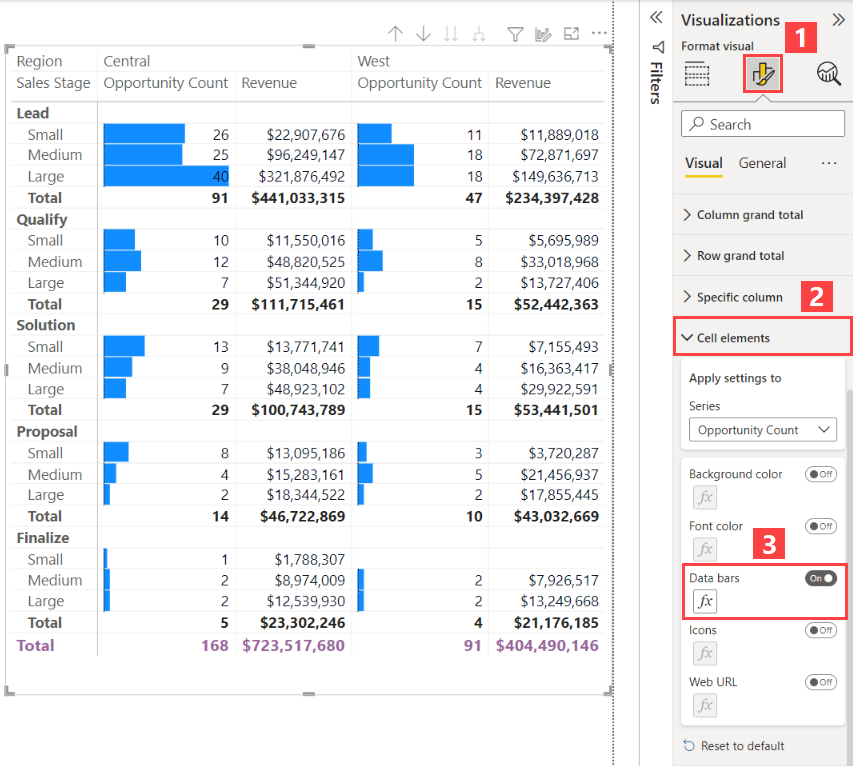
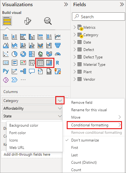
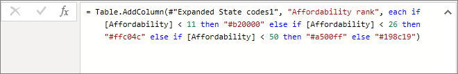
Please note that the URLs provided are for reference and additional information; they should not be included in the study guide.
Visualize and analyze the data (25–30%)
Create reports
Apply Slicing and Filtering in Power BI Reports
Slicing and filtering are essential techniques in Power BI that allow report users to segment and refine the data displayed in reports. These techniques enable the creation of focused and interactive reports that cater to specific analysis needs.
Slicing
Slicing in Power BI is achieved through slicers, which are visual tools that let users filter the data within a report. Slicers can be used to display only the data relevant to a particular aspect, such as a date range, a list of products, or a set of geographical locations.
- Implementation: To add a slicer to a report, you can select the slicer icon from the Visualizations pane and then choose the field you want to use for slicing. For example, if you want to allow users to filter by date, you would add a Date field to the slicer.
- Customization: Slicers can be customized in terms of appearance and behavior. You can choose between different slicer types, such as a list, dropdown, or slider, and configure the slicer to allow single or multiple selections.
- Interactivity: Slicers are interactive and can be connected to other visuals in the report. When a user selects a value in the slicer, other visuals on the report page will automatically update to reflect the filtered data.
Filtering
Filtering in Power BI allows you to limit the data displayed in a visual or report page by specifying criteria. Filters can be applied at different levels: visual-level, page-level, or report-level.
Visual-Level Filters: These filters are applied to a single visual on a report page. They allow you to refine the data shown in that specific visual without affecting other visuals on the page.
Page-Level Filters: These filters apply to all the visuals on a single report page. They are useful when you want to create a report page focused on a particular segment, such as a specific region or product category.
Report-Level Filters: These filters apply to all the pages within a report. They are used to set a consistent view across the entire report, such as filtering out discontinued products from all analyses.
Implementation: To apply filters, you can use the Filters pane in Power BI Desktop. You can drag fields into the different filter buckets (visual, page, or report) and set the desired filter criteria.
Conditional Formatting: Filters can also be used in conjunction with conditional formatting to highlight specific data points or to apply dynamic formatting based on the data.
Interactivity: Filters can be made interactive by using report elements like buttons or images to trigger filter actions, providing a dynamic user experience.
For more detailed guidance on how to apply slicing and filtering in Power BI, you can refer to the following resources:
By mastering slicing and filtering, you can create more engaging and user-friendly reports that empower users to explore data in a meaningful way.
Visualize and analyze the data (25–30%)
Create reports
Configure the Report Page
When configuring a report page in Power BI, there are several key considerations to ensure that the report is both functional and visually appealing. Below are the steps and options available for configuring a report page:
Page Refresh Settings: For reports published to the Power BI service, you can set up automatic page refresh if the data source is DirectQuery. This allows the report to update automatically without manual intervention. The configuration options include turning the page refresh on or off, selecting the refresh type, and providing inputs and information depending on the chosen refresh type. Note that when publishing a report with automatic page refresh from Power BI Desktop to the service, credentials for the DirectQuery data source must be provided in the semantic model settings menu https://learn.microsoft.com/en-us/power-bi/create-reports/desktop-automatic-page-refresh .
Mobile Layout Configuration: When embedding a Power BI report, it’s important to consider the mobile experience. After the initial report load, switching to a mobile layout is only supported if the mobile layout has been set in the initial embedding configuration object. If a report page does not have a ‘MobilePortrait’ layout, it will default to the ‘MobileLandscape’ layout. To navigate between pages in mobile layouts,
report.setPagecan be used to implement custom navigation https://learn.microsoft.com/en-us/javascript/api/overview/powerbi/mobile .Lock Pages in Memory: If there are issues rendering a Power BI report, assigning the “Lock pages in memory” privilege to the service account running Power BI Report Server may resolve the problem. This configuration helps in managing how memory is allocated to the service, which can be critical for performance https://learn.microsoft.com/en-us/power-bi/troubleshoot/../report-server/scheduled-refresh-troubleshoot .
Intune Configuration: Before end users can use the Power BI app on their devices, an Intune admin must add the app to Intune and assign it to users. It’s important to note that after configuring Intune, background data refresh is turned off for the Power BI mobile app. The app will refresh data from the Power BI service when opened https://learn.microsoft.com/en-us/power-bi/admin/service-admin-mobile-intune .
Paginated Reports: For large Power BI paginated reports, it is crucial to configure them to support pagination. Page breaks are enabled by default and should not be disabled for large reports. When a report contains a significant amount of data, it is advisable to choose execution, rendering, and delivery options that can handle large documents. Monitoring the data source for volatility can also inform whether additional steps are needed to manage large reports effectively https://learn.microsoft.com/en-us/power-bi/create-reports/../paginated-reports/report-design/process-large-reports .
For additional information on these topics, you can refer to the following resources: - DirectQuery in Power BI https://learn.microsoft.com/en-us/power-bi/create-reports/desktop-automatic-page-refresh . - Page navigation in Power BI https://learn.microsoft.com/en-us/javascript/api/overview/powerbi/mobile . - Windows privileges for Analysis Services https://learn.microsoft.com/en-us/power-bi/troubleshoot/../report-server/scheduled-refresh-troubleshoot . - What is Intune? https://learn.microsoft.com/en-us/power-bi/admin/service-admin-mobile-intune . - Paginated report considerations https://learn.microsoft.com/en-us/power-bi/create-reports/../paginated-reports/report-design/process-large-reports .
Please ensure that you review these configurations and settings to optimize the performance and usability of your Power BI reports.
Visualize and analyze the data (25–30%)
Create reports
Use the Analyze in Excel Feature
The Analyze in Excel feature in Power BI allows users to create an Excel workbook that contains the entire semantic model from a specific Power BI report. This enables the analysis of the semantic model within Excel using its robust features such as PivotTables, Pivot Charts, and other functionalities.
How to Use Analyze in Excel
To utilize the Analyze in Excel feature, follow these steps:
- Accessing Analyze in Excel:
- Open a Power BI report and select Export > Analyze in Excel from the top ribbon.
- In the workspace containing your Power BI semantic model or report, select More options (…) next to the semantic model or report name and choose Analyze in Excel.
- Select a semantic model in a Power BI workspace and, on the Semantic model details page, select Analyze in Excel on the menu bar.
- Workbook Generation:
- After selecting Analyze in Excel, Power BI generates an Excel workbook and saves it to your OneDrive SharePoint account. The workbook will have the same name as the Power BI report.
- If you do not have a OneDrive SharePoint account, Power BI downloads the Excel workbook to your local computer.
- Opening the Workbook:
- To open the workbook in Excel for the web, choose Open in Excel for the web. Your Excel workbook will open in a separate browser tab.
- To enable the Power BI query in Excel, select Yes on the Query and Refresh Data dialog.
- Once confirmed, you can see the tables and measures from your Power BI semantic model in the PivotTable Fields and start building your PivotTable reports in Excel.
- If you prefer to work with your data in the Excel Desktop app, select the Editing button in the ribbon and choose Open in Desktop app.
Additional Information and Considerations
- Security: Row-level security (RLS) and object-level security (OLS) are supported, ensuring that data access is appropriately restricted https://learn.microsoft.com/en-us/power-bi/collaborate-share/service-analyze-in-excel .
- Data Model Compatibility: Only Power BI semantic models using Import mode preserve hierarchies in PivotTable Fields. DirectQuery or composite models do not retain hierarchies https://learn.microsoft.com/en-us/power-bi/collaborate-share/service-analyze-in-excel .
- Limitations: There are certain limitations, such as the inability to analyze data in Excel for users external to the tenant hosting the Power BI semantic model, and the feature is not supported in Power BI Report Server or Power BI PaaS Embedded, except for Power BI reports in Premium capacities https://learn.microsoft.com/en-us/power-bi/collaborate-share/service-analyze-in-excel .
- Mac Users: Mac users can only use Excel for the web to explore Excel workbooks containing Power BI semantic models https://learn.microsoft.com/en-us/power-bi/collaborate-share/service-analyze-in-excel .
- Column Names and Order: The column name and order in a Power BI visual may not be preserved when data is exported to Excel from that visual https://learn.microsoft.com/en-us/power-bi/collaborate-share/service-analyze-in-excel .
For more detailed information and guidance on using the Analyze in Excel feature, please refer to the following resources:
- Analyze in Excel documentation
- Row-level security (RLS) in Power BI
- Object-level security (OLS) in Power BI
- XMLA endpoint for large datasets
By following the steps and considering the additional information provided, users can effectively use the Analyze in Excel feature to enhance their data analysis capabilities within Excel.
Visualize and analyze the data (25–30%)
Create reports
Choosing When to Use a Paginated Report
Paginated reports are ideal for scenarios where a highly formatted, pixel-perfect output is required, often for operational reporting or printing purposes. These reports are called “paginated” because they are formatted to fit well on a page. They can be printed or shared as PDFs without losing the layout or formatting. Here are some key considerations for choosing to use a paginated report:
Print-Ready Reports: If the requirement is for a report that is optimized for printing, such as invoices, sales reports, or summary reports, paginated reports are the best choice https://learn.microsoft.com/en-us/power-bi/create-reports/../paginated-reports/paginated-reports-samples .
Document Generation: When the goal is to generate documents that need to adhere to precise formats, like forms or checks, paginated reports allow for the control necessary to meet these needs https://learn.microsoft.com/en-us/power-bi/create-reports/../paginated-reports/paginated-reports-samples .
Precise Layout and Formatting: Paginated reports provide the ability to control the report layout down to the pixel, which is essential for detailed and specific formatting requirements https://learn.microsoft.com/en-us/power-bi/create-reports/../paginated-reports/paginated-reports-samples .
Large Datasets: For reports that need to display large amounts of data in a tabular format, paginated reports can handle vast numbers of rows efficiently without compromising performance https://learn.microsoft.com/en-us/power-bi/create-reports/../paginated-reports/subreports-troubleshoot .
Parameterized Reporting: When users need to filter or customize the data in a report based on parameters, paginated reports offer robust parameterization capabilities https://learn.microsoft.com/en-us/power-bi/consumer/end-user-paginated-report .
Scheduled Delivery: Paginated reports can be scheduled to run at specific times, and the results can be delivered to users via email or saved to a shared location https://learn.microsoft.com/en-us/power-bi/consumer/end-user-paginated-report .
Advanced Data Operations: If the report requires advanced data operations such as grouping, sorting, and subreporting, paginated reports provide these features out of the box https://learn.microsoft.com/en-us/power-bi/create-reports/../paginated-reports/subreports-troubleshoot .
Multiple Data Sources: Paginated reports can combine data from different data sources into a single report, which is useful when aggregating data across various systems https://learn.microsoft.com/en-us/power-bi/create-reports/../paginated-reports/paginated-reports-samples .
For additional information on paginated reports and their features, you can refer to the following resources:
- Subreports in Power BI paginated reports
- Bar Charts (Power BI Report Builder)
- Sample Paginated Reports
Remember, the choice between a paginated report and other types of reports should be based on the specific needs of the report consumers and the nature of the data being reported.
Visualize and analyze the data (25–30%)
Enhance reports for usability and storytelling
Configure Bookmarks in Power BI
Bookmarks in Power BI are a powerful feature that allows users to capture the current state of a report page, including all filters and the state of visuals. This capability is essential for creating interactive and user-friendly reports. Here’s a detailed explanation of how to configure bookmarks in Power BI:
Understanding Bookmarks
There are two types of bookmarks in Power BI:
Personal Bookmarks: These are created by individual users to capture their own report states. They are only visible to the user who created them and are not shared when the report is shared https://learn.microsoft.com/en-us/power-bi/consumer/end-user-bookmarks .
Report Bookmarks: These are created by report designers and are included with the report when shared. All users with access to the report can see and use these bookmarks https://learn.microsoft.com/en-us/power-bi/consumer/end-user-bookmarks .
Creating and Applying Bookmarks
To create a bookmark:
- Configure your report page with the desired filters, slicers, and visual states.
- Go to the Bookmarks pane and select ‘Add’ to create a new bookmark.
- Give your bookmark a meaningful name to remember the state it represents.
To apply a bookmark:
- Select the bookmark from the Bookmarks pane to restore the report to the state when the bookmark was created.
Using the Power BI Client APIs
Developers can use the Power BI Client APIs to programmatically capture and apply bookmarks. This is particularly useful when embedding reports for your organization or customers https://learn.microsoft.com/en-us/javascript/api/overview/powerbi/report-bookmarks .
Personal vs. Report Bookmarks
- Personal bookmarks can be created by any viewer of a report in the Power BI service, without needing edit permissions. However, these bookmarks are private and do not travel with the report when shared https://learn.microsoft.com/en-us/power-bi/consumer/end-user-bookmarks .
- Report bookmarks are created by designers and can be used by anyone with access to the report https://learn.microsoft.com/en-us/power-bi/consumer/end-user-bookmarks .
Selection Pane and Bookmarks
The Selection pane in Power BI Desktop and the Power BI service allows you to control the visibility of objects on the report page. When you add a bookmark, the visibility status of each object is saved based on its setting in the Selection pane https://learn.microsoft.com/en-us/power-bi/create-reports/desktop-bookmarks .
Considerations and Limitations
- Bookmarks capture the state of the page at the time they were created. Changes to the report, such as renaming fields, may affect the ability to display the bookmark as originally intended https://learn.microsoft.com/en-us/power-bi/consumer/end-user-bookmarks .
- Custom visuals should generally work with bookmarks, but if issues arise, contact the visual creator for support https://learn.microsoft.com/en-us/power-bi/consumer/end-user-bookmarks .
- Personal bookmarks are not affected by report updates unless major changes are made https://learn.microsoft.com/en-us/power-bi/consumer/end-user-bookmarks .
- Bookmarks are recognized in the Power BI mobile apps, but cannot be created within these apps https://learn.microsoft.com/en-us/power-bi/consumer/end-user-bookmarks .
- You can create up to 20 personal bookmarks for a single report https://learn.microsoft.com/en-us/power-bi/consumer/end-user-bookmarks .
For additional information on bookmarks in Power BI, refer to the following resources:
- Create bookmarks in Power BI Desktop
- Personal bookmarks in Power BI
- Bookmark navigation experience
- Capture report view showcase
By understanding and utilizing bookmarks, you can enhance the interactivity and user experience of your Power BI reports.
Visualize and analyze the data (25–30%)
Enhance reports for usability and storytelling
Create Custom Tooltips in Power BI
Custom tooltips in Power BI are a powerful feature that allows users to provide additional context and detailed information when hovering over data points in a visual. Here’s how you can create and customize tooltips in Power BI Desktop and the Power BI service:
Default Tooltips
By default, when a visualization is created, tooltips display the data point’s value and category. This provides a basic level of information but may not be sufficient for all user needs https://learn.microsoft.com/en-us/power-bi/create-reports/desktop-custom-tooltips .
Customizing Tooltips
To provide more detailed information, you can customize tooltips. This involves specifying additional data points that will be displayed as part of the tooltip when a user hovers over a visual https://learn.microsoft.com/en-us/power-bi/create-reports/desktop-custom-tooltips .
Steps to Create Custom Tooltips
Add Fields to Tooltips Bucket: In the Fields well of the Visualizations pane, drag the desired fields into the Tooltips bucket. You can add multiple fields to display more data points https://learn.microsoft.com/en-us/power-bi/create-reports/desktop-custom-tooltips .
Select Aggregation Function: You can further customize a tooltip by selecting an aggregation function for the field in the Tooltips bucket. Click the arrow beside the field and choose from the available options https://learn.microsoft.com/en-us/power-bi/create-reports/desktop-custom-tooltips .
Quick Measures: In Power BI Desktop, you can also use quick measures for more complex data calculations and aggregations within tooltips https://learn.microsoft.com/en-us/power-bi/create-reports/desktop-custom-tooltips .
Adjust Tooltip Size: Tooltips can be set to adjust their size automatically based on the canvas size. This setting can be found under Report settings in Power BI Desktop and in the Settings pane in the Power BI service https://learn.microsoft.com/en-us/power-bi/create-reports/desktop-custom-tooltips .
Create Report Tooltips: For a more visually rich experience, create a report page in Power BI Desktop that will serve as your tooltip. This custom tooltip can include visuals, images, and other items. Each tooltip page can be associated with one or more fields in your report https://learn.microsoft.com/en-us/power-bi/create-reports/desktop-tooltips .
Advanced Customization
- Visual Tooltips: Explore visual tooltips, which are currently in preview. These tooltips can include drill-down and drill-through actions and can reflect report theme styling https://learn.microsoft.com/en-us/power-bi/create-reports/desktop-tooltips .
For additional information and guidance on customizing tooltips in Power BI, you can refer to the following resources: - Customize tooltips in Power BI Desktop and Power BI service - Creating quick measures in Power BI Desktop - Visual tooltips in Power BI Desktop
By following these steps and utilizing the resources provided, you can create custom tooltips that enhance the user experience by providing insightful and context-rich information directly within your Power BI reports and dashboards.
Visualize and analyze the data (25–30%)
Enhance reports for usability and storytelling
Edit and Configure Interactions Between Visuals
In Power BI, visuals on a report page can interact with each other through cross-filtering and cross-highlighting. By default, selecting an element in one visual will filter or highlight corresponding data in other visuals. However, you can customize these interactions to control how visuals on your report page affect each other.
Customizing Visual Interactions
To edit and configure interactions between visuals, follow these steps:
Select a Visual: Click on the visual you want to set interactions for to make it active.
Access Interaction Controls:
- In Power BI Desktop: Go to the Format ribbon and select Edit interactions https://learn.microsoft.com/en-us/power-bi/create-reports/../visuals/power-bi-visualization-slicers .
- In Power BI Service: Open the report in Editing view, then select the dropdown from the report menu bar to access Visual Interactions https://learn.microsoft.com/en-us/power-bi/create-reports/service-reports-visual-interactions .
Adjust Interactions: Power BI will display filter and highlight icons above other visuals on the report page. You can choose between:
- Filter: The selected visual will filter the data in the other visuals.
- Highlight: The selected visual will highlight related data in the other visuals.
- None: The selected visual will not affect the other visuals https://learn.microsoft.com/en-us/power-bi/create-reports/../visuals/power-bi-visualization-slicers https://learn.microsoft.com/en-us/power-bi/create-reports/service-reports-visual-interactions .
Optimization Presets: You can also use optimization presets for query reduction, which can turn off default cross-highlighting and cross-filtering. This does not affect customizations made at the visual level with Edit interactions https://learn.microsoft.com/en-us/power-bi/create-reports/desktop-optimize-ribbon-scenarios .
Apply Buttons: For slicers, you can add Apply buttons, allowing users to make multiple selections without sending a query until the Apply button is clicked. This helps in managing the data queries and interactions more efficiently https://learn.microsoft.com/en-us/power-bi/create-reports/desktop-optimize-ribbon-scenarios .
Additional Considerations
- Cross-Filtering vs. Cross-Highlighting: The default interaction in Power BI Desktop is cross-highlighting, but you can change it to cross-filtering by adjusting the report settings https://learn.microsoft.com/en-us/power-bi/create-reports/desktop-optimize-ribbon-scenarios .
- Drilling: Drilling down in one visualization does not impact other visuals by default, but this behavior can be changed https://learn.microsoft.com/en-us/power-bi/create-reports/service-reports-visual-interactions .
- Combo Charts: Interactions with combo charts can also be customized using visual interactions https://learn.microsoft.com/en-us/power-bi/create-reports/../visuals/power-bi-visualization-combo-chart .
For more detailed guidance on editing interactions between visuals, refer to the following resources: - Change how visuals interact in a Power BI report https://learn.microsoft.com/en-us/power-bi/create-reports/../visuals/power-bi-visualization-slicers . - Filters and highlighting in Power BI reports https://learn.microsoft.com/en-us/power-bi/create-reports/service-reports-visual-interactions . - Format filters in Power BI reports - Apply filters button https://learn.microsoft.com/en-us/power-bi/create-reports/desktop-optimize-ribbon-scenarios .
By mastering the customization of visual interactions, you can create more dynamic and user-friendly reports that cater to specific analytical needs.
Visualize and analyze the data (25–30%)
Enhance reports for usability and storytelling
Configure Navigation for a Report
When designing a Power BI report, it’s essential to provide an intuitive navigation system that guides users through the insights and data presented. Here’s how to configure navigation for a Power BI report:
Page Navigation Buttons: Utilize page navigation buttons to create a seamless flow between different pages of your report. These buttons can be strategically placed to guide the user through the report’s story or insights. For example, you can add a button on each page that returns the user to the home or summary page of the report. This is particularly useful in multi-page reports https://learn.microsoft.com/en-us/power-bi/consumer/end-user-buttons .
Action Type - Page Navigation: You can create a button that directly links to another page in your report by setting the Type of an Action to Page navigation. This method does not require creating bookmarks and is a straightforward way to link pages https://learn.microsoft.com/en-us/power-bi/create-reports/desktop-buttons .
Conditional Formatting for Tooltips: Optionally, you can enhance the user experience by conditionally formatting the Tooltip that appears when hovering over the navigation button. This can provide additional context or instructions to the user https://learn.microsoft.com/en-us/power-bi/create-reports/desktop-buttons .
Page and Bookmark Navigators: For a more comprehensive navigation experience, consider creating page and bookmark navigators. This approach allows you to build a custom navigation pane for the report, which can be more dynamic than individual buttons. It’s a way to manage the entire navigation experience without the need to save or manage bookmarks https://learn.microsoft.com/en-us/power-bi/create-reports/desktop-buttons .
For additional information and step-by-step instructions on setting up navigation in Power BI reports, you can refer to the following resources:
- To learn more about creating and using page navigation buttons in Power BI, visit: Create and use page navigation buttons in Power BI https://learn.microsoft.com/en-us/power-bi/consumer/end-user-buttons .
- For guidance on setting up a single-page navigation button, see: Set up a single-page navigation button in Power BI https://learn.microsoft.com/en-us/power-bi/create-reports/desktop-buttons .
- To explore building an entire navigation experience with page and bookmark navigators, check out: Create page and bookmark navigators in Power BI https://learn.microsoft.com/en-us/power-bi/create-reports/desktop-buttons .
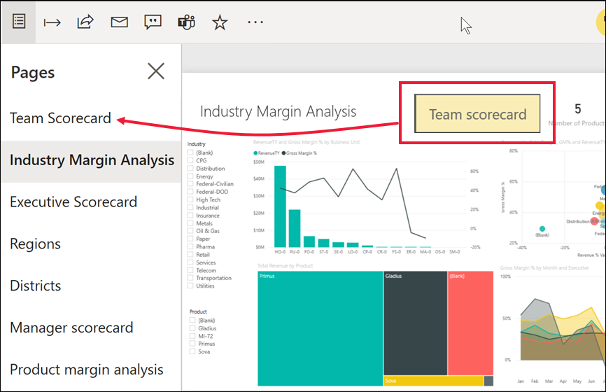
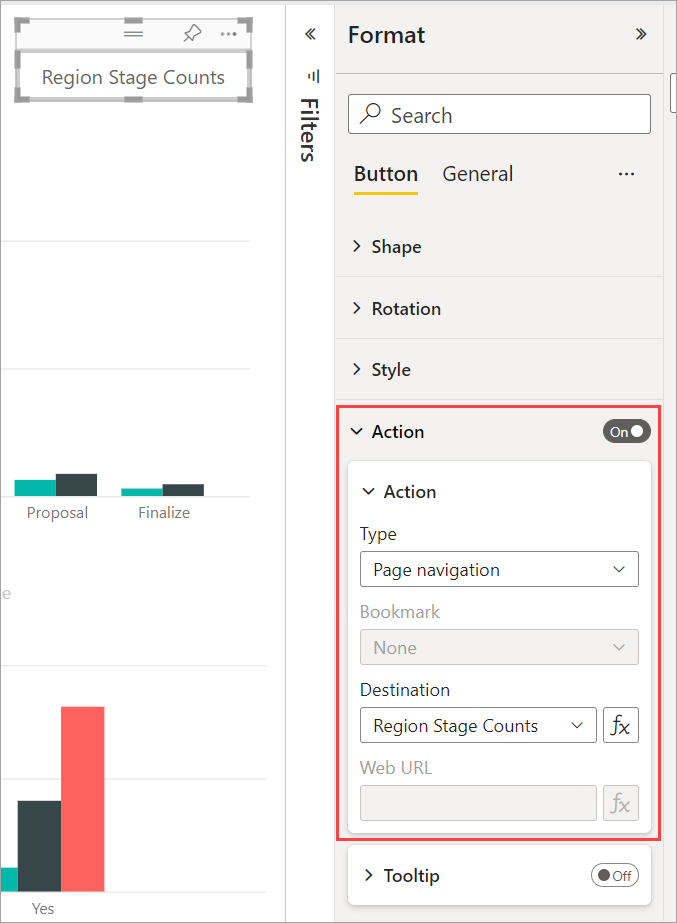
By following these steps and utilizing the provided resources, you can effectively configure navigation within your Power BI reports, enhancing the user experience and making your data insights more accessible.
Visualize and analyze the data (25–30%)
Enhance reports for usability and storytelling
Apply Sorting in Power BI
Sorting in Power BI is a fundamental feature that allows users to organize data within visuals to emphasize the most relevant information. Whether dealing with numeric or text data, Power BI offers a variety of ways to sort data to best convey the intended message.
Sorting Visuals by Different Data Fields
In Power BI, you can change the appearance of a visual by sorting it
using different data fields. This flexibility is crucial for
highlighting key insights. For instance, sales figures can be sorted to
show top-performing products or regions, while text data like state
names can be sorted alphabetically or by another criterion relevant to
the analysis. The visual.sortBy API is available for
programmatically changing the sort order of a visual by one of its data
fields, and you can control the direction of the sort as well https://learn.microsoft.com/en-us/javascript/api/overview/powerbi/sort-visuals-by
.
Sorting Data in a Data Region
When working with categories on the x-axis, they appear in the order they are returned in the result set. However, you can modify this order by adding a SORT command to the query or by using an expression to sort the dataset. This sorting applies to chart data regions and is consistent across all other data regions https://learn.microsoft.com/en-us/power-bi/create-reports/../paginated-reports/report-design/visualizations/format-axis-labels-chart-report-builder .
Sorting Without Edit Permissions
For users of the Power BI service without edit permissions for a report or semantic model, sorting is still available to highlight important information. Most visuals can be sorted by one or two fields, although some, like treemaps and filled maps, do not support sorting. After sorting a visual, users can save a personalized version of the report with their sort order changes https://learn.microsoft.com/en-us/power-bi/consumer/end-user-change-sort .
Sorting by a Field Not Included in the Visual
There are scenarios where you might need to sort data by a field that isn’t displayed in the visual. For example, sorting months in sequential order rather than alphabetically, or sorting numbers as whole numbers instead of by individual digits. To sort by a different field in the semantic model, edit permissions are required. Report designers can address sorting issues by creating new columns in the semantic model https://learn.microsoft.com/en-us/power-bi/consumer/end-user-change-sort .
Controlling Sort Order
To control the sort order of data in your report, you can sort data in a dataset query, define a sort expression for a data region or group, or add interactive sort buttons to tables and matrices. These methods can be combined within the same report. While most aggregate function results are not affected by sort order, functions like First, Last, and Previous are exceptions https://learn.microsoft.com/en-us/power-bi/create-reports/../paginated-reports/report-design/filter-group-sort-data-report-builder .
For additional information on sorting in Power BI, you can refer to the following resources: - [Change how a chart is sorted in a Power BI report] https://learn.microsoft.com/en-us/javascript/api/overview/powerbi/sort-visuals-by - [Sort Data in a Data Region (Power BI Report Builder)] https://learn.microsoft.com/en-us/power-bi/create-reports/../paginated-reports/report-design/visualizations/format-axis-labels-chart-report-builder - [Sort one column by another column in Power BI] https://learn.microsoft.com/en-us/power-bi/consumer/end-user-change-sort https://learn.microsoft.com/en-us/power-bi/consumer/end-user-change-sort - [Aggregate functions reference (Power BI Report Builder)] https://learn.microsoft.com/en-us/power-bi/create-reports/../paginated-reports/report-design/filter-group-sort-data-report-builder
By understanding and applying these sorting techniques, you can significantly enhance the clarity and impact of your Power BI reports.
Visualize and analyze the data (25–30%)
Enhance reports for usability and storytelling
Configure Sync Slicers
In Power BI, slicers are a type of filter that can be used on report pages to allow users to select and visualize data that meets certain criteria. Sync slicers are a powerful feature that enables slicers to be synchronized across multiple pages within a report. This means that when a user makes a selection in a slicer on one page, it can automatically apply to slicers on other pages that are linked through the sync slicers feature.
How to Configure Sync Slicers
- Accessing Sync Slicers Pane:
- In Power BI Desktop, go to the View ribbon and select Sync slicers.
- In the Power BI service, on the View menu, set the Sync slicers pane to On. The Sync slicers pane will appear between the Filters and Visualizations panes https://learn.microsoft.com/en-us/power-bi/create-reports/../visuals/power-bi-visualization-slicers .
- Syncing a Slicer Across Pages:
- Select the slicer you wish to sync on the report page.
- In the Sync slicers pane, check the boxes under the Sync column for the pages you want the slicer to be in sync with.
- To make the slicer visible on other pages, check the boxes under the Visible column for those pages https://learn.microsoft.com/en-us/power-bi/create-reports/../visuals/power-bi-visualization-slicers .
- Syncing Multiple Slicers:
- To sync two or more separate slicers, mark them as part of a group in the Sync slicers pane.
- Expand Advanced options and enter a name for the group in the group name box for each slicer you want to sync.
- Select the appropriate options for syncing, such as Sync filter changes to other slicers or Sync field changes to other slicers, depending on your needs https://learn.microsoft.com/en-us/power-bi/create-reports/../visuals/power-bi-visualization-slicers .
Considerations and Limitations
- Sync slicers work well with composite models and can be used without relying on cross-source group relationships https://learn.microsoft.com/en-us/power-bi/create-reports/../visuals/power-bi-visualization-slicers .
- Sync slicers do not support tuple slicers and only support a single filter for out-of-the-box slicers https://learn.microsoft.com/en-us/javascript/api/overview/powerbi/control-report-slicers .
- There is no API to change the slicers’ sync configuration https://learn.microsoft.com/en-us/javascript/api/overview/powerbi/control-report-slicers .
- Changes to the field names used by slicers can affect the functionality of bookmarks related to those slicers.
Additional Information
For more detailed steps and visual guidance on configuring sync slicers, you can refer to the following resources: - Power BI Desktop: Power BI Desktop - Power BI Service: Power BI service
By configuring sync slicers, report designers can create a more interactive and consistent experience for report users, allowing them to filter data across multiple report pages efficiently.
Please note that the URLs provided are placeholders and should be replaced with actual links to the Power BI documentation for sync slicers when used in the study guide.
Visualize and analyze the data (25–30%)
Enhance reports for usability and storytelling
Group and Layer Visuals Using the Selection Pane
When creating reports in Power BI, organizing visuals effectively is crucial for both design and functionality. The Selection pane is a powerful tool that allows you to manage visuals in your reports by grouping and layering them.
Grouping Visuals
To create a cohesive and organized report, you can group related visuals together. Here’s how you can create a group of visuals:
- Click on the first visual on the canvas.
- Hold the
CTRLkey and select additional visuals you want to include in the group. - Go to the Format menu, choose Group, and then select Group from the submenu.
Groups are then displayed in the Selection pane. You can create multiple groups as needed, and even nest groups within other groups. For example, you might have a “Statistics” group and a “Tools” group nested under a “Header” group. To manage these groups:
- Expand a group by clicking the caret beside the group name.
- Collapse it by clicking the caret again.
- Drag and drop individual visuals to include them in a group or remove them from a group.
- Nest a group or remove a group from a nest by dragging the group to the desired location.
To rename a group, double-click the group name in the Selection pane and type the new name. To ungroup, select the group, right-click, and choose “ungroup” from the context menu https://learn.microsoft.com/en-us/power-bi/create-reports/desktop-grouping-visuals .
Layering Visuals
Layering, or managing the z-order of visuals, determines which visuals appear on top of others when they overlap. You can adjust the layering of visuals using the Selection pane:
- Access the Selection pane from the View menu by turning it on.
- In the Selection pane, you’ll see a list of visuals and groups. The order in this list reflects their layering on the report page.
- To change the order, drag a visual or group to a new position, or use the up and down arrows to move the selected item https://learn.microsoft.com/en-us/power-bi/create-reports/desktop-gridlines-snap-to-grid .
The Selection pane also allows you to hide or show visuals by clicking the eye icon next to each visual or group. This can be useful for managing the visibility of certain elements without deleting them https://learn.microsoft.com/en-us/power-bi/create-reports/desktop-gridlines-snap-to-grid https://learn.microsoft.com/en-us/power-bi/create-reports/buttons-apply-all-clear-all-slicers .
Accessibility Features
The Selection pane is designed with accessibility in mind:
- Navigate through the pane using the tab key.
- Use the left and right arrow keys to switch between layer order and tab order.
- Activate the Selection pane by pressing
F6and then use the up and down arrow keys to navigate between objects. - Hide or show an object with
Ctrl + Shift + S. - Move an object up in the layer order with
Ctrl + Shift + F. - Move an object down in the layer order with
Ctrl + Shift + B. - Multi-select objects with
Ctrl + Spacehttps://learn.microsoft.com/en-us/power-bi/create-reports/desktop-accessibility-creating-tools .
By mastering the use of the Selection pane to group and layer visuals, you can create more structured and visually appealing reports in Power BI.
For additional information and visual aids on how to use the Selection pane, you can refer to the following resources: - Manage the z-order of report visuals in Power BI - Group or ungroup visuals in a report
Visualize and analyze the data (25–30%)
Enhance reports for usability and storytelling
Drill Down into Data Using Interactive Visuals
Interactive visuals in Power BI provide a dynamic way to explore and understand complex datasets by allowing users to drill down into more specific layers of data. This feature is particularly useful for uncovering hidden details and gaining insights that might not be immediately apparent at higher levels of data aggregation.
How to Use Drill Down in Power BI:
Enable Drill Down: To use the drill down feature, you must first enable it on the visual you are working with. This can be done by selecting the visual and then clicking on the drill down icon.
Selecting the Data Point: Once the drill down feature is enabled, you can select a specific data point within the visual. For example, if you are looking at sales data by region, you could select a particular region to see more detailed data, such as sales by city within that region https://learn.microsoft.com/en-us/power-bi/create-reports/desktop-visual-tooltips .
Drilling Down: After selecting the data point, you can drill down to view the next level of data hierarchy related to that point. This could mean going from viewing data by quarters to viewing it by months, or from categories to subcategories, depending on the data structure https://learn.microsoft.com/en-us/power-bi/create-reports/desktop-visual-tooltips .
Interactive Exploration: Fully interactive visuals allow users to explore their data further by drilling down into the report for more details on each aspect. This can be done without having to use the right-click menu or the visual’s header, making the process more intuitive and user-friendly https://learn.microsoft.com/en-us/power-bi/connect-data/service-connect-to-salesforce .
Using AI Visuals: Some AI visuals, like the decomposition tree, can automatically aggregate data and enable drilling down into dimensions in any order. They can also suggest the next dimension to drill down into based on certain criteria, aiding in ad hoc exploration and root cause analysis https://learn.microsoft.com/en-us/power-bi/consumer/../visuals/power-bi-visualization-types-for-reports-and-q-and-a .
Benefits of Drill Down:
- Detailed Analysis: Provides a granular view of the data, which is essential for detailed analysis and decision-making.
- Insight Discovery: Helps in discovering insights that are not visible at the aggregated level.
- Interactive Reports: Makes reports more interactive and engaging for the end-users, allowing them to explore data at their own pace.
Additional Resources:
For more information on how to effectively use drill down and other interactive features in Power BI, you can refer to the following resources:
- Power BI Visualization Types for Reports and Q&A: Power BI Visualization Types
- Power BI Desktop Visual Tooltips: Visual Tooltips in Power BI
By mastering the drill down feature, users can significantly enhance their ability to navigate and understand complex datasets, leading to more informed business decisions.
Visualize and analyze the data (25–30%)
Enhance reports for usability and storytelling
Configure Export of Report Content and Perform an Export
When preparing reports in Power BI, it is often necessary to share insights with stakeholders in various formats. Configuring the export of report content and performing an export are essential skills for effectively disseminating information. Below is a detailed explanation of how to configure and execute this process:
- Configure Export Settings:
- In Power BI, you can configure the export settings for a report to control how the report content will be exported. This includes setting up options for exporting to different file formats such as Excel, PowerPoint, and PDF files.
- It is important to note that when exporting data to Excel, PDF, or PowerPoint, Power BI automatically applies a sensitivity label to the exported file, if one is present, and protects it according to the label’s file encryption settings https://learn.microsoft.com/en-us/power-bi/enterprise/service-security-sensitivity-label-overview .
- Performing an Export:
- To export a report, navigate to the report in the Power BI service and select the desired export option. You can export the report content to file formats supported by Power BI, such as Excel, PowerPoint, and PDF.
- When using the “Download the .pbix” option in the Power BI service, the more restrictive label between the report and its semantic model will be applied to the .pbix file https://learn.microsoft.com/en-us/power-bi/enterprise/service-security-sensitivity-label-overview .
- Keep in mind that sensitivity labels and protection are not applied when exporting to .csv files or any other unsupported export paths https://learn.microsoft.com/en-us/power-bi/enterprise/service-security-sensitivity-label-overview .
- Handling Export Failures:
- If an export fails because a sensitivity label cannot be applied, you will see a message indicating “Sensitivity label can’t be loaded” in the info dropdown. This could be due to a temporary system issue or because the applied label has been unpublished or deleted by the security admin https://learn.microsoft.com/en-us/power-bi/enterprise/service-security-sensitivity-label-overview .
- Additional Export Capabilities:
- Power BI also allows for the configuration of other export-related features, such as bookmarks, custom tooltips, and the design of reports for mobile devices https://learn.microsoft.com/en-us/credentials/certifications/resources/study-guides/pl-300 https://learn.microsoft.com/en-us/credentials/certifications/resources/study-guides/pl-300 .
- For paginated reports, you can use the Word rendering extension to export reports to the Microsoft Word format (.docx), which is particularly useful for creating document-style reports https://learn.microsoft.com/en-us/power-bi/create-reports/../paginated-reports/report-builder/export-microsoft-word-report-builder .
For more detailed instructions on how to configure and perform exports in Power BI, you can refer to the following resources: - Export reports (Power BI Report Builder) https://learn.microsoft.com/en-us/power-bi/create-reports/../paginated-reports/report-builder/export-microsoft-word-report-builder . - When Office apps apply content marking and encryption https://learn.microsoft.com/en-us/power-bi/enterprise/service-security-sensitivity-label-overview .
By understanding and utilizing these export features, you can ensure that your reports are shared securely and efficiently, maintaining the integrity of sensitive data.
Visualize and analyze the data (25–30%)
Enhance reports for usability and storytelling
Design Reports for Mobile Devices
When designing reports for mobile devices, it is essential to create an experience that is optimized for smaller screens and touch interactions. Power BI offers a suite of features to help you design mobile-friendly reports that are both functional and visually appealing.
Mobile Layout View
Power BI provides a mobile layout view which allows you to create mobile-optimized reports using an interactive phone emulator canvas. This view enables you to:
- Drag and drop visuals onto the canvas.
- Test how buttons, slicers, and visuals will behave on mobile devices.
- Select, rearrange, and reformat visuals specifically for mobile users, ensuring the report views are focused and easy to navigate on mobile devices https://learn.microsoft.com/en-us/power-bi/create-reports/power-bi-create-mobile-optimized-report-about https://learn.microsoft.com/en-us/training/modules/power-bi-effective-user-experience/9-reports-mobile .
Formatting Pane (Preview)
The formatting pane in Power BI allows you to:
- Precisely format your report visuals.
- Change format settings to enhance readability and usability on mobile devices https://learn.microsoft.com/en-us/power-bi/create-reports/power-bi-create-mobile-optimized-report-about .
Optimized Visuals and Slicers
Power BI supports:
- Visuals and slicers that are specifically optimized for small, mobile screens.
- The ability to use and rearrange these elements to create an effective mobile user experience https://learn.microsoft.com/en-us/power-bi/create-reports/power-bi-create-mobile-optimized-report-about https://learn.microsoft.com/en-us/training/modules/power-bi-effective-user-experience/9-reports-mobile .
Publishing Mobile-Optimized Reports
Once you have created a mobile-optimized report:
- Publish the main report as usual.
- The web and mobile versions are published simultaneously, ensuring users have access to both formats https://learn.microsoft.com/en-us/training/modules/power-bi-effective-user-experience/9-reports-mobile .
Embedding Mobile Layouts in Web Applications
If you have created a mobile layout in Power BI Desktop or Power BI service:
- You can embed the report with this layout into your web application, providing a seamless experience for mobile users https://learn.microsoft.com/en-us/javascript/api/overview/powerbi/mobile .
Additional Features for Mobile Reports
In addition to the mobile-specific features, Power BI also allows you to:
- Configure bookmarks, custom tooltips, and interactions between visuals.
- Apply sorting, configure sync slicers, and group and layer visuals using the Selection pane.
- Drill down into data using interactive visuals and configure the export of report content https://learn.microsoft.com/en-us/credentials/certifications/resources/study-guides/pl-300 .
Best Practices and Further Reading
For best practices and additional guidance on creating or working with mobile-optimized reports and dataflows, refer to the following resources:
- Mobile layout view
- Best practices when working with Power Query
- Best practices for designing and developing complex dataflows
- Best practices for reusing dataflows across environments and workspaces
- Best practices for creating a dimensional model using dataflows
- Configure Power BI Premium dataflow workloads
- Optimize Power Query when expanding table columns
- Power Query query folding
- Using the data profiling tools
- Dealing with errors in Power Query
- Schema view
- Using incremental refresh with dataflows
By following these guidelines and utilizing the features provided by Power BI, you can create reports that are not only informative but also tailored to the needs of mobile users.
Visualize and analyze the data (25–30%)
Identify patterns and trends
Use the Analyze Feature in Power BI
The Analyze feature in Power BI is a powerful tool that allows users to explore and perform ad-hoc analysis directly within the Power BI service or in Microsoft Excel. This feature provides a seamless integration with Excel, enabling users to work with Power BI data using familiar Excel tools and functionalities.
Analyze in Excel
To leverage the full capabilities of Excel for data analysis, Power BI offers the “Analyze in Excel” option. This feature allows you to create Excel PivotTables or tables that are connected to live Power BI datasets. The steps to use this feature are as follows:
- In the Power BI service, locate the dataset you wish to analyze.
- Select the option to “Analyze in Excel.”
- Install the required OLAP drivers if prompted.
- Open the downloaded .odc file with Excel, which will create a live connection to the Power BI dataset.
- Use Excel’s PivotTable or table tools to slice, dice, and analyze the data.
For more information on how to use the Analyze in Excel feature, you can visit the following URL: Analyze in Excel https://learn.microsoft.com/en-us/power-bi/collaborate-share/service-analyze-in-excel .
Export to Excel with Live Connection
Another way to analyze Power BI data in Excel is by exporting the data with a live connection. This method ensures that the data in Excel is always up-to-date with the Power BI service. Here’s how to do it:
- From the Power BI service, choose the report or dataset you want to analyze.
- Use the “Export to Excel” option to create an Excel workbook with a live connection to the Power BI data.
- Analyze the data in Excel as needed, with the assurance that any updates in Power BI will reflect in Excel.
Create Connected PivotTables and Tables in Excel
Power BI also allows you to create connected PivotTables and tables directly in Excel using an add-in. This add-in facilitates a direct connection to Power BI datasets, enabling you to perform complex analyses using Excel’s robust features. To use this feature:
- Install the Power BI Excel add-in from the Office Store.
- Connect to the Power BI dataset from within Excel.
- Create PivotTables and tables as you normally would in Excel.
By using the Analyze feature in Power BI, users can take advantage of Excel’s advanced analytical capabilities while maintaining a live connection to their Power BI datasets. This integration provides a flexible and powerful environment for data analysis, catering to a wide range of business intelligence needs.
Visualize and analyze the data (25–30%)
Identify patterns and trends
Use Grouping, Binning, and Clustering in Power BI
Grouping, binning, and clustering are powerful features in Power BI that allow you to organize and analyze your data more effectively. Here’s a detailed explanation of each:
Grouping
Grouping in Power BI lets you combine data points into categories that make sense for your analysis. This can simplify visuals and make them easier to understand. To create a group:
- Select two or more elements on a visual using Ctrl+Select.
- Right-click one of the selected elements, scroll to Group, and choose Group from the context menu https://learn.microsoft.com/en-us/power-bi/create-reports/desktop-grouping-and-binning .
- The new group will appear in the Fields list and can be added to the Legend well for the visual with (groups) appended https://learn.microsoft.com/en-us/power-bi/create-reports/desktop-grouping-and-binning .
- You can edit the group by right-clicking it in the Legend well or Fields list and selecting Edit groups https://learn.microsoft.com/en-us/power-bi/create-reports/desktop-grouping-and-binning .
Binning
Binning is the process of dividing your data into a series of intervals, or bins, which can be particularly useful for numerical or time fields. This helps in visualizing the distribution of data across a set range. To use binning:
- Right-click a Field in Power BI Desktop and choose New group https://learn.microsoft.com/en-us/power-bi/create-reports/desktop-grouping-and-binning .
- In the Groups dialog box, set the Bin size to your desired size https://learn.microsoft.com/en-us/power-bi/create-reports/desktop-grouping-and-binning .
- A new field with (bins) appended will appear in the Fields pane, which you can drag onto the canvas to use in a visual https://learn.microsoft.com/en-us/power-bi/create-reports/desktop-grouping-and-binning .
Clustering
Clustering is an advanced analytics feature that groups similar data points together based on their characteristics. This is particularly useful when you have a large dataset and want to identify patterns or relationships. Power BI uses machine learning algorithms to perform clustering, which can be accessed through the analytics pane in scatter charts and other visuals.
For additional information on these features, you can refer to the following resources:
These features enable you to present your data in a more structured and insightful way, enhancing the overall analytical capabilities of your Power BI reports.
Visualize and analyze the data (25–30%)
Identify patterns and trends
Incorporating the Q&A Feature in a Power BI Report
The Q&A feature in Power BI is a powerful tool that allows users to explore their data using natural language queries. This feature can be utilized in reports to enable interactive data exploration and visualization. Here’s how to incorporate the Q&A feature into a Power BI report:
- Adding a Q&A Visual: Report designers can add a
Q&A visual to their reports, which allows users to type in questions
and receive answers in the form of visuals. To add a Q&A visual,
follow these steps:
- In Power BI Desktop or the Power BI service, navigate to the report where you want to add the Q&A visual.
- Select the “Insert” tab and then choose the “Q&A” option.
- Click on the report canvas to place the Q&A visual.
- Users can now start typing natural language questions within the Q&A box and see the visualizations update in real-time https://learn.microsoft.com/en-us/power-bi/create-reports/../consumer/end-user-q-and-a https://learn.microsoft.com/en-us/power-bi/create-reports/../consumer/end-user-q-and-a .
- Using a Q&A Button: Alternatively, a Q&A
button can be added to a report, which opens the Power BI Q&A
Explorer window when selected. This is how you can add a Q&A button:
- Ensure you have edit permissions for the report.
- Go to the “Insert” tab and select “Buttons” followed by “Q&A”.
- Place the button on the report canvas.
- When users click the Q&A button, the Q&A Explorer window will appear, allowing them to ask questions and generate visuals https://learn.microsoft.com/en-us/power-bi/create-reports/../consumer/end-user-q-and-a https://learn.microsoft.com/en-us/power-bi/create-reports/power-bi-tutorial-q-and-a .
- Interacting with Q&A: Once the Q&A feature
is incorporated into a report, users can interact with it by:
- Typing questions into the Q&A box or Q&A Explorer window.
- The Q&A feature will interpret the question and present the best visual representation of the answer.
- Users can refine their questions to get more precise answers or explore different aspects of the data.
- Customizing Q&A: Report creators can customize
the Q&A experience by:
- Defining synonyms for terms in the dataset to improve the Q&A’s understanding of user queries.
- Adjusting the Q&A setup to recognize specific terms or phrases that are relevant to the dataset.
- Exploration Only: It’s important to note that visuals created using the Q&A button are for exploration purposes only. They cannot be saved to the report or dashboard. The Q&A button is available only in Reading mode https://learn.microsoft.com/en-us/power-bi/create-reports/power-bi-tutorial-q-and-a .
For additional information and detailed guides on how to use and customize the Q&A feature in Power BI, you can refer to the following resources: - Use Q&A on a dashboard - Use Q&A in a report - Create a Q&A visual on a dashboard - Add a Q&A visual in a report - Q&A virtual analyst in Power BI iOS apps - Q&A in Power BI embedded analytics
By incorporating the Q&A feature into a Power BI report, users can leverage the convenience of natural language to interact with their data, making data analysis more accessible and intuitive.
Visualize and analyze the data (25–30%)
Identify patterns and trends
Use AI Visuals in Power BI
AI visuals in Power BI leverage machine learning to provide insights and interactive experiences within reports. These visuals are designed to make complex data analysis more accessible to report consumers. Here are the main AI visuals available in Power BI:
Key Influencers
The Key Influencers visual helps identify what factors influence a particular metric. It analyzes your data, ranks the factors that matter, and displays them as key influencers. This visual is particularly useful for understanding the drivers behind a metric’s increase or decrease.
Decomposition Tree
The Decomposition Tree allows users to break down a metric into its contributing factors in a hierarchical manner. It can be used to explore data across various dimensions and to understand the contribution of different factors to the overall metric. The AI aspect of this visual can automatically find and highlight the most significant data points based on the analysis https://learn.microsoft.com/en-us/training/modules/perform-analytics-power-bi/9-use-specialized-visuals .
Q&A
The Q&A feature enables users to ask natural language questions about their data and receive answers in the form of visuals. This AI-powered feature interprets the questions and generates appropriate visuals to represent the answers, making data exploration intuitive and user-friendly.
Tips for Using AI Visuals: - Ensure that AI visuals are sized appropriately on the report page to allow full interaction and exploration by the report consumers https://learn.microsoft.com/en-us/training/modules/perform-analytics-power-bi/9-use-specialized-visuals . - AI levels in the Decomposition Tree can be recalculated based on cross-filtering with other visuals, providing dynamic insights into how different factors affect the metric https://learn.microsoft.com/en-us/power-bi/create-reports/../visuals/power-bi-visualization-decomposition-tree . - It is possible to chain multiple AI levels in the Decomposition Tree, but a non-AI level cannot follow an AI level https://learn.microsoft.com/en-us/power-bi/create-reports/../visuals/power-bi-visualization-decomposition-tree .
For additional information on AI visuals in Power BI, you can refer to the following resources: - Organizational visuals now generally available https://learn.microsoft.com/en-us/power-bi/fundamentals/desktop-latest-update-archive - Power BI visuals documentation https://learn.microsoft.com/en-us/power-bi/fundamentals/desktop-latest-update-archive - Decomposition Tree visual documentation https://learn.microsoft.com/en-us/power-bi/create-reports/../visuals/power-bi-visualization-decomposition-tree - Q&A Explorer https://learn.microsoft.com/en-us/power-bi/fundamentals/desktop-latest-update-archive
By incorporating these AI visuals into your reports, you can enhance the data exploration experience, making it easier for users to derive meaningful insights from complex datasets.
Visualize and analyze the data (25–30%)
Identify patterns and trends
Use of Reference Lines, Error Bars, and Forecasting in Power BI
Reference Lines
Reference lines in Power BI are dynamic lines that can be added to visuals to provide context and enhance data comprehension. They can represent statistical measures such as minimum, maximum, average, median, and specific percentiles, or they can be constant values on the X or Y axis. These lines help users to quickly assess how individual data points relate to the rest of the data.
To add a reference line, you can use the Analytics pane in Power BI Desktop. Here’s how you can do it:
- Select or create a visual and then click on the Analytics icon in the Visualizations section.
- Choose the type of reference line you want to add (e.g., Average line, Min line, Max line) and click + Add.
- Customize the line by setting its color, transparency, style, and position. You can also decide whether to include a data label.
It’s important to note that not all types of lines are available for every visual type https://learn.microsoft.com/en-us/power-bi/transform-model/desktop-analytics-pane .
Error Bars
Error bars are not directly mentioned in the provided documents, but they are typically used in data visualization to represent the variability of data and can indicate the error or uncertainty in a reported measurement. They can show standard deviation, standard error, confidence intervals, or the range of data. In Power BI, error bars can be added to visuals such as bar charts or line charts to provide a visual representation of the variability of the data.
Forecasting
Forecasting in Power BI allows you to predict future values based on historical data. This feature is particularly useful when working with time-series data. To use forecasting, follow these steps:
- Select a line chart visual.
- Expand the Forecast section in the Analytics pane.
- Set the forecast parameters, such as Forecast length and Confidence interval.
The forecasting feature is only available for line chart visuals and is a powerful tool for making predictions and planning for future trends https://learn.microsoft.com/en-us/power-bi/transform-model/desktop-analytics-pane .
For more information on these features, you can refer to the following resources: - R visuals in Power BI - Analytics pane and dynamic reference lines - Forecasting capabilities in Power BI
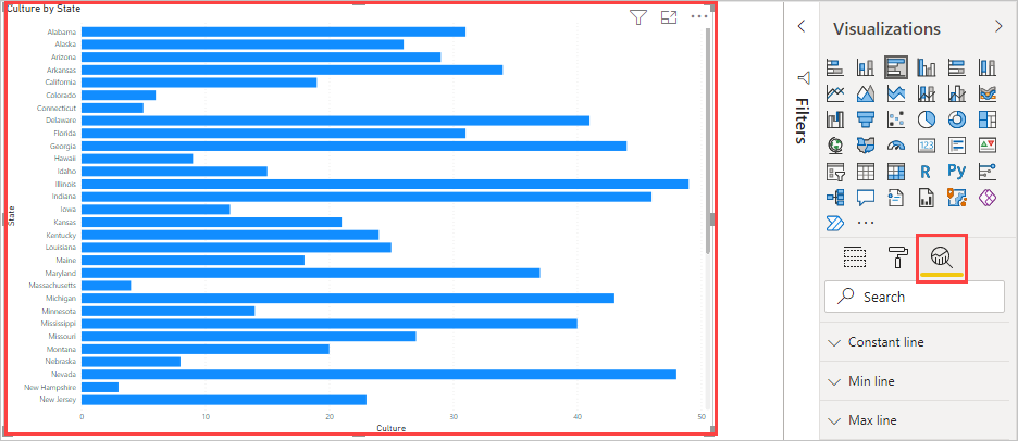
By incorporating reference lines, error bars, and forecasting into your Power BI reports, you can enhance the analytical value of your visuals, making it easier to interpret complex data and make informed decisions.
Visualize and analyze the data (25–30%)
Identify patterns and trends
Detecting Outliers and Anomalies in Power BI
Outliers and anomalies are data points that deviate significantly from the rest of the data. Detecting these can be crucial for identifying errors, unusual behavior, or new trends in your data. Power BI provides features to help users detect outliers and anomalies in both time series and non-time series data.
Outliers in Non-Time Series Data
Power BI uses a clustering model to identify outliers in non-time series data. This model is designed to detect when specific categories have values that are significantly different from other categories. For example, if you have sales data across different regions, Power BI can help you spot a region with sales figures that are unusually high or low compared to the rest https://learn.microsoft.com/en-us/power-bi/consumer/end-user-insight-types .
Outliers in Time Series Data
For time series data, Power BI can pinpoint specific dates or times where the values are significantly different from other date/time values. This is particularly useful for identifying seasonal effects, sudden spikes, or drops in time-dependent data such as sales over time or website traffic https://learn.microsoft.com/en-us/power-bi/consumer/end-user-insight-types .
Visuals and Data Sampling
When dealing with visuals that contain more data points than Power BI can render, the platform samples the data to show the overall shape and outliers. This allows users to still gain insights from large datasets without compromising on the detection of significant deviations https://learn.microsoft.com/en-us/power-bi/consumer/end-user-glossary .
Power BI Features for Detecting Outliers and Anomalies
- Analyze Feature: Utilize the Analyze feature in Power BI to automatically find and highlight outliers in your data https://learn.microsoft.com/en-us/credentials/certifications/resources/study-guides/pl-300 https://learn.microsoft.com/en-us/credentials/certifications/resources/study-guides/pl-300 .
- Grouping, Binning, and Clustering: These techniques help in organizing data in a way that makes it easier to spot anomalies and outliers https://learn.microsoft.com/en-us/credentials/certifications/resources/study-guides/pl-300 https://learn.microsoft.com/en-us/credentials/certifications/resources/study-guides/pl-300 .
- AI Visuals: Power BI offers AI-powered visuals that can assist in identifying unusual data points https://learn.microsoft.com/en-us/credentials/certifications/resources/study-guides/pl-300 https://learn.microsoft.com/en-us/credentials/certifications/resources/study-guides/pl-300 .
- Reference Lines and Error Bars: Adding reference lines or error bars to visuals can help in quickly spotting data points that fall outside of the expected range https://learn.microsoft.com/en-us/credentials/certifications/resources/study-guides/pl-300 https://learn.microsoft.com/en-us/credentials/certifications/resources/study-guides/pl-300 .
- Forecasting: Forecasting can be used to predict future values based on historical data, and any significant deviations from these forecasts could be considered anomalies.
Additional Resources
For more information on how to use these features in Power BI, you can refer to the following resources:
- Power BI documentation on detecting outliers in non-time series data: Outliers in Non-Time Series Data
- Power BI documentation on detecting outliers in time series data: Outliers in Time Series Data
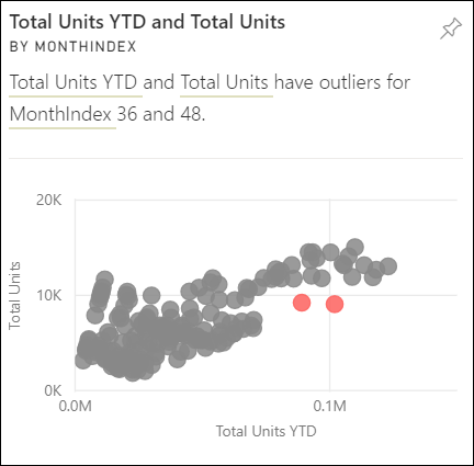
By leveraging these tools and techniques within Power BI, users can effectively monitor their data for any irregularities that may indicate important insights or areas that require further investigation.
Visualize and analyze the data (25–30%)
Identify patterns and trends
Create and Share Scorecards and Metrics
Scorecards and metrics are essential tools in Power BI that allow users to track and measure performance against goals. Creating and sharing scorecards involves several steps and considerations, which are outlined below:
Creating Scorecards
Access to Workspace: To create a scorecard, you must have either a contributor or owner role in the Power BI workspace. This is necessary to ensure that you have the appropriate permissions to create and manage scorecards within the workspace https://learn.microsoft.com/en-us/power-bi/create-reports/service-goals-introduction .
Metric-Level Permissions: Scorecards in Power BI can have metric-level permissions. This means that while workspace permissions allow users to view or build within the workspace, metric-level permissions can be set to restrict access to specific metrics. This allows for granular control over who can see and interact with certain metrics within a scorecard https://learn.microsoft.com/en-us/power-bi/create-reports/service-goals-introduction .
Using Power BI Features: When creating scorecards, you can utilize various Power BI features such as AI visuals, reference lines, error bars, forecasting, and the detection of outliers and anomalies. These features enhance the scorecards by providing advanced analytics and visualizations https://learn.microsoft.com/en-us/credentials/certifications/resources/study-guides/pl-300 https://learn.microsoft.com/en-us/credentials/certifications/resources/study-guides/pl-300 .
Sharing Scorecards
Scorecard Distribution: Once a scorecard is created, it can be shared with other users within the organization. Sharing can be done through Power BI service by granting access to the scorecard to other workspace members.
Metric-Level Access Control: When sharing scorecards, you can control access at the metric level. This means you can specify which users or groups can see certain metrics and perform check-ins within the scorecard. This is particularly useful for maintaining confidentiality and ensuring that users only see the metrics relevant to them https://learn.microsoft.com/en-us/power-bi/create-reports/service-goals-introduction .
Additional Resources
For more detailed information on roles in workspaces and how to manage them, you can visit the following URL: - Roles in Workspaces
To learn more about setting metric-level permissions in scorecards, refer to the following URL: - Metric-Level Permissions in Scorecards
By following these guidelines, you can effectively create and share scorecards and metrics in Power BI, enabling your team to monitor and analyze performance data efficiently. Remember to always check for the latest updates and best practices on the official Power BI documentation to ensure you are using the most current features and security measures.
Deploy and maintain assets (15–20%)
Create and manage workspaces and assets
Create and Configure a Workspace in Power BI
Creating and configuring a workspace in Power BI is a fundamental task for organizing and managing your Power BI assets, such as reports, dashboards, datasets, and dataflows. Here’s a detailed explanation of the steps involved:
- Create a Workspace:
- Sign in to Power BI Service.
- In the left navigation pane, select ‘Workspaces’.
- Click ‘Create a workspace’.
- Enter the name for the workspace and add a description if necessary.
- Set the workspace’s privacy level to either ‘Public’ or ‘Private’.
- Add members and assign roles such as Admin, Member, Contributor, or Viewer.
- Configure Workspace Settings:
- Once the workspace is created, you can configure its settings by clicking on ‘Settings’ within the workspace.
- Here, you can update the workspace name, description, and privacy settings.
- You can also manage the list of members and their permissions.
- Assign Workspace Roles:
- Assign appropriate roles to workspace members to control their level of access and actions they can perform within the workspace.
- Roles include:
- Admin: Full control over the workspace, including member management.
- Member: Can publish, edit, and delete content.
- Contributor: Can publish and edit content.
- Viewer: Can view content but cannot edit or share.
- Publish and Manage Assets:
- Publish reports, dashboards, and datasets to the workspace from Power BI Desktop or by uploading .pbix files.
- Update or delete existing assets as needed.
- Distribution and Security:
- Choose how to distribute content, either by sharing directly with users, through apps, or by publishing to the web.
- Apply sensitivity labels to workspace content to ensure data governance and compliance.
- Configure Subscriptions and Alerts:
- Set up data alerts for reports in the workspace.
- Configure subscriptions to receive regular updates from reports and dashboards.
- Content Promotion and Certification:
- Promote or certify Power BI content to signify reports and dashboards that are official and endorsed by the organization.
- Global Options for Files:
- Manage global settings for files in the workspace, such as export and sharing options.
For additional information on creating and configuring a workspace in Power BI, you can refer to the following resources:
Remember, the ability to create and configure workspaces effectively allows for better collaboration and management of Power BI content within an organization. It is essential to understand the various settings and options available to tailor the workspace to your team’s needs.
Deploy and maintain assets (15–20%)
Create and manage workspaces and assets
Assign Workspace Roles in Power BI
In Power BI, workspaces are collaborative environments where teams can work together on dashboards, reports, and other content. Assigning workspace roles is a crucial aspect of managing access and permissions within these workspaces. There are four primary roles that can be assigned to users or user groups: Admin, Member, Contributor, and Viewer.
Admin: Users with the Admin role have full control over the workspace. They can manage the workspace settings, add or remove members, publish reports, and more. Admins have the ability to edit all content within the workspace and manage roles for other users.
Member: Members have significant permissions within the workspace, including the ability to edit content, but they cannot change workspace settings. This role is suitable for users who need to contribute to and edit Power BI content but do not require full administrative control.
Contributor: Contributors can publish, update, and delete content within the workspace. This role is designed for users who are actively developing reports and dashboards but do not need to manage other users or the workspace settings.
Viewer: Viewers can view and interact with content in the workspace but cannot edit or create new content. Even if Viewers are given Build permissions to the semantic model, Row-Level Security (RLS) still applies, ensuring that their view of the data is restricted appropriately https://learn.microsoft.com/en-us/power-bi/create-reports/../enterprise/service-admin-rls .
It is important to note that the RLS roles are applied to members who are assigned to the Viewer role in the workspace. Workspace members with Admin, Member, or Contributor roles have edit permissions for the semantic model, and therefore, RLS does not apply to them https://learn.microsoft.com/en-us/power-bi/create-reports/../enterprise/service-admin-rls .
To assign workspace roles, navigate to the workspace where you want to manage roles, select “Access” from the workspace settings, and then add or remove individuals or groups as needed. Remember that everyone in a user group gets the role that you’ve assigned, and if someone is in several user groups, they get the highest level of permission from the roles they’re assigned https://learn.microsoft.com/en-us/power-bi/collaborate-share/service-roles-new-workspaces .
For more detailed information on workspace roles and permissions in Power BI, you can refer to the following resources: - Roles in workspaces https://learn.microsoft.com/en-us/power-bi/create-reports/../enterprise/service-admin-rls https://learn.microsoft.com/en-us/power-bi/create-reports/service-interact-with-a-report-in-editing-view https://learn.microsoft.com/en-us/power-bi/collaborate-share/service-roles-new-workspaces https://learn.microsoft.com/en-us/power-bi/create-reports/service-interact-quick-report - Workspaces in Power BI https://learn.microsoft.com/en-us/power-bi/collaborate-share/service-roles-new-workspaces - Give users access to workspaces https://learn.microsoft.com/en-us/power-bi/collaborate-share/service-roles-new-workspaces
Understanding and correctly assigning workspace roles is essential for maintaining the security and integrity of Power BI content, as well as ensuring that users have the appropriate level of access to perform their tasks effectively.
Deploy and maintain assets (15–20%)
Create and manage workspaces and assets
Configure and Update a Workspace App
When configuring and updating a workspace app in Power BI, there are several key steps and considerations to ensure that the app reflects the most current and accurate data, as well as adhering to organizational requirements.
Configuration Steps:
Create and Configure a Workspace: Initially, you need to create a workspace in Power BI and configure it according to your organization’s needs. This includes assigning appropriate workspace roles to team members and setting up the workspace environment https://learn.microsoft.com/en-us/credentials/certifications/resources/study-guides/pl-300 .
Publish and Manage Assets: Once the workspace is configured, you can publish, import, or update various assets such as reports, dashboards, and datasets within the workspace. It’s important to manage these assets effectively to maintain an organized and efficient workspace https://learn.microsoft.com/en-us/credentials/certifications/resources/study-guides/pl-300 .
Apply Sensitivity Labels: Sensitivity labels can be applied to workspace content to control access and maintain data governance standards. These labels help in ensuring that sensitive information is handled appropriately within the workspace https://learn.microsoft.com/en-us/credentials/certifications/resources/study-guides/pl-300 .
Distribution Method: Choose a suitable distribution method for the workspace content. This could involve setting up subscriptions, data alerts, or configuring other sharing options to distribute the content to the intended audience https://learn.microsoft.com/en-us/credentials/certifications/resources/study-guides/pl-300 .
Update Steps:
Assign Update Permissions: Workspace admins can grant users with the Contributor role the ability to update the organizational app for the workspace. This permission allows designated contributors to make necessary updates to the app https://learn.microsoft.com/en-us/power-bi/troubleshoot/known-issues/known-issue-571-contributor-can-not-update-organizational-app .
Update the App: After making changes to the reports, dashboards, or semantic models in the workspace, it is crucial to update the app to apply these changes. Overwriting updates the workspace content but not the app navigation, setup, and permissions. It is important to remember to update the app after overwriting to ensure that the changes are reflected for all users https://learn.microsoft.com/en-us/power-bi/connect-data/service-template-apps-install-distribute .
Handle Sample Data During Refresh: When updating the app, an automatic semantic model refresh starts, and during this refresh, the app presents sample data. Users will not see the new data until the refresh is complete, and they will see sample data during this time https://learn.microsoft.com/en-us/power-bi/connect-data/service-template-apps-install-distribute .
Manage New Versions: If a new version of the app is released, the update process may vary. For apps obtained from the organization, updates are typically automatic. For template apps from AppSource, users will be notified of the new version and can select “Get it” to update. It’s important to note that installing a new version overwrites any changes made to the app’s reports and dashboards unless they are saved under a different name or location https://learn.microsoft.com/en-us/power-bi/consumer/end-user-app-view .
For additional information on configuring and updating workspace apps in Power BI, you can refer to the following resources: - Configure and update a workspace app - Manage your workspace in Power BI - What is Intune?
By following these steps and considerations, you can effectively configure and update a workspace app in Power BI, ensuring that it serves the needs of your organization and remains up-to-date with the latest information and features.
Deploy and maintain assets (15–20%)
Create and manage workspaces and assets
Publish, Import, or Update Assets in a Workspace
When managing assets within a Power BI workspace, there are several key actions that can be taken to ensure that the workspace remains up-to-date and functional for all users. These actions include publishing, importing, or updating assets. Below is a detailed explanation of each process:
Publishing Assets
Publishing assets to a Power BI workspace typically involves the use of Power BI Desktop. When you create a report (.pbix file) in Power BI Desktop, you can publish it directly to a workspace in the Power BI service. This action creates a new report and dataset in the workspace. If the published file has the same name as an existing asset, you will be prompted to either replace the existing asset or cancel the publish action https://learn.microsoft.com/en-us/power-bi/admin/service-security-apply-data-sensitivity-labels .
Importing Assets
Importing assets can refer to bringing in different types of files or content packs into a Power BI workspace. For example, you can import Power BI reports (.pbix), Excel workbooks (.xlsx), or paginated reports (.rdl) into your workspace. This is done through the Power BI service interface, where you can upload files directly or connect to files stored in services like OneDrive or SharePoint https://learn.microsoft.com/en-us/power-bi/admin/service-security-apply-data-sensitivity-labels .
Updating Assets
Updating assets in a workspace can involve several different actions. For example, if you have made changes to a report in Power BI Desktop, you can republish the .pbix file to update the report in the workspace. Additionally, if you have paginated reports (.rdl files) that have been migrated from an SSRS server, you can update these reports by republishing the updated .rdl files to the Power BI workspace https://learn.microsoft.com/en-us/power-bi/create-reports/../guidance/publish-reporting-services-power-bi-service .
It is important to note that when you publish or update assets, any sensitivity labels associated with the .pbix files will be applied to the assets in the Power BI service. If there is a conflict between the labels of the new and existing assets, you will have the option to choose which labels to retain https://learn.microsoft.com/en-us/power-bi/admin/service-security-apply-data-sensitivity-labels .
For more information on these processes, you can refer to the following URLs: - Publish to Power BI from Power BI Desktop - Importing and uploading data into Power BI - Migrate .rdl reports to Power BI - Using sensitivity labels with Power BI
Remember to follow best practices when managing assets in a Power BI workspace, such as assigning appropriate workspace roles, applying sensitivity labels to content, and configuring subscriptions and data alerts to keep users informed of changes and updates https://learn.microsoft.com/en-us/credentials/certifications/resources/study-guides/pl-300 .
Deploy and maintain assets (15–20%)
Create and manage workspaces and assets
Create Dashboards
Creating dashboards in Power BI is a process that involves the organization and presentation of visualizations to convey insights effectively. Dashboards are a collection of tiles, which are visual representations of the data from reports. Here’s a step-by-step guide to creating dashboards:
Understand Semantic Models: Before creating a dashboard, it’s essential to understand the semantic models that provide the data. Semantic models are data sources that report designers use to create visualizations. They can be based on various data sources like Excel workbooks, SQL Server Analysis Services datasets, or Google Analytics datasets https://learn.microsoft.com/en-us/power-bi/consumer/end-user-basic-concepts .
Explore Sample Dashboards: To get comfortable with dashboard creation, explore sample dashboards provided by Power BI. These samples can give you an idea of how to structure your dashboard and what kind of visualizations work best for different types of data https://learn.microsoft.com/en-us/power-bi/create-reports/service-dashboards https://learn.microsoft.com/en-us/power-bi/create-reports/sample-procurement .
Add and Arrange Tiles: Dashboard tiles can be reports, images, videos, or web content. You can add tiles to your dashboard by pinning them from reports or creating them directly on the dashboard. Arrange the tiles in a way that tells a story or allows the viewer to understand the data at a glance https://learn.microsoft.com/en-us/power-bi/create-reports/service-dashboards .
Set Data Alerts: Power BI allows you to set data alerts on tiles. This feature enables you to receive email notifications when the data reaches a certain threshold, ensuring that you are always aware of significant changes in your data https://learn.microsoft.com/en-us/power-bi/create-reports/service-dashboards .
Use Power BI Q&A: Utilize the Power BI Q&A feature to ask questions about your data in natural language and receive answers in the form of visualizations. This can be a powerful tool for dashboard users to explore data without needing to create new reports or visualizations https://learn.microsoft.com/en-us/power-bi/create-reports/service-dashboards https://learn.microsoft.com/en-us/power-bi/consumer/end-user-q-and-a .
Design Best Practices: Consider design best practices when creating your dashboard. This includes choosing the right visualizations, organizing content for readability, and ensuring that the dashboard is accessible and understandable to your audience. You can find design tips from experts like Marco Russo of SQLBI.com https://learn.microsoft.com/en-us/power-bi/create-reports/service-dashboards-design-tips .
Save and Share: Once your dashboard is complete, you can share it with others by granting permissions or sharing the entire app. Remember that viewers of the dashboard cannot alter the underlying semantic model, which ensures data integrity https://learn.microsoft.com/en-us/power-bi/consumer/end-user-basic-concepts .
For additional information and resources on creating dashboards in Power BI, you can visit the following URLs:
- Learn about dashboard tiles
- Create an alert on a tile
- Use Power BI Q&A
- Samples for Power BI
- Use Q&A on a dashboard
By following these steps and utilizing the resources provided, you can create informative and interactive dashboards that will help you and your organization make data-driven decisions.
Deploy and maintain assets (15–20%)
Create and manage workspaces and assets
When preparing study materials for understanding distribution methods in Power BI, it’s important to consider the various ways in which Power BI content can be shared and distributed. Choosing the right distribution method is crucial for ensuring that the right people have access to the reports and insights they need, in a manner that aligns with the organization’s security, governance, and compliance requirements.
Distribution Methods in Power BI
Power BI offers several distribution methods, each with its own set of features and use cases:
Publish to Web: This method allows you to create a public link or embed code for your Power BI report, which can then be shared with anyone on the internet. This is the easiest way to share your content, but it is also the least secure as anyone with the link can view it.
Power BI Apps: You can package dashboards, reports, Excel workbooks, and datasets into a Power BI app and distribute them to the entire organization or specific people within the organization. This method provides a more controlled environment for distributing content.
Shared Dashboards and Reports: You can share your dashboards and reports directly with other users within your organization. The recipients can view and interact with the shared content, but they cannot edit it.
Power BI Service: The Power BI service allows for secure distribution within an organization. Users can access reports and dashboards through the Power BI service, with permissions managed by the report owner.
Email Subscriptions: Users can subscribe to reports and dashboards to receive regular updates via email. This method ensures that users are always up-to-date with the latest data.
Export to PDF or PowerPoint: Reports can be exported to PDF or PowerPoint files, which can then be distributed outside of Power BI. This is a static snapshot of the data at the time of export.
Print the Report: For physical distribution, reports can be printed directly from Power BI.
Secure Embed Codes: For secure embedding in internal web portals or applications, Power BI provides embed codes that respect the data security and permissions of the Power BI service.
When choosing a distribution method, consider the following factors:
- Audience: Who needs to access the report?
- Security: What level of data security is required?
- Interactivity: Do users need to interact with the report, or is a static view sufficient?
- Frequency: How often does the data need to be updated?
- Compliance: Are there any compliance requirements that affect how data can be shared?
For additional information on distribution methods in Power BI, you can refer to the official documentation provided by Microsoft:
- Publish to web from Power BI
- Distribute to large audiences with Power BI apps
- Share Power BI dashboards and reports with coworkers and others
- Subscribe yourself and others to reports and dashboards in Power BI
By understanding these distribution methods and considering the factors mentioned above, you can ensure that your Power BI content is shared effectively and securely within your organization.
Deploy and maintain assets (15–20%)
Create and manage workspaces and assets
Apply Sensitivity Labels to Workspace Content in Power BI
When working with Power BI, it’s crucial to ensure that sensitive data is adequately protected. Sensitivity labels are a feature in Power BI that allows you to classify and protect your organization’s data based on its sensitivity. These labels can be applied to various Power BI content, including reports, dashboards, semantic models, and dataflows within a workspace.
Requirements for Applying Sensitivity Labels
To apply sensitivity labels to workspace content in Power BI, the following requirements must be met:
Power BI License: Users must possess either a Power BI Pro or Premium Per User (PPU) license and have edit permissions on the content they wish to label https://learn.microsoft.com/en-us/power-bi/collaborate-share/../enterprise/service-security-apply-data-sensitivity-labels https://learn.microsoft.com/en-us/power-bi/admin/service-security-apply-data-sensitivity-labels https://learn.microsoft.com/en-us/power-bi/collaborate-share/../enterprise/service-security-apply-data-sensitivity-labels .
Sensitivity Labels Configuration: Sensitivity labels must be enabled for your organization. This setting is typically managed by the Power BI administrator https://learn.microsoft.com/en-us/power-bi/collaborate-share/../enterprise/service-security-apply-data-sensitivity-labels https://learn.microsoft.com/en-us/power-bi/admin/service-security-apply-data-sensitivity-labels https://learn.microsoft.com/en-us/power-bi/collaborate-share/../enterprise/service-security-apply-data-sensitivity-labels .
Security Group Membership: Users must be part of a security group with the permissions to apply sensitivity labels. Details on how to enable this can be found in the official documentation https://learn.microsoft.com/en-us/power-bi/collaborate-share/../enterprise/service-security-apply-data-sensitivity-labels https://learn.microsoft.com/en-us/power-bi/admin/service-security-apply-data-sensitivity-labels https://learn.microsoft.com/en-us/power-bi/collaborate-share/../enterprise/service-security-apply-data-sensitivity-labels .
Licensing and Other Requirements: All additional licensing and requirements outlined in the Power BI documentation must be satisfied https://learn.microsoft.com/en-us/power-bi/collaborate-share/../enterprise/service-security-apply-data-sensitivity-labels https://learn.microsoft.com/en-us/power-bi/admin/service-security-apply-data-sensitivity-labels https://learn.microsoft.com/en-us/power-bi/collaborate-share/../enterprise/service-security-apply-data-sensitivity-labels .
Steps to Apply Sensitivity Labels
To apply sensitivity labels to workspace content, follow these steps:
Create or Navigate to a Workspace: Begin by creating a new workspace or navigating to an existing one where you have the necessary permissions https://learn.microsoft.com/en-us/credentials/certifications/resources/study-guides/pl-300 .
Select Content: Choose the reports, dashboards, semantic models, or dataflows to which you want to apply the sensitivity label https://learn.microsoft.com/en-us/power-bi/collaborate-share/../enterprise/service-security-apply-data-sensitivity-labels https://learn.microsoft.com/en-us/power-bi/admin/service-security-apply-data-sensitivity-labels .
Apply the Label: From the settings or more options menu (‘…’), select the option to apply a sensitivity label and choose the appropriate label for the content https://learn.microsoft.com/en-us/credentials/certifications/resources/study-guides/pl-300 .
Save Changes: Ensure that you save any changes made to the content to retain the applied sensitivity label.
Additional Considerations
Inheritance from Data Sources: Sensitivity labels can be inherited from data sources if certain conditions are met, such as the data being labeled with sensitivity labels from Microsoft Purview Information Protection and the scope of the labels being set to Files, emails, and Azure Purview assets https://learn.microsoft.com/en-us/power-bi/enterprise/service-security-sensitivity-label-troubleshooting .
Supported Workspaces and Models: Inheritance is not supported for semantic models in classic workspaces. It is only supported in My Workspace and V2 workspaces, and for semantic models with enhanced metadata using the Import data connectivity mode https://learn.microsoft.com/en-us/power-bi/enterprise/service-security-sensitivity-label-troubleshooting .
Connectivity Limitations: Inheritance from data sources is not supported for Live connection and DirectQuery connectivity modes, nor is it supported in connections via gateways or Azure Virtual Network (VNet) https://learn.microsoft.com/en-us/power-bi/enterprise/service-security-sensitivity-label-troubleshooting .
For more detailed information and guidance on applying sensitivity labels in Power BI, refer to the following resources:
- Purchasing Power BI Pro or PPU License https://learn.microsoft.com/en-us/power-bi/collaborate-share/../enterprise/service-security-apply-data-sensitivity-labels https://learn.microsoft.com/en-us/power-bi/admin/service-security-apply-data-sensitivity-labels https://learn.microsoft.com/en-us/power-bi/collaborate-share/../enterprise/service-security-apply-data-sensitivity-labels
- Enable Sensitivity Labels in Power BI https://learn.microsoft.com/en-us/power-bi/collaborate-share/../enterprise/service-security-apply-data-sensitivity-labels https://learn.microsoft.com/en-us/power-bi/admin/service-security-apply-data-sensitivity-labels https://learn.microsoft.com/en-us/power-bi/collaborate-share/../enterprise/service-security-apply-data-sensitivity-labels
- Using Enhanced Dataset Metadata https://learn.microsoft.com/en-us/power-bi/enterprise/service-security-sensitivity-label-troubleshooting
By following these guidelines and utilizing the provided resources, you can effectively apply sensitivity labels to your Power BI workspace content, ensuring that your data is classified and protected according to your organization’s data governance policies.
Deploy and maintain assets (15–20%)
Create and manage workspaces and assets
Configure Subscriptions and Data Alerts in Power BI
Subscriptions and data alerts in Power BI are essential features that allow users to stay informed about changes in their data and reports. Here’s a detailed explanation of how to configure these features:
Subscriptions
Subscriptions in Power BI give users the ability to receive regular updates on published reports or dashboards. Users can set up a subscription to get an email when the data is refreshed or at a specific frequency (daily, weekly, etc.).
To configure a subscription: 1. Navigate to the report or dashboard you want to subscribe to. 2. Select the ‘Subscribe’ option. 3. Choose the frequency of the updates. 4. Configure additional options, such as the specific pages of the report you are interested in. 5. Save the subscription to start receiving updates.
Data Alerts
Data alerts notify users when certain conditions are met in the data. For example, an alert can be set to trigger when sales drop below a certain threshold or when inventory levels exceed a set limit. Alerts can be set on tiles pinned from report visuals or from Power BI Q&A, and only on gauges, KPIs, and cards https://learn.microsoft.com/en-us/power-bi/consumer/end-user-alerts .
To configure data alerts: 1. Go to the dashboard that contains the tile you want to set an alert on. 2. Click on the ellipsis (…) on the top right of the tile and select ‘Manage alerts’. 3. Set the conditions for the alert, such as the threshold value and the direction (above or below). 4. Configure the alert frequency and the email addresses to notify. 5. Save the alert to activate it.
Please note that alerts only work on data that is refreshed. When data refreshes, Power BI checks if an alert is set for that data. If the data has reached an alert threshold, an alert is triggered https://learn.microsoft.com/en-us/power-bi/consumer/end-user-alerts .
For additional information on configuring subscriptions and data alerts in Power BI, you can refer to the following resources: - Set alerts in Power BI service - Create a data alert in Power BI
By utilizing subscriptions and data alerts, users can automate the monitoring of their Power BI content and receive timely notifications that enable them to act on their data proactively.
Deploy and maintain assets (15–20%)
Create and manage workspaces and assets
Promote or Certify Power BI Content
In Power BI, content promotion and certification are processes that help users and organizations identify and rely on the most authoritative and trusted reports, dashboards, and datasets. Here’s a detailed explanation of both:
Promotion
Promotion is a way to highlight content that is valuable and should be recognized by others in the organization. When content is promoted, it is marked as such, making it easier for users to find and use it as a trusted resource. To promote content, you typically need to have edit permissions on the workspace where the content resides.
- Promote Semantic Models: Semantic models are data models that provide a structured and meaningful representation of the data, making it easier for end-users to understand and analyze. Promoting a semantic model signals to users that it is of high quality and recommended for use https://learn.microsoft.com/en-us/power-bi/collaborate-share/service-endorse-content .
Certification
Certification takes promotion a step further by indicating that the content not only is recommended but also meets the organization’s quality standards and is reliable for decision-making. Certification is typically controlled by a select group of authorized reviewers within the organization, as defined by the Power BI administrator.
- Certify Semantic Models: To certify a semantic model, an authorized reviewer must evaluate it against the organization’s quality standards. Once certified, the content is marked with a certification badge, signaling its reliability and authority https://learn.microsoft.com/en-us/power-bi/collaborate-share/service-endorse-content .
Endorsement Visibility
Endorsed content, whether promoted or certified, is clearly identified in Power BI, making it easier for users to find and select high-quality content when building reports https://learn.microsoft.com/en-us/power-bi/collaborate-share/service-endorsement-overview .
Discoverability
If enabled by the organization, endorsed semantic models can be made discoverable, allowing users who do not have access to them to find and request access. This feature enhances collaboration and the sharing of valuable resources within the organization https://learn.microsoft.com/en-us/power-bi/collaborate-share/service-endorse-content .
Requesting Certification
Content owners who wish to have their content certified but are not authorized to certify it themselves must follow their organization’s process for requesting certification. This often involves submitting the content for review by the authorized reviewers https://learn.microsoft.com/en-us/power-bi/collaborate-share/service-endorse-content .
Governance
Organizations can govern the use of semantic models across workspaces to ensure that only high-quality, endorsed content is used for decision-making https://learn.microsoft.com/en-us/power-bi/connect-data/service-datasets-across-workspaces .
For more detailed information on promoting and certifying Power BI content, including the specific steps and guidelines, you can refer to the following resources:
- Endorsement: Promoting and certifying Power BI content https://learn.microsoft.com/en-us/power-bi/transform-model/dataflows/dataflows-develop-solutions .
- Promote content https://learn.microsoft.com/en-us/power-bi/connect-data/service-datasets-across-workspaces .
- Certify content if you’re an authorized reviewer https://learn.microsoft.com/en-us/power-bi/connect-data/service-datasets-across-workspaces .
- Request certification if you’re not an authorized reviewer https://learn.microsoft.com/en-us/power-bi/connect-data/service-datasets-across-workspaces .
- Govern the use of semantic models across workspaces https://learn.microsoft.com/en-us/power-bi/connect-data/service-datasets-across-workspaces .
By following these practices, organizations can ensure that their Power BI environment fosters a culture of trust and data-driven decision-making.
Deploy and maintain assets (15–20%)
Create and manage workspaces and assets
Manage Global Options for Files in Power BI Desktop
Managing global options for files in Power BI Desktop is an essential skill for effectively working with Power BI reports and datasets. Global options allow users to configure settings that apply to all Power BI Desktop files, ensuring consistency and efficiency in how Power BI handles data and reports. Here’s a detailed explanation of how to manage these options:
Auto Date/Time Configuration
Auto date/time is a feature in Power BI Desktop that can be set globally or for the current file. The global setting affects all new Power BI Desktop files, while the current file setting applies only to the file you are working on.
- Global Configuration: To configure auto date/time
globally, navigate to
File > Options and settings > Options. Under the Global tab, find the Data Load section. Here, you can enable or disable the “Auto date/time for new files” option https://learn.microsoft.com/en-us/power-bi/transform-model/desktop-auto-date-time . - Current File Configuration: Similarly, for the current file, go to the same location and select the Current File tab. Adjust the auto date/time setting as needed. Be cautious when disabling this feature, as it will remove auto date/time tables from the model, which may require fixing any broken report filters or visuals https://learn.microsoft.com/en-us/power-bi/transform-model/desktop-auto-date-time .
Clearing Cache
To ensure that Power BI Desktop performs optimally, you may
occasionally need to clear the cache. This can be done by going to
File > Options and settings > Options. Under the
GLOBAL section, select Data Load and
then choose Clear Cache https://learn.microsoft.com/en-us/power-bi/create-reports/desktop-troubleshoot-publish
.
R Scripting Options
For users who incorporate R scripts into their Power BI reports, it’s important to verify that Power BI Desktop has correctly enabled R.
- Go to
File > Options and settings > Options. - Under Global, select R scripting.
- In the R script options, check that the Detected R home directories field points to the correct local R installation path https://learn.microsoft.com/en-us/power-bi/create-reports/desktop-r-visuals .
Important: Power BI Desktop and the Power BI service currently support R version 3.4.4. Ensure that your local R installation matches this version to avoid compatibility issues https://learn.microsoft.com/en-us/power-bi/create-reports/desktop-r-visuals .
By understanding and managing these global options, you can tailor Power BI Desktop to your preferences and workflow, leading to a more streamlined and efficient data analysis process.
For additional information on configuring global options in Power BI Desktop, you can refer to the following resources:
- Auto Date/Time Configuration: Auto date/time in Power BI Desktop
- Clearing Cache: Clear Cache in Power BI Desktop
- R Scripting Options: R visuals in Power BI Desktop
Deploy and maintain assets (15–20%)
Manage datasets
Identify When a Gateway is Required
When working with Power BI and managing data refreshes, it is essential to understand when a gateway is necessary. A gateway acts as a bridge, facilitating secure data transfer between on-premises data sources and Power BI service. Here are the scenarios where a gateway is required:
On-Premises Data Sources: If your reports and dashboards are based on Direct Query or Live Connect to on-premises data sources, a gateway is needed to enable data refreshes https://learn.microsoft.com/en-us/power-bi/admin/service-admin-failover .
Multiple Data Sources: When your Power BI Desktop file contains multiple data sources, and not all of them are configured with the gateway, you must ensure each data source is defined within the gateway to enable it for scheduled refresh https://learn.microsoft.com/en-us/power-bi/connect-data/service-gateway-onprem-tshoot .
Mismatch in Server and Database Names: The server and database names entered in Power BI Desktop must match those configured for the gateway. If there is a discrepancy, a gateway may not be visible for scheduled refreshes https://learn.microsoft.com/en-us/power-bi/connect-data/service-gateway-onprem-tshoot .
User Permissions: Your account must be listed under the Users tab of the data source within the gateway configuration. If you are not added, you will not be able to use the gateway for data refreshes https://learn.microsoft.com/en-us/power-bi/connect-data/service-gateway-onprem-tshoot .
Version Requirements: The gateway version must be February 2021 or later. It is recommended to install the gateway on a separate computer from Power BI Report Builder or Power BI Desktop to avoid potential issues https://learn.microsoft.com/en-us/power-bi/create-reports/../paginated-reports/paginated-reports-odbc-support .
For additional information on troubleshooting refresh scenarios and understanding when a gateway is required, you can refer to the following resources:
Remember to verify that the gateway version is up to date and that the report has a gateway selected. If there is no gateway selected, the data source might have changed or might be missing https://learn.microsoft.com/en-us/power-bi/troubleshoot/../connect-data/refresh-troubleshooting-refresh-scenarios . In case of a service disruption, the gateway configuration remains unchanged, and normal functions resume once the Power BI instance returns to its original state https://learn.microsoft.com/en-us/power-bi/admin/service-admin-failover .
Deploy and maintain assets (15–20%)
Manage datasets
Configure a Dataset Scheduled Refresh
To ensure that reports and dashboards reflect the most current data, it is essential to configure a dataset for scheduled refresh in Power BI. The following steps outline the process to set up a refresh schedule for a Power BI dataset that is connected to an on-premises SQL Server database through a data gateway:
- Accessing the Workspace:
- Navigate to the left pane and expand My Workspace.
- Locating the Dataset:
- In the Semantic models section, locate the AdventureWorksProducts dataset. Click on the Open menu (three vertical dots icon) and select Schedule refresh.
- Ensure you select the dataset and not a report with the same name, as the report does not have a Schedule refresh option https://learn.microsoft.com/en-us/power-bi/connect-data/service-gateway-sql-tutorial .
- Setting the Refresh Schedule:
- In the Scheduled refresh section, toggle the refresh to On.
- Under Refresh frequency, choose how often you want the refresh to occur (e.g., Daily).
- Specify the times for the refresh to happen. For example, you can set it to refresh at 6:00 AM and 6:00 PM. You can configure up to eight daily time slots on shared capacity or 48 time slots on Power BI Premium https://learn.microsoft.com/en-us/power-bi/connect-data/service-gateway-sql-tutorial .
- Notification Settings:
- Leave the checkbox under Send refresh failure notifications to set to Semantic model owner to receive alerts if the refresh fails https://learn.microsoft.com/en-us/power-bi/connect-data/service-gateway-sql-tutorial .
- Applying the Configuration:
- After setting the desired options, click Apply to save the refresh schedule https://learn.microsoft.com/en-us/power-bi/connect-data/service-gateway-sql-tutorial .
Note: If you encounter an error related to the gateway after a scheduled refresh, such as after uninstalling and reinstalling the gateway (personal mode), you will need to re-enter the data source credentials in the Power BI service. Go to the dataset’s refresh settings, select Edit credentials for the data source with an error, and sign in again https://learn.microsoft.com/en-us/power-bi/troubleshoot/../connect-data/service-admin-troubleshooting-power-bi-personal-gateway .
Additional Considerations: - Ensure that the server name and database name in your Power BI dataset match those in the gateway configuration. This consistency is crucial for the gateway to connect properly for scheduled refreshes https://learn.microsoft.com/en-us/power-bi/connect-data/service-gateway-data-sources . - If your dataset includes multiple data sources, each one must be configured in the gateway to enable scheduled refresh https://learn.microsoft.com/en-us/power-bi/connect-data/service-gateway-data-sources . - Power BI uses the connection information and credentials in the dataset to query for updated data from the data sources during a refresh https://learn.microsoft.com/en-us/power-bi/connect-data/refresh-excel-file-local-drive .
For more detailed information and guidance on setting up scheduled refreshes, managing data gateways, and data sources, you can refer to the following resources: - Configure scheduled refresh - Manage an on-premises data gateway - Manage your data source - Import/scheduled refresh - Data refresh in Power BI https://learn.microsoft.com/en-us/power-bi/connect-data/service-gateway-sql-tutorial .
Deploy and maintain assets (15–20%)
Manage datasets
Configure Row-Level Security Group Membership
Row-Level Security (RLS) is a feature in Power BI that allows database administrators to control access to rows in a database table. This is particularly useful when you want to ensure that users only see data relevant to them, without having to create multiple reports or datasets.
To configure RLS group membership, follow these steps:
- Define Roles and Rules:
- In Power BI Desktop, define roles and rules that specify which rows of data a user can access. This is done by creating DAX expressions that filter the data based on user attributes.
- Publish to Power BI Service:
- Once roles are defined, publish the report to the Power BI service. In the service, you will be able to assign users to the roles you have created.
- Assign Users to Roles:
- In the Power BI service, go to the dataset settings, and under the Security tab, you can add users or security groups to the roles. Note that you cannot add Groups created in Power BI, and Microsoft 365 groups are not supported https://learn.microsoft.com/en-us/power-bi/create-reports/../enterprise/service-admin-rls .
- External Users:
- You can also add users external to your organization to these roles, which is useful for sharing data with partners or clients while still maintaining data security https://learn.microsoft.com/en-us/power-bi/create-reports/../enterprise/service-admin-rls .
- Limitations:
- RLS does not apply to users with Admin, Member, or Contributor permissions in the workspace. It only restricts data access for users with Viewer permissions https://learn.microsoft.com/en-us/power-bi/admin/service-admin-rls .
- DirectQuery and Live Connections:
- For DirectQuery sources or live connections to SQL Server Analysis Services or Azure Analysis Services, RLS should be configured in the external model, not in Power BI https://learn.microsoft.com/en-us/power-bi/admin/service-admin-rls .
- Testing RLS:
- It is important to test RLS configurations by using the “View as Roles” feature in Power BI Desktop to ensure that the security rules are working as expected.
For additional information on configuring RLS in Power BI, you can refer to the following resources: - Row-Level Security (RLS) with Power BI - Microsoft Entra Security Groups
By following these steps and utilizing the provided resources, you can effectively configure row-level security group membership in Power BI to ensure that users only have access to the data they are authorized to view.
Deploy and maintain assets (15–20%)
Manage datasets
Provide Access to Datasets in Power BI
When working with Power BI, providing access to datasets is a crucial step in enabling collaboration and ensuring that the right individuals can view and interact with the data. Here’s a detailed explanation of how to provide access to datasets:
Dataset Ownership and Permissions: The owner of a dataset in Power BI has full control over it and can manage permissions. It’s important to understand that sharing datasets allows users to interact with the data, create reports, and gain insights.
Sharing a Semantic Model: Power BI allows you to share semantic models with other users within your organization. This is done through the Power BI service by selecting the “Share semantic model” button, which opens a dialog where you can choose which permissions to grant on the semantic model https://learn.microsoft.com/en-us/power-bi/connect-data/service-dataset-details-page .
Configuring Access Rights: When you provide access to a dataset, you can assign different levels of permissions to users. These permissions can range from read-only access to full edit rights, depending on the role and needs of the user.
Row-Level Security (RLS): For datasets that contain sensitive information, you can configure Row-Level Security to control access to data at the row level. This means that you can define rules to filter data based on user roles, ensuring that users see only the data they are authorized to view https://learn.microsoft.com/en-us/credentials/certifications/resources/study-guides/pl-300 .
Using Azure Active Directory (Azure AD): Power BI is integrated with Azure AD, which helps govern identity and access management within your organization. Azure AD can be used to manage user access to Power BI datasets and provides features like identity secure score to assess and improve security posture https://learn.microsoft.com/security/benchmark/azure/baselines/power-bi-security-baseline .
External Identities: Azure AD supports external identities, allowing users without a Microsoft account to sign in to their applications and resources. This feature can be used to provide access to Power BI datasets to users outside of your organization https://learn.microsoft.com/security/benchmark/azure/baselines/power-bi-security-baseline .
Best Practices: It is recommended to follow best practices when managing access to datasets. This includes regularly reviewing and updating permissions, using groups to manage access efficiently, and monitoring activity logs for any unusual access patterns.
For more detailed information on these topics, you can refer to the following resources: - Share semantic model dialog https://learn.microsoft.com/en-us/power-bi/connect-data/service-dataset-details-page . - Row-Level Security group membership configuration https://learn.microsoft.com/en-us/credentials/certifications/resources/study-guides/pl-300 . - Azure AD identity and access management https://learn.microsoft.com/security/benchmark/azure/baselines/power-bi-security-baseline .
By following these guidelines, you can ensure that your Power BI datasets are shared securely and efficiently, enabling your team to make the most of the data available to them.
Deploy and maintain assets (15–20%)
Manage datasets
Provide Access to Datasets in Power BI
When working with Power BI, it is essential to understand how to manage access to datasets effectively. Datasets are the foundational elements that store data in a structured format, and providing the right access to the right users is crucial for maintaining data security and governance.
Identifying When a Gateway is Required
Before granting access to datasets, it’s important to determine if a gateway is necessary. A gateway acts as a bridge that provides secure data transfer between on-premises data sources and Power BI service. If your datasets include on-premises data sources, you will need to configure a gateway for data refresh and access https://learn.microsoft.com/en-us/credentials/certifications/resources/study-guides/pl-300 .
Configuring Dataset Scheduled Refresh
Datasets in Power BI can be refreshed to ensure that reports and dashboards reflect the most up-to-date information. You can configure scheduled refreshes to automate this process. This involves setting up the frequency and time of the refreshes within the Power BI service https://learn.microsoft.com/en-us/credentials/certifications/resources/study-guides/pl-300 .
Configuring Row-Level Security Group Membership
Row-level security (RLS) is a feature in Power BI that allows you to control access to rows in a dataset based on group membership. When configuring RLS, you define rules and roles that specify which data can be viewed by which users. This ensures that users only see the data that they are authorized to view https://learn.microsoft.com/en-us/credentials/certifications/resources/study-guides/pl-300 .
Providing Access to Datasets
To provide access to datasets, you can use the manage permissions feature in Power BI. This feature allows you to manage who has access to your datasets and what level of permissions they have. You can grant permissions to individuals or groups, and specify whether they can view or edit the datasets https://learn.microsoft.com/en-us/credentials/certifications/resources/study-guides/pl-300 .
When users share reports or semantic models, links are created that provide permissions on the semantic model. Users authorized to use those links will be able to access the semantic model. Users with Admin or Member roles in the workspace where a semantic model is located can manage these links on the manage permissions page https://learn.microsoft.com/en-us/power-bi/connect-data/service-datasets-permissions .
The direct access tab lists users who have been granted access to the dataset. For each user, you can see their email address and the permissions they have. To modify a user’s permissions, select More options (…) and choose one of the available options. To grant semantic model access to another user, click + Add user. The Share semantic model dialog will open, allowing you to specify the user and the level of access https://learn.microsoft.com/en-us/power-bi/connect-data/service-datasets-manage-access-permissions .
Additional Resources
For more detailed information on managing access to datasets in Power BI, you can refer to the following resources:
- Manage permissions for datasets in Power BI
- Direct access tab for managing user permissions
- Share semantic model dialog in Power BI
By following these guidelines and utilizing the provided resources, you can effectively manage access to datasets in Power BI, ensuring that your data remains secure and is accessible to the right users.